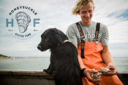
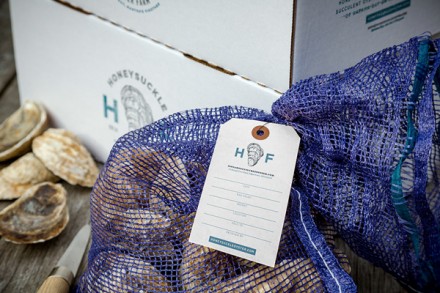
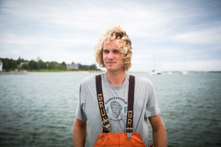
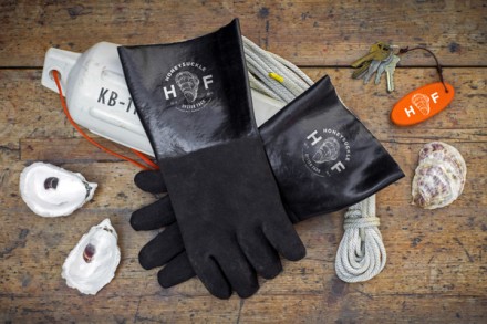
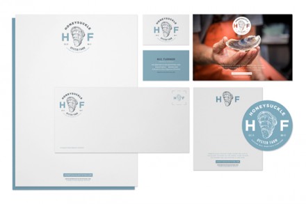
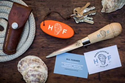
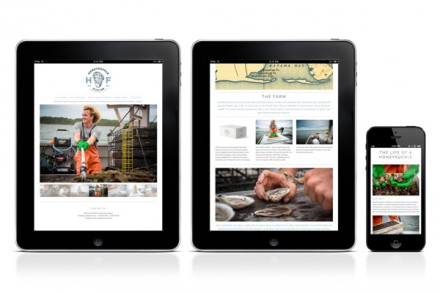
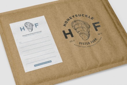
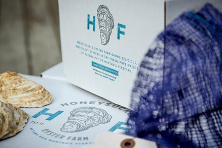
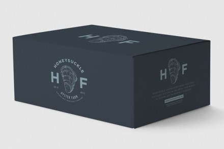
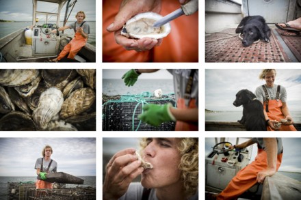
I discussed branding that captures a way of life to help market a brand last week. This week we find another oyster purveyor that has fallen into a similar line. Much of the imagery involved in the branding of Honeysuckle Oyster Farm by Bluerock Design features scenes from the sea and the equipment involved in bringing their oysters from sea to plate. Both designs capture a similar aesthetic, but they diverge in a few key areas so the branding isn’t a carbon copy. Much like Island Creek Oysters, I appreciate the timeless quality created by Bluerock for Honeysuckle and I think their brand mark has enough modern elements to bring the brand into the current century. There’s a sense that companies like this won’t modernize a great deal over time and when you’re dealing with oysters, perhaps that’s how it should be, but with modern touches like a detailed blueprint of an oyster in the logo, I think Honeysuckle shows that they’re going to be able to grow with the times while maintaining the heritage that makes them one of the best at what they do.

