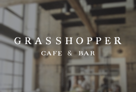
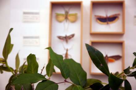
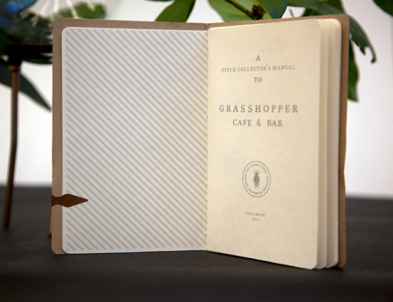
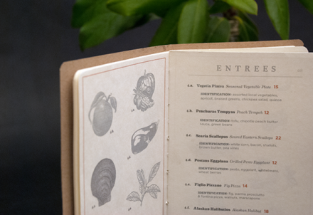
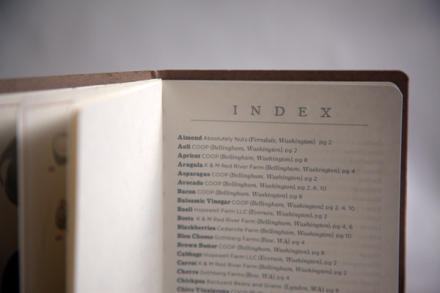
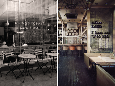
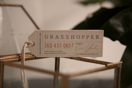
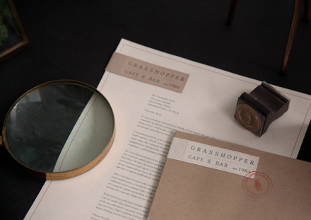
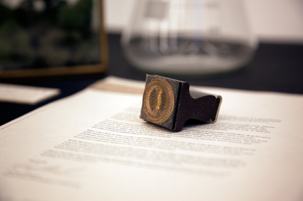
I’ve seen a lot of science influences in restaurant branding and decor lately and I can’t say I don’t like it. The vintage science vibe captures quite a few moods, particularly that of intelligence. Lacy Kuhn‘s branding of Grasshopper Cafe & Bar has that smartness to it and it’s fueled by her decision to go all science on everyone’s asses. In her words, Grasshopper’s mission is inspired by the quote “Eat food. Not too much. Mostly plants” and that certainly found its place in the branding of the healthy-living restaurant. Using vintage-style field guides, entomology and fancy diagrams, Kuhn injects Grasshopper with a little cerebral, which in turns helps position the restaurant as an authority of some kind. Kuhn carefully crafts this image, cautiously straying from the over-designed and cluttered forms some science-influenced brands can take. All this science is mixed with some industrial influences inside the four walls and it all comes together to create a very attractive, authentic and honest portrayal of a restaurant that isn’t too smart for its own good.

