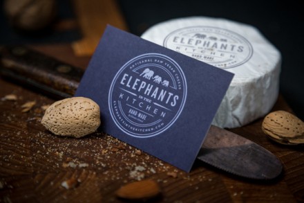
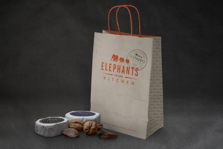
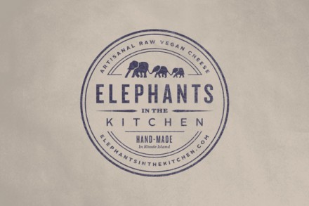
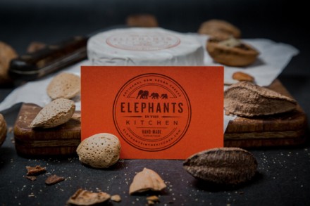
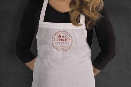
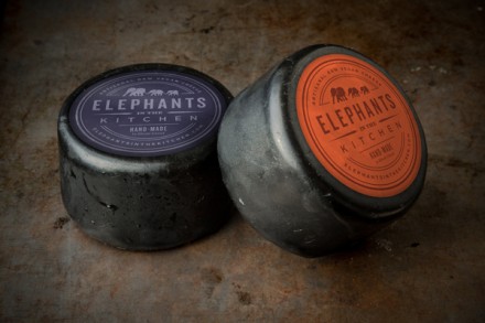
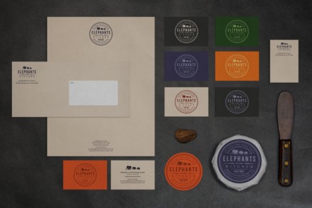
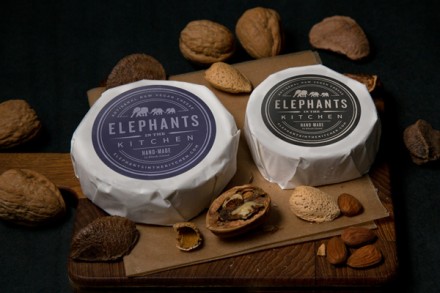
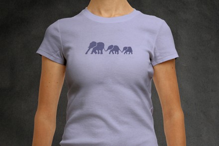
The age-old question is “how do you brand cheese,” right? Maybe not, but it’s a reasonable question to ask. Elephants in the Kitchen, branded by Blue Rock Design, have presented one answer to that question. I think the smartest part about this design is the use of the badge to shape the logo. The circle resembles the top of a circle of cheese and when EITK package their cheese, the logo fits snugly on top. It’s not a ground-breaking detail, but it works so incredibly well that in hindsight it looks like a must-have detail. Raw, vegan cheese is the specialty here and it’s all hand made. The name itself probably has some meaning with a context, but it’s not immediately obvious. Yet, it still works. The elephants walk in a line on the logo and there’s a peaceful quality about them. There’s a natural quality to them as well and that speaks to the cheese that EITK provides. Ultimately what Blue Rock accomplished is simple: they gave Elephants in the Kitchen a simple and smart logo that has a quality design and backs up the quality product. Can you ask for anything more?
The Forktales Podcast™: Interviews with restaurant industry leaders and visionaries
Restaurant and advertising industry headlines and thinking
Reviews of restaurant experiences from around the globe
Reviews of our favorite design, business, & restaurant books
Our favorite typography and fonts
Inspiration in your inbox
Get the latest inspiration in your inbox every Monday morning, for FREE!
"*" indicates required fields

