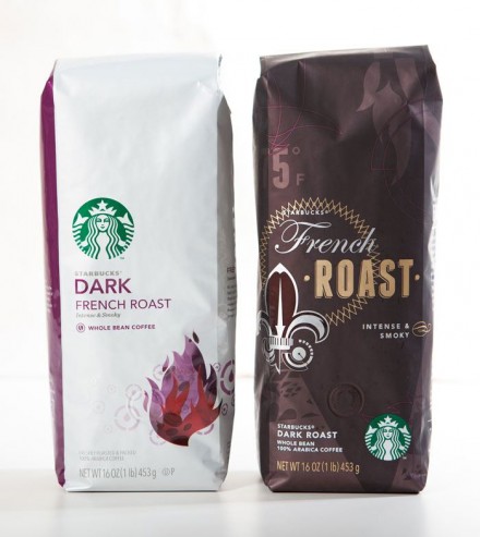
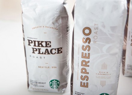
Earlier this year, Starbucks released new designs for their coffee bags, something that has become a tradition every few years. This year’s designs are a departure from the previous bag designs that consisted primarily of white with accents of color, action and logo presence. A recent interview with Starbucks creative directors Steve Murray and Mike Peck sheds some light onto the new designs and the dramatic departure from the design of old. The white bags came out around 2010, when the company was pushing a “fresh-scooped” vibe and they wanted the white bags to symbolize the heritage off the company. The white bags were long a staple in the stores and the sealed bags were still intended to appear hand-scooped, like all bags of coffee were once packaged. It was a nice effort, but Starbucks’ history is understood for the most part and focusing on the past in this instance wasn’t completely necessary. The new bags pop with color and each tells a story unique to the coffee. Each coffee’s bag sticks to the color system Starbucks has established to help customers understand the differences in roast length, but they’ve added imagery that is symbolic and unique to the coffee. Each bag’s design is attractive and they showcase the quality and appeal the coffee company has established. I think it was a smart move to update the bag and close the door on some of Starbucks’ lingering design decisions from a troubled time in the company’s past.