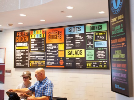
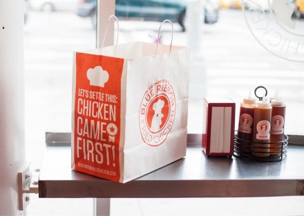
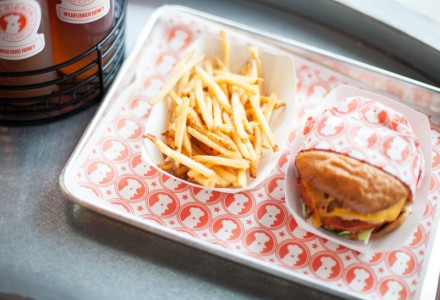
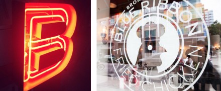
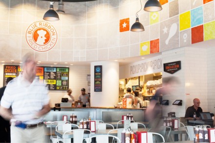
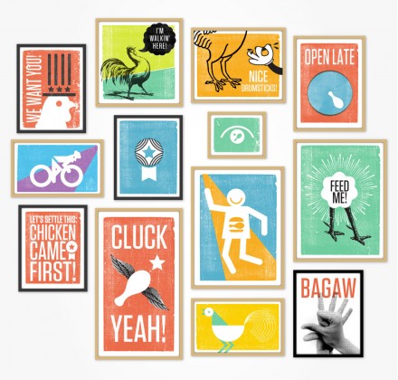
Whenever I think about attaching “award-winning” or “world’s best” to a product, especially at a restaurant, I’m reminded of that scene in Elf. Whenever I see claims like that, I too want to rush in and celebrate the self-proclaimed title. The point is, in branding, claims to be the best or the only shouldn’t be thrown around too loosely. In the case of Bromberg Bros. Blue Ribbon Fried Chicken, they gently handle such a distinction. The chicken at Bromberg’s is award-winning, but they don’t put that claim front and center. Instead they work the superiority into the brand itself, by allowing it to influence the name. Blue ribbons, as we know from our childhood, are indicative of the best. I think the Blue Ribbon branding by Red Antler is a classy attempt at combining an authoritative stance on serving chicken with a light-hearted, tongue-in-cheek voice. I appreciate the modern use of colors and iconography inside the restaurant’s interior, but what I really love is the logo. It’s the badge style, but fortunately they didn’t turn the logo into a ribbon. Avoiding the predictable is key and they did that with one simple move. But even more so, I appreciate the authority that is implied with the circular logo and beyond that, the caricature of the chicken puts him front and center and creates the expectations that this place may not take itself as seriously as some chicken fast casual places. It’s all about a vibe, and Bromberg Bros. nailed it.

