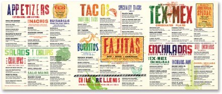
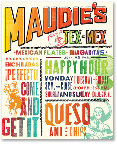
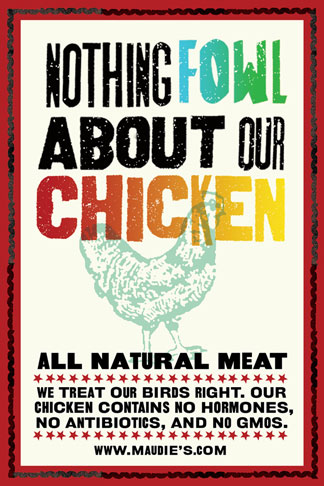
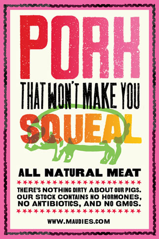
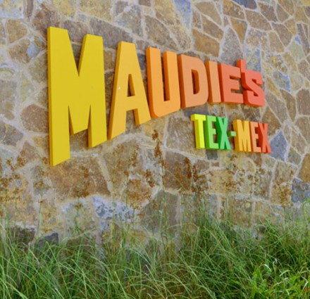
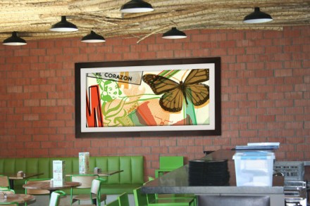
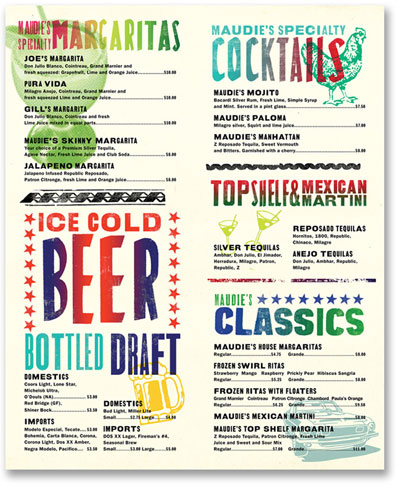
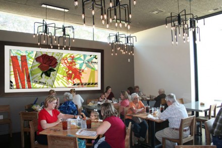
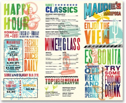
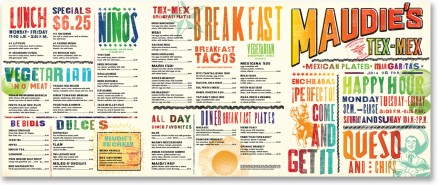
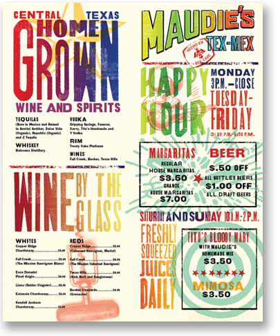
There are guys out there that will spend more than a few minutes each morning fine-tuning their hair, making sure each strand is in its appropriate position. This is pretty uniform across the board, however there’s a select group of those guys who are doing this with one seemingly counter-productive goal: make my hair look messy. The notion of styled messy is alive and well in design all around us and Pentagram’s work on Maudie’s Tex-Mex is a brilliant example of this approach. The goal was to rebrand Maudie’s with a new look, but one that didn’t look designed, essentially creating a “non-design” philosophy. Using elements inspired by border cantinas, those that don’t have a design agency helping with branding, or much of a “design” at all for that matter, Pentagram crafted a colorful, authentic Tex-Mex image that is light-hearted and vibrant. I love the distressed look of the typography and how it works with the clip art style and splash artistry of interior elements. The work was challenging because designers don’t typically take an approach in their work to create a product that looks as if design was removed from the project. Pentagram did a smooth job pulling the wool over our eyes.

