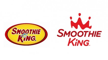
Smoothie retailer Smoothie King is gearing up for a run at major expansion in the coming years and this week they released their new logo to help with the evolution of the brand. The Ohio design house WD Partners completed the redesign and Smoothie King likely chose them because of their successful work with many other food retailers. Many of WD’s projects feature redesigns and rebranding, taking a product or brand into a modern place within the retail world. The logo redesign is the precursor to redesigned stores and a five-year expansion plan to triple the U.S. locations as well as quadrupling locations outside of the U.S. It’s an aggressive plan and after 20 years, Smoothie King is trying to get ahead of the healthy smoothie craze that is growing in the fast casual category. The logo isn’t a drastic departure from old, understandable since the chain is relatively established. It’s a cleaner look with a lot of the clutter of the old logo removed. It maintains the lower case “i” and the crown is still there, just on top now with an abstract vibe. The badge style of the old logo is gone, opening things up for a more airy logo, a concept I hope influences the shops’ interiors. The logo is being introduced after a year-long partnership with WD, so you can expect more interesting ideas to come from Smoothie King in the coming months.


