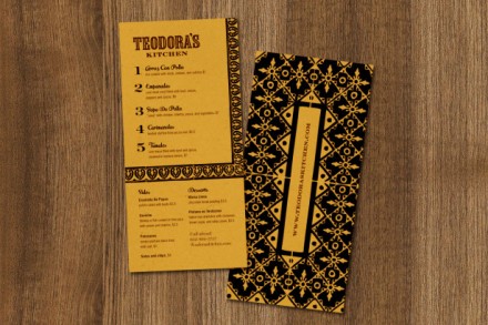
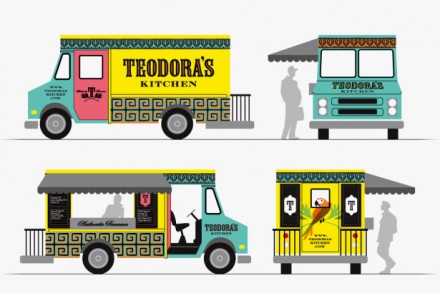
Sometimes it seems like restaurants that serve an “authentic” brand of food that correlates to a spot on the globe have challenges in developing a universal brand that is appealing. On the one hand, you limit yourself to inspirations from the place and on the other you try to develop something that is a departure from the place. Both options have risks, but I like how designer Jeremy Slagle handed this when he branded Teodora’s, a Latin American restaurant in Columbus, Ohio. Slagle took the aspects of the flair the country is known for and created an authentic look. The name itself isn’t going to win diners over, so something needed to showcase the Latin influence. Slagle added a parakeet on crossed branches, an image with a splash of color above the old-style typography of the location’s name. There’s an interesting Gothic theme running through this branding as well. I did a quick Google search on Gothic influences in Latin culture and couldn’t come up with much. I’m not sure where that comes from in the branding, but it seems to work. I love the pattern used as the background to the menu and the similar repeating patterns that show up on the food truck. Slagle did an excellent job taking recognizable influences from Latin America and allowing them to breathe as he created a fresh branding job for Teodora’s.

