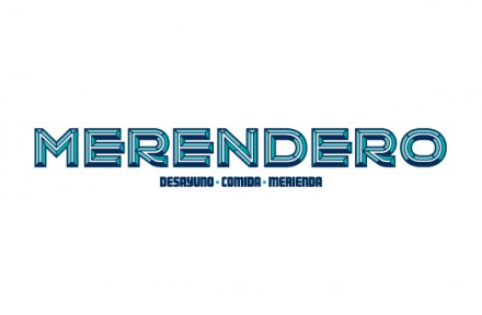
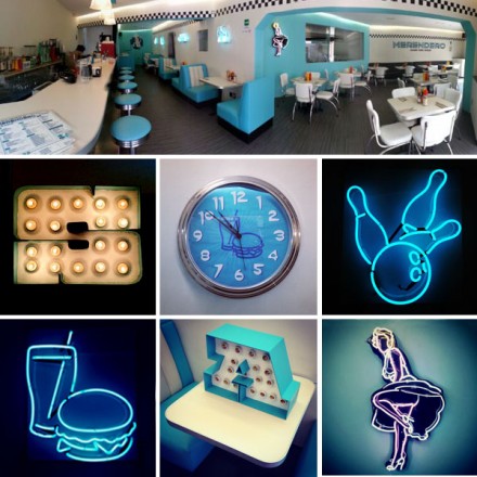
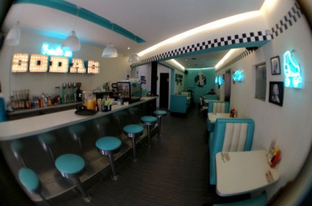
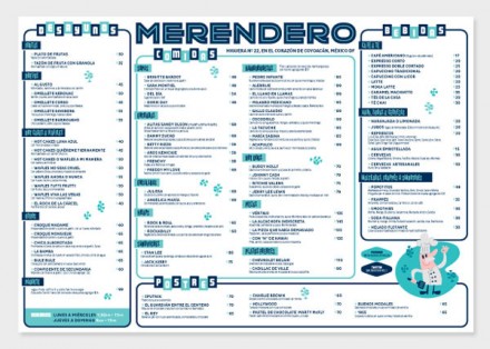
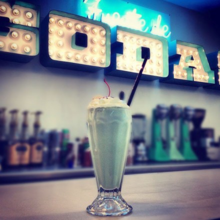
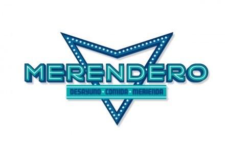
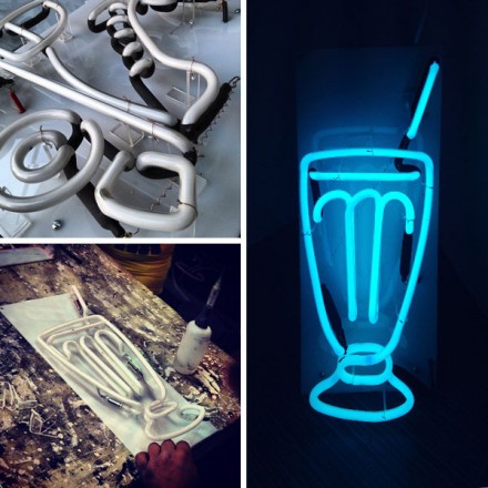
There’s a lot to love about Mexico City’s Merendero, an American-inspired 50’s-themed diner, but unfortunately there are a few things to like not so much as well. First, this place captures the American spirit really well, more so than many of the American-inspired restaurants that are popping up around the world. I love the logo. It’s bold, classic but has a modern twist that almost makes it appear to be chromed out and sparkling. Chrome can be a throwback to the 50’s, a time when the American diner was alive and well, but it also has a modern look as well. Smart choice for the logo there by designer Quique Ollervides. I appreciate the imagination and scope of this brand creation, but I think they miss the mark in a few places, but in general they get more right than wrong. I think the menu is a clever recreation of a 50’s-inspired menu presentation and I like the choices of icons throughout the shop in the form of neon lights. I think they get a little predictable with a few of them (roller skates?), but the graphic imagery they’re creating is consistent with the theme and rounds out the brand well. The one thing I really don’t understand is the male chef character with the mustache. How does it influence the brand or reinforce the vibe that is already projected? It just seems to stick out like a sore thumb (to coin a 50’s phrase) and I don’t get its relevancy. That aside, I think the creation here is a good one. It’s authentic, creative and a new type of offering for a market not quite as familiar with diners, drive-ins and dives as Americans are.

