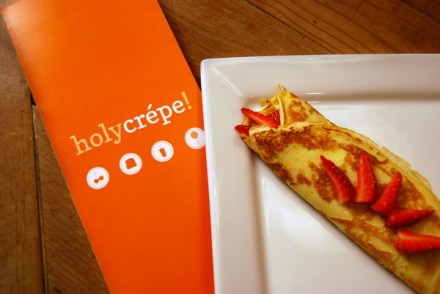
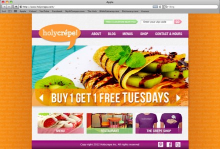
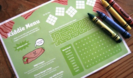
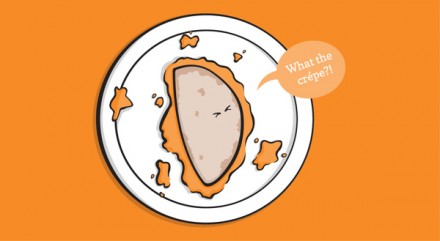
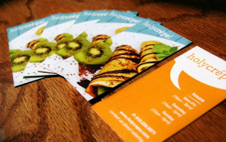
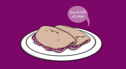
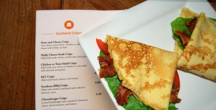
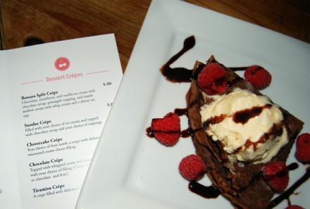
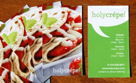
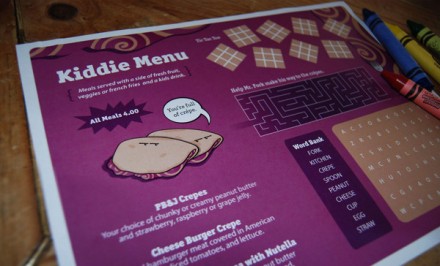
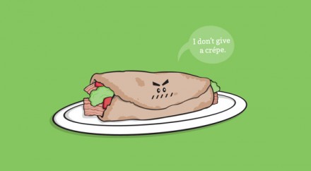
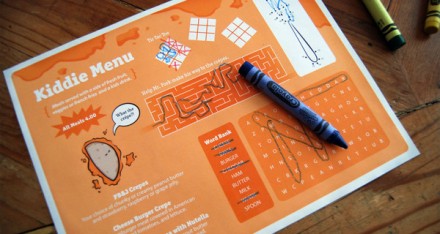
I’ve long believed that if restaurants are targeting the average adult, that adult often comes accompanied by a child. Because of this, I believe restaurants are leaving a lot on the table when it comes to their branding and their efforts to not only make kids feel engaged and/or entertained, but welcomed. If you can develop a concept that isn’t Chuck E. Cheese’s, but welcomes parents and kids alike, I think you’ll have a successful restaurant on your hands. Holycrepe! is that kind of place and the designer, Katrina Williams, definitely considered the children in all of this. Her design for the French-inspired crepe cafe puts an American spin on a food that is distinctly French. Using the art of the pun, Williams developed a vibe that features playful images of food that talk. That extends into the logo itself, which often features the familiar voice bubble. I love the icon-heavy branding, the use of colors and the attention paid to kids. Holy crepe it’s a good look!

