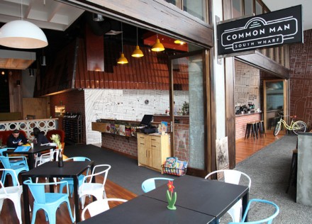
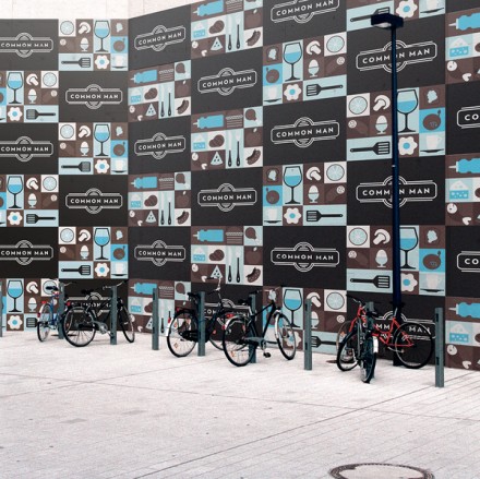
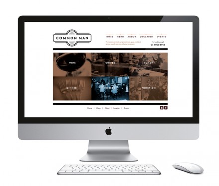
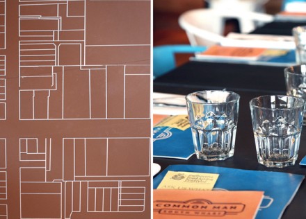
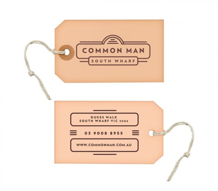
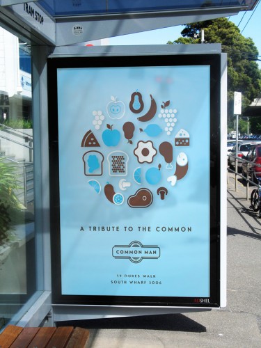
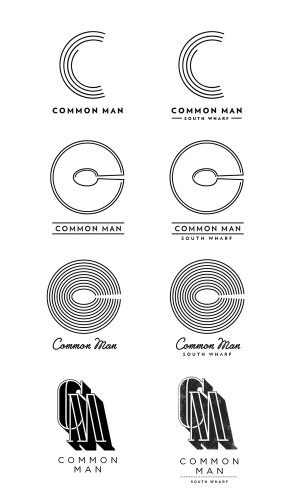
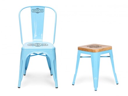
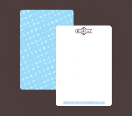
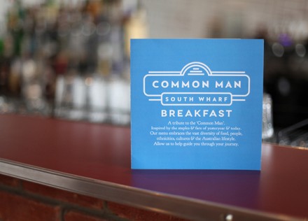
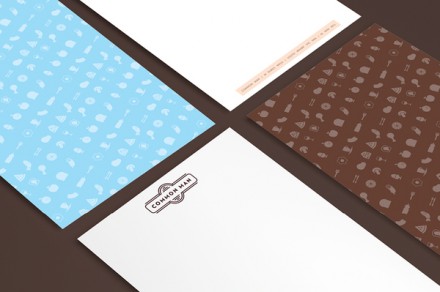
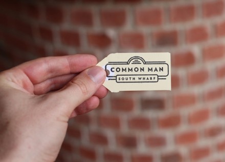
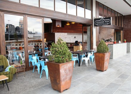
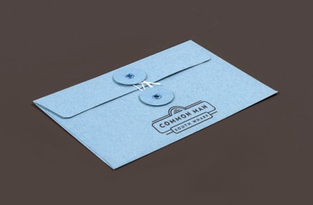
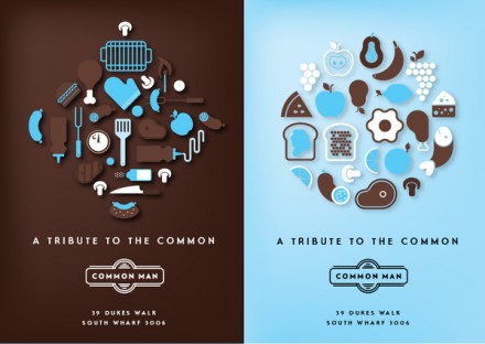
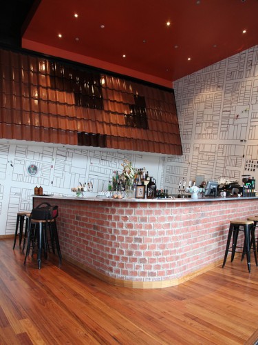
Melbourne’s Common Man has a really interesting statement attached to its logo and full branding. “A tribute to the common” is what they proclaim and the entire image embraces this commonality. It’s an interesting concept to frame a brand presence around, but Josip Kelava definitely makes it work. The restaurant and bar takes on the idea of a place that is a destination after a hard day’s work, but it’s not the kind of place to kick off a night of shenanigans. It’s a place where hard-working folks go to eat, drink and relax before heading home to get ready for tomorrow. It’s a place serving meat pies, pizzas and pastas, gloriously filling meals of the common man, and let’s be honest, we all have a little common in all of us. That’s the concept that this restaurant tackles and the simple iconography of foods and utensils reinforces it all, while also giving it a little tech-forward feel. It’s truly a new take on the old-meets-new themes we so regularly see.

