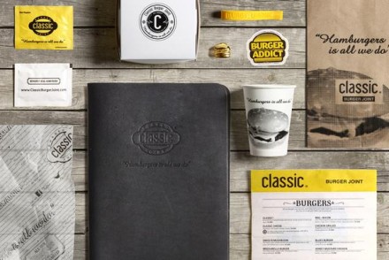
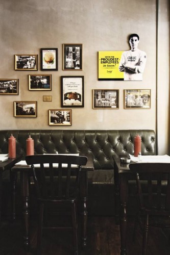
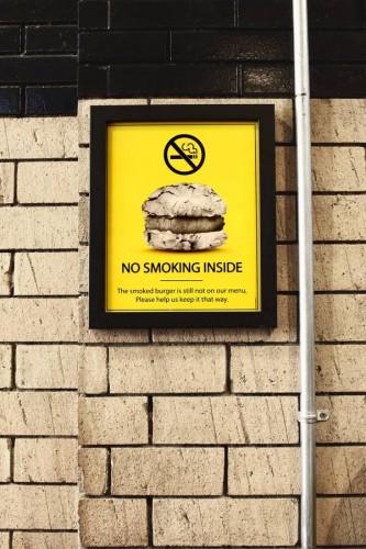
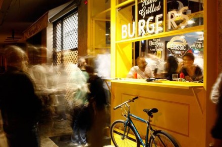
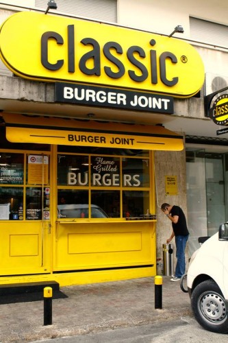
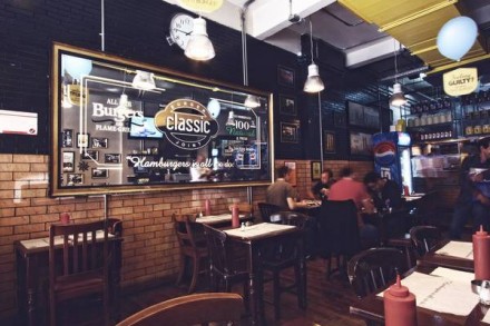
Ahh, classics. The original Star Wars–that’s the one originally released in the 70’s–will always be a classic. The best Ford Mustang? The original, of course. Great firsts are almost always classic, so why not try to recreate that kind of elitism in a restaurant brand? Classic Burger Joint, branded by Wondereight, did just that. Located in Lebanon, Classic Burger Joint does exactly what it says it does: serve a laid-back, New York-style burger. Using a black and yellow color scheme, Wondereight produced a brand that appears familiar without being a carbon copy. The familiarity comes from that color scheme and it calls to mind McDonald’s, a brand that may not have the reputation it once did, but is still the unquestioned leader of burgers and fries in many parts of the world. The brand has a tongue-in-cheek vibe, with the name leading the way. They’re stating the obvious and allowing their name to clearly explain to each potential customer what’s in store. The interiors are a departure from places like McDonald’s, which is probably a good thing, and everything is presented with a classy angle. All in all, this brand is presented cleanly with little confusion. I appreciate the straight-forward approach taken with Classic Burger Joint.

