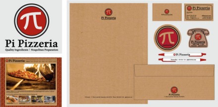
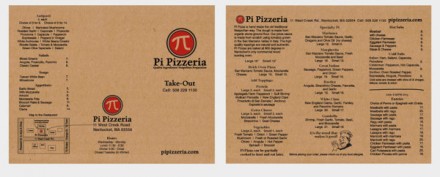
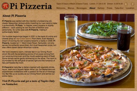
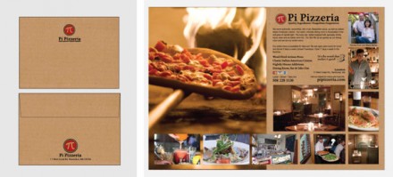
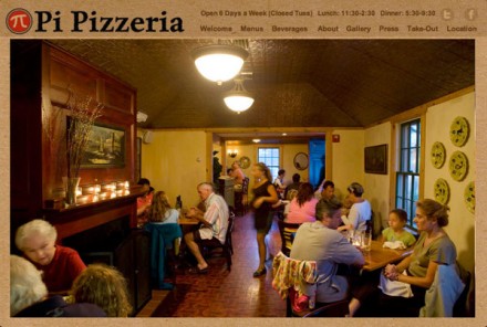
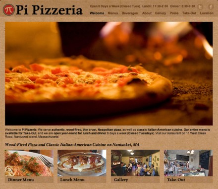
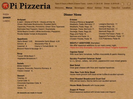
Sometimes branding requires the ability to see the obvious and use it to your advantage. That seems to be the case with Pi Pizzeria, branded by Malcolm Brooks. The name is an obvious fit, though it does encourage the question “why Pi,” but that’s really just an ancillary item. The choice of the pi sign is another obvious one, a fitting move for a pizza place called Pi. All in all it’s a quality job, but there are aspects of this that feel incomplete. I like the cardboard color option, reminiscent of the take-out box, a key part of the to-go pizza branding. It’s also a fitting tribute to the restaurant’s original days as a take-out only stop. The logo stands on it own and provides the proper context to the brand, but like I mentioned, it feels like something is missing. It seems like the branding ended with the logo and while it’s placed prominently throughout, there isn’t much conversation happening between the brand mark and the entire brand vibe as a completed piece. This is a good example of how branding is more than just a clean logo. The brand is the complete look, the entire line and I think Pi is missing some opportunities to flesh out what they represent.

