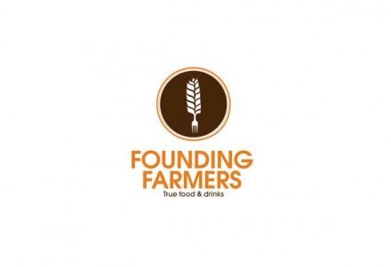
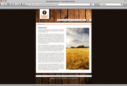
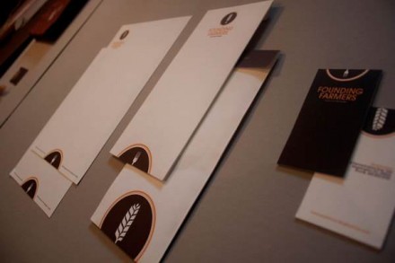
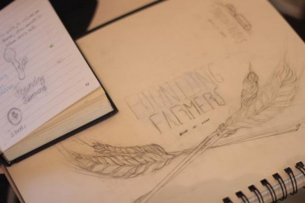
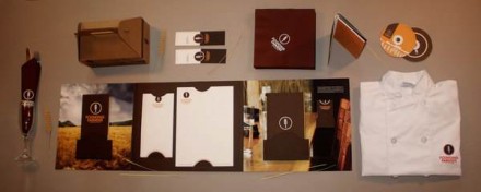
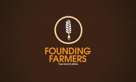
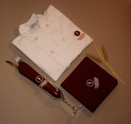
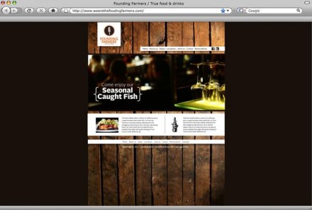
Founding Farmers is one of those restaurants that actually does what other restaurants say they do. It’s award-winning and it accomplishes this with food legitimately sourced from American farms, ranches and fisheries. The branding for this D.C. restaurant was completed by Peter Verastegui and he gave them a brand vibe reflective of the super-appropriate tagline: “true food & drink”. The brand has a primary brandmark, a badge-style emblem of wheat that evolves in its lower portion into a fork. It’s clever and honest and evokes a certain Boy Scout merit badge persona. The color choices of brown and mustard are fitting and allow the brand to continue the farm and all-natural influences throughout the remainder of the collateral. Much of it works off the color scheme and the brandmark is a strong part of everything they present. I love the American roots this brand projects and it’s a true reflection of a brand that supports the kind of things America was built on. It’s a hard-working brand; an honest portrayal of the folks that put the food on the table, and that’s the true product they’re offering.
UPDATED: 10/16/13
“The ORIGINAL branding for this D.C. restaurant was completed by ALLISON SETH OF TASTE. CORCORAN COLLEGE OF ART & DESIGN STUDENT Peter Verastegui gave the RESTAURANT BRAND A NEW INTERPRETATION AND A vibe reflective of the super-appropriate tagline: “true food & drink”. HIS INTERPRETED brand has a primary brandmark, a badge-style emblem of wheat that evolves in its lower portion into a fork. HIS VERSION IS clever ….”
– Jennifer Motruk / VP, Marketing + Communications / Farmers Restaurant Group

