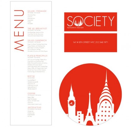
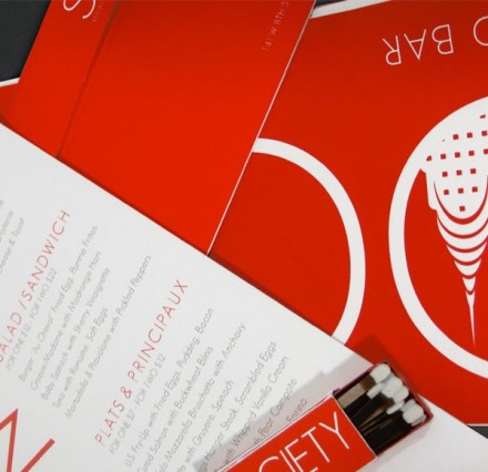
Society, a New York City-based restaurant and bar, serves Pan-American. For those that don’t know, “Pan-American” refers to the unified continents of America, both north and south. That was the direction and Meagan Burns appears to have hit the mark, for the most part. The brand has an elegance, influenced heavily by her design choices and the use of “society” as the location’s name. Society has a few connotations and one of them is high, meaning an element of people that are cultured and elite in wealth, experience or intelligence. Burns captures this vibe with the impactful red choice for the logo and corresponding branding elements. I think the brandmark is a good-looking one, but I’m a little confused by something. Knowing what I know about “Pan-American”, I find it odd that iconic buildings like Big Ben are included in this mark. I get the exclusive and worldly vibe they’re going for, but the presence of buildings outside of the Pan-American reach may confuse some and influence what they’re expecting when they visit Society. Nothing against Burns on this one because she created a slick and clean image, but I think the consistency is missing. Creators can’t forget or overlook details in their brand because consumers won’t and don’t.


