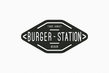
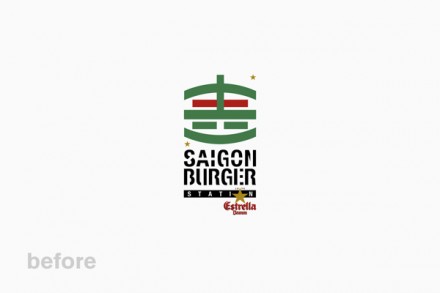
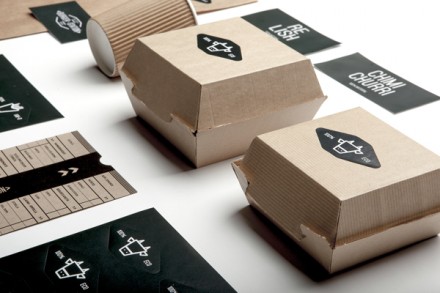
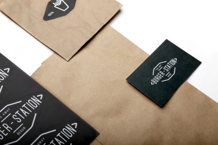
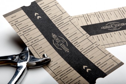
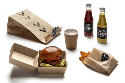
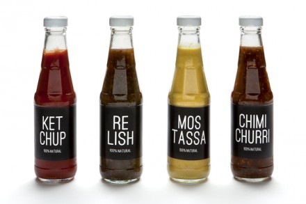
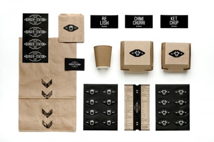
When The Saigon Burger Station wanted a rebrand, they turned to nueve estudio to give them a fresh, new look. The old one was a squashy look with an emblem that could be loosely translated as a burger. The result is a move away from “Saigon” and toward “Burger Station”. The name change alone is huge and it was a smart initial move. Brands with location references can always be a tough sell should the brand ever try to expand. Plus, the use of Saigon is a little ambiguous, not the kind of characteristic you want in a logo. I like the modern twists this brand gives to a classic look. It’s clearly inspired by the neon signs and printed meal tickets of days of old. I like the badge logo style and the broken lines that frame its interior are reminiscent of neon signage. The packaging is simple, but the bold black & white works well for drawing attention to itself. I love the sauce bottle wraps with the chopped-up lines of print. It’s clear good thought went into this project. This rebrand job is far less unanimous and much clearer, and in rebranding jobs, that’s kind of the point.

