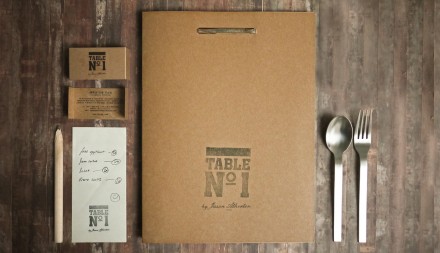
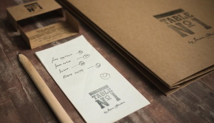
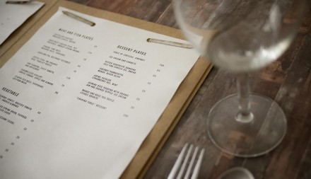
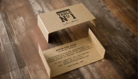
Table No. 1 is one of Shanghai’s first (and many say best) gastropubs. They serve tapas-style Euro cuisine and their hook is community. Everything’s communal at Table No. 1, designed by Foreign Policy. It only makes sense when you serve table-friendly meals that are tapas based. The interior of the restaurant isn’t fancy. Instead it’s polished but minimal. The intent is to get diners interacting whether they’re strangers or not. The restaurant features long common tables that puts everyone elbow-to-elbow. If you want your space, this isn’t the space for you. But if you like your meal mixed with some stranger conversation, it’s perfect. This commitment to the art of conversation and engagement makes up a significant portion of the brand’s overall vibe. It prefers simplicity rather than the complexities than can come with high-end restaurants. That idea is also portrayed in the collateral throughout the job. Brown craft paper is used liberally and that creates a strong easy-going, homey feel. Business cards in brown craft paper color that fold like tables, basic clips and folders and blank newsprint for order pads rounds out this simple and honest brand. What could be perceived as a lack of design for Table No. 1 is actually a great example of cautious editing in the branding process and a focus on a few key details. The food and service should do the rest.


