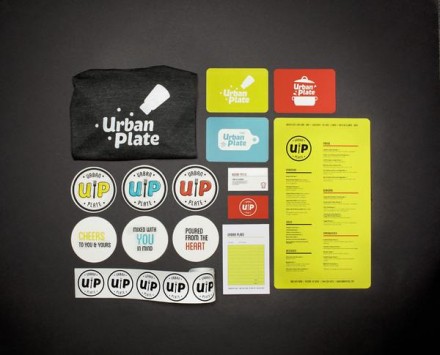
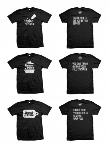
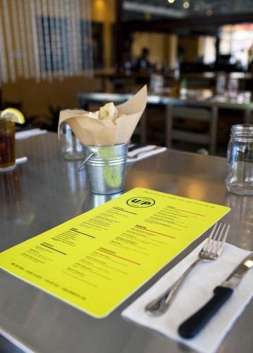
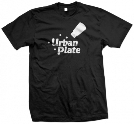
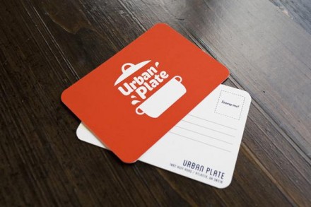
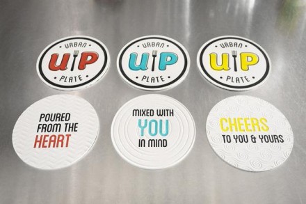
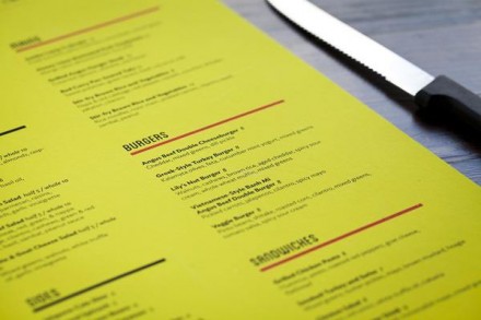
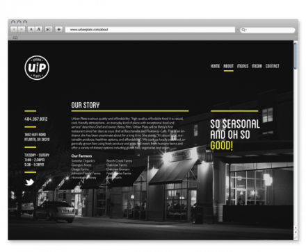
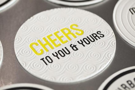
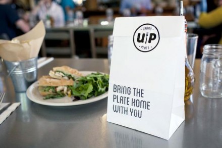
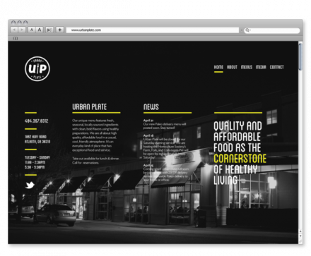
I think it’s safe to say each restaurant has its thing. It has a No. 1 something. It’s the kind of thing that separates that restaurant from everything else. It could be a special dish, or a philosophy, but it’s still something different. At one point in time, choosing to open a restaurant that focused solely on quality ingredients with healthy eaters in mind would be the kind of concept a place could hang its hat on. But these days, concepts like that are alive and well. Except there’s one thing about so many of these places: they seem to follow guidelines in the Designing for Organic & Healthy Food Brands handbook. No, these brands aren’t carbon copies of each other, but many of them feature similar and like-minded ideas in the presentation of their brands. Urban Plate, designed by Chris Yoon is a little different. First, they adhere to the idea that “exceptional and healthy food” should be accessible to everyone. But the vibe they project is quite different from many of their peer restaurants. Yoon incorporated pops of color throughout and witty comments on t-shirts and other items that project a truly playful, but incredibly kind, brand. The primary logo of a fork between a U and a P inside a badge has a slightly folksy appearance, but the rest of the design picks it up a little more with fun icons and action. Quite frankly, this brand could not only stand side by side with its organic neighbors, but could quite possibly compete in the larger market of fast casual, healthy, organic or otherwise. It’s got enough familiarity that it could latch on. This brand’s got some guts and for that, they got a brand that sends a new kind of message.

