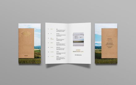
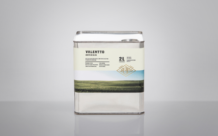
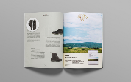
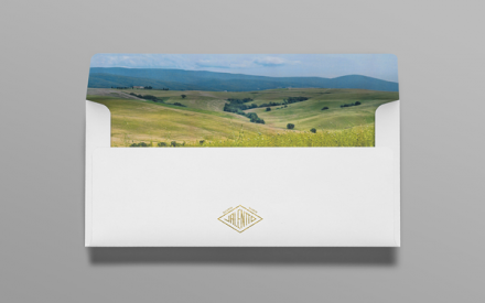
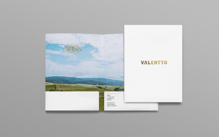
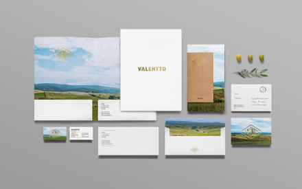
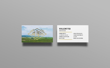
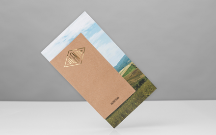
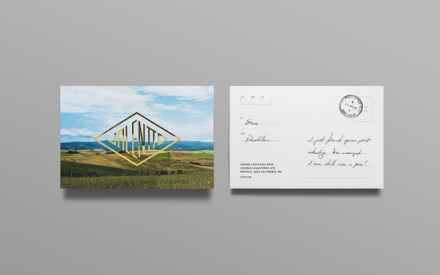
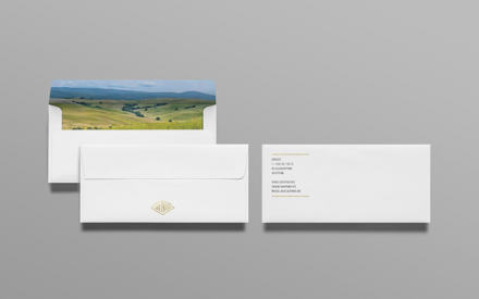
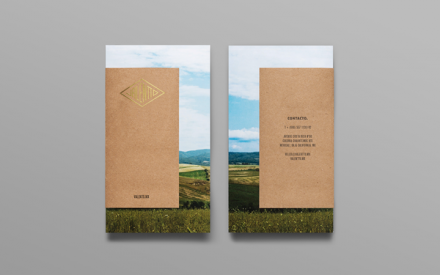
Branding for products used in the restaurant industry can be challenging. All too often many of these manufacturers forget a complete brand look is required, despite the fact that the product doesn’t sit on grocery store shelves and compete for eyeballs. Anagrama‘s finished branding for Valentto, a virgin olive oil company for use in industrial kitchens and restaurants, is a great example of how polished brands like this can look. Valentto traditionally had an industrial feel and Anagrama used that influence but managed to soften it quite a bit. The packaging has a vintage feel, a look similar to an old aluminum gasoline canister. The brand mark itself also has the industrial feel with its metal-stamped logo in a diamond shape. Anagrama softens the look with images from the Italian country sides, a technique that provides an open-ended feel for a brand with a limited focus of customers. Much of the trim of the brand is done with gold foil, adding a layer of prestige to the overall vibe. This is a well-executed example of a brand that can expand should they ever chose to.


