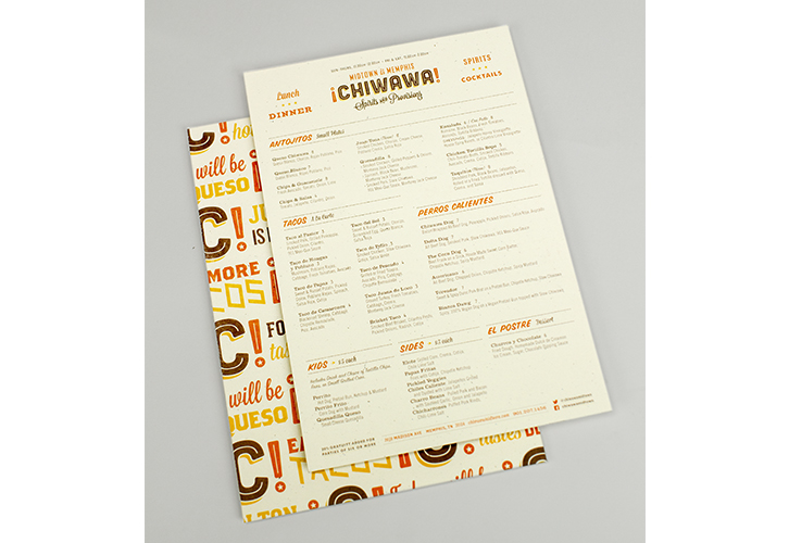
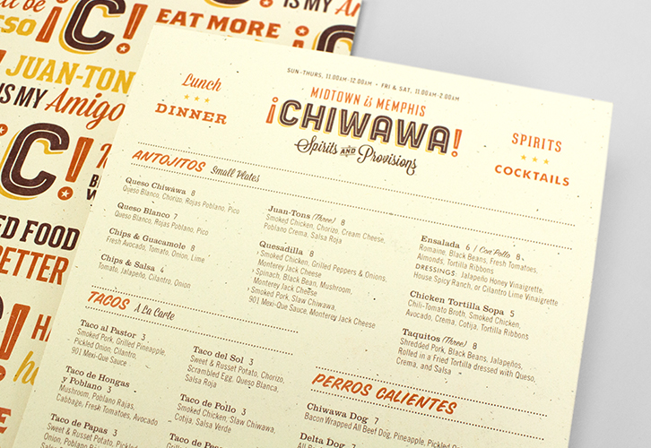
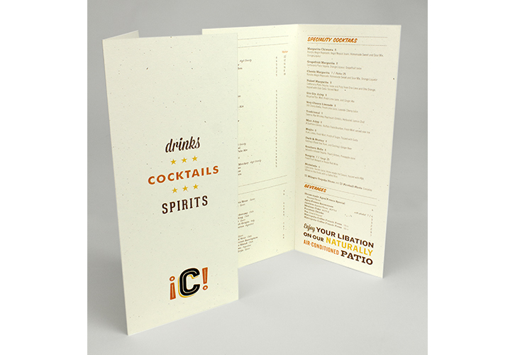
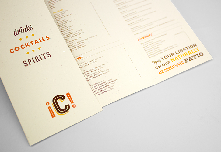
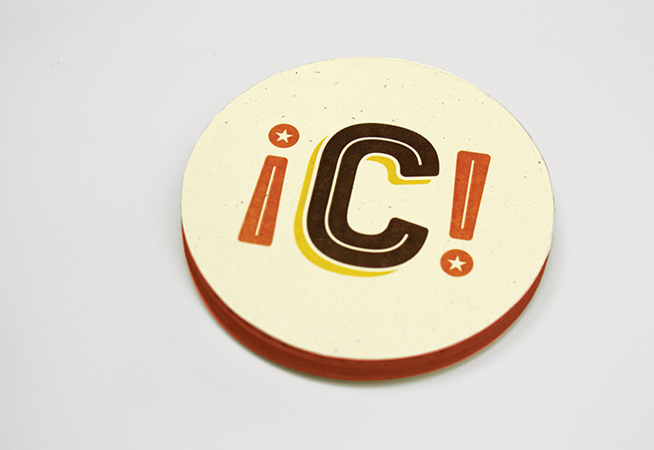
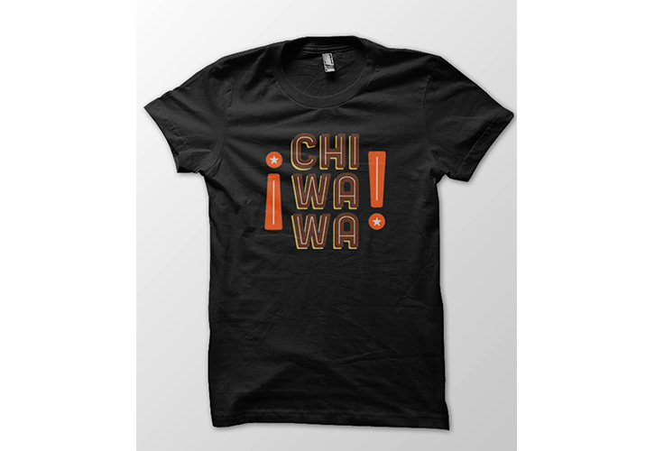
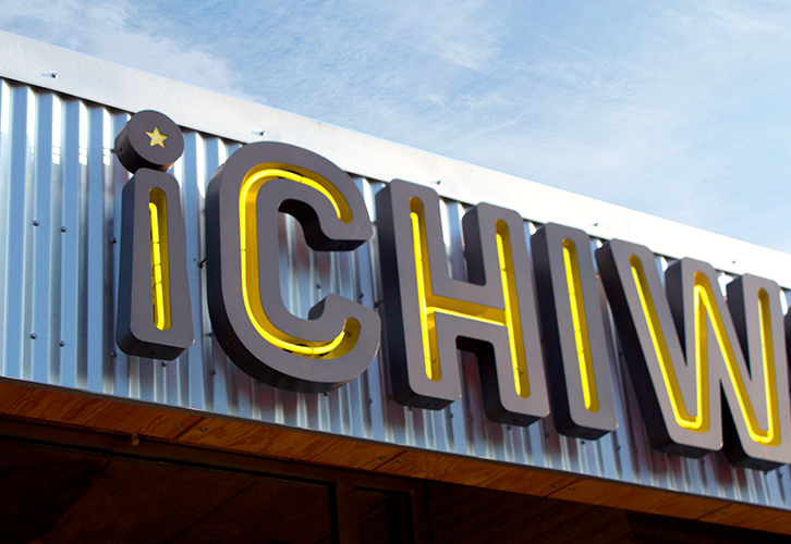
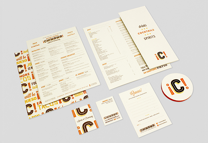
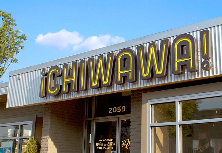
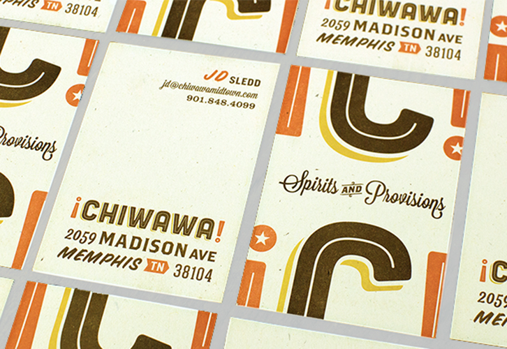
Marked by a misspelling that just plain worked, Chiwawa! has a lively brand with sign painter style typography and a warm color palette. The graphic elements that help shape the brand feature large C letter forms as an insignia style logo mixed in a pattern with fun typographical treatments of food and Spanish words. Here is the designer Robert Finkel‘s description of the project:
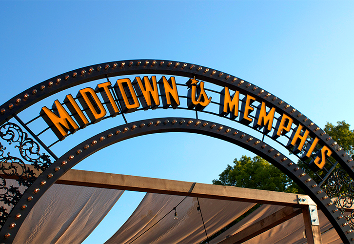
¡CHIWAWA! is Memphis, TN’s eclectic mashup of Southern cuisine and Mexican staples located in Overton Square. The goal was to create a mark that boldly proclaimed itself as the destination for gourmet hot dogs, tacos, and specialty cocktails. The name ¡CHIWAWA! serendipitously came about through a text message exchange between the owners discussing possible names for their new venture. One partner unknowingly misspelled chihuahua as chiwawa. It was a great result of phonetics that captured the spirit of the restaurant. The lighted arch way over the outdoor patio declaring, “Midtown is Memphis,” has become an instant icon in Overton Square. Architecture by brg3s
