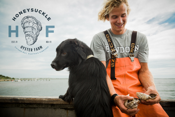
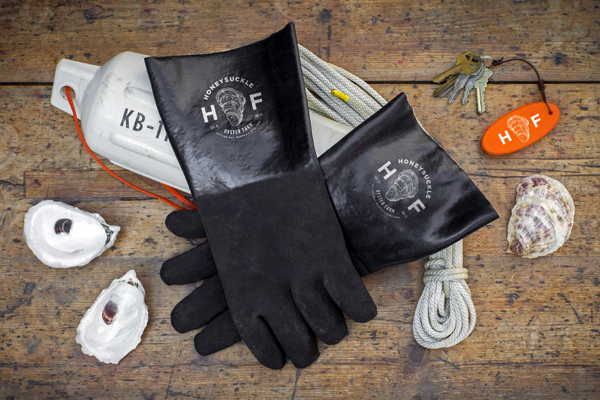
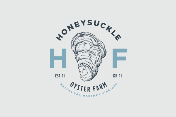
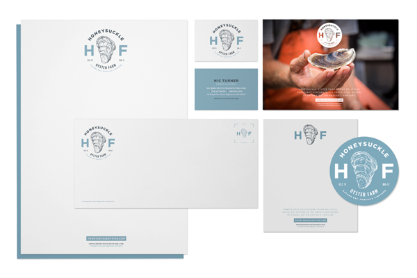
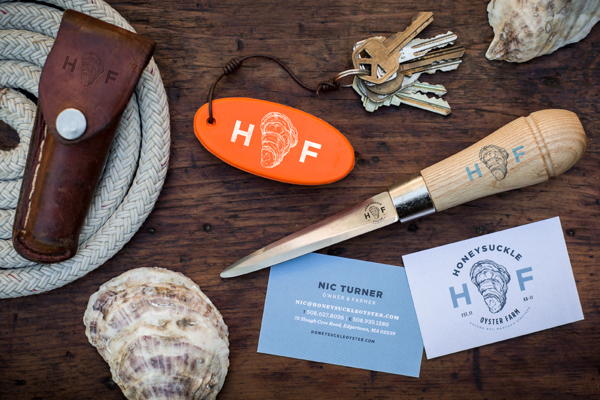
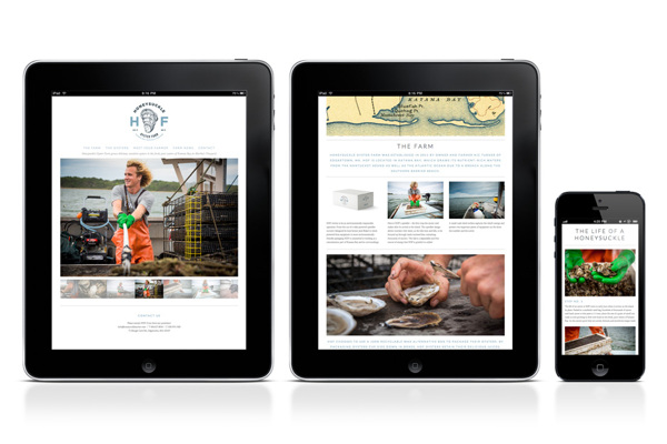
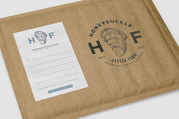
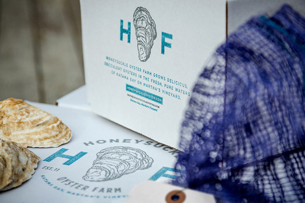
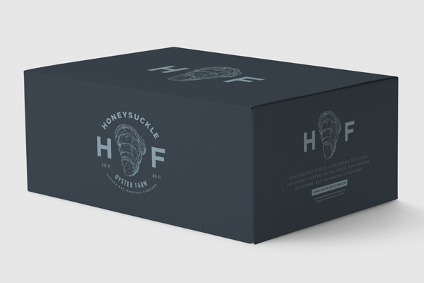
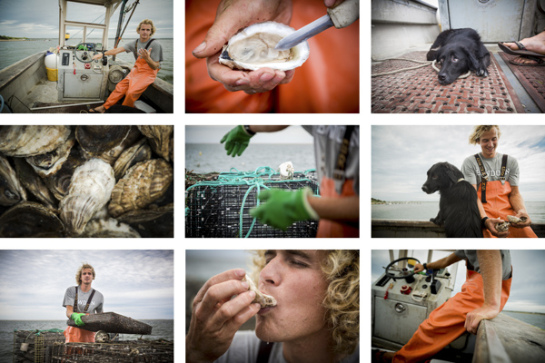
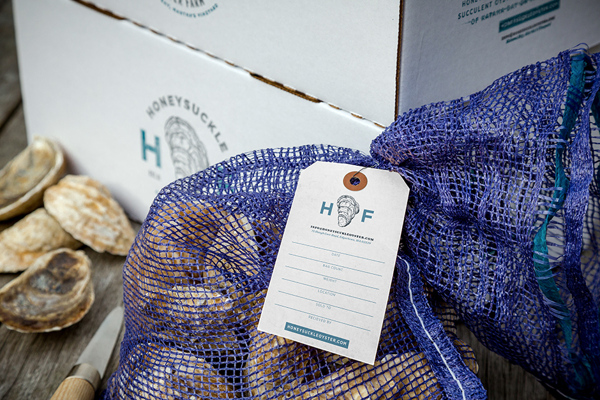
Once again an industry that may seem to not need branding has a visionary that steps up the game. Honeysuckle Oyster Farm’s brand, designed by Bluerock Design, combines solid, simple letterforms with handdrawn illustration to make for a direct identity. What says “oysters” better than an image of an oyster? Combine that with good, straightforward typography and you have an excellent brand that’ll stand away from competing companies. What makes this brand even more compelling is the way it’s applied across the packaging and promotional products. It’s not simply a logo slapped on a box. It takes the design further and creates a graphic language.
