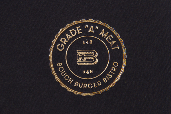
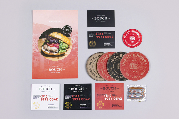
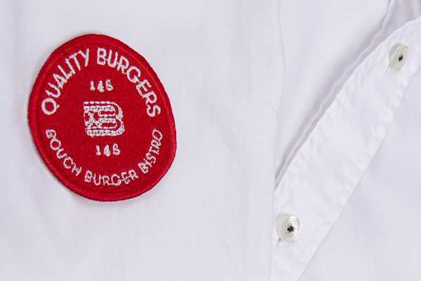
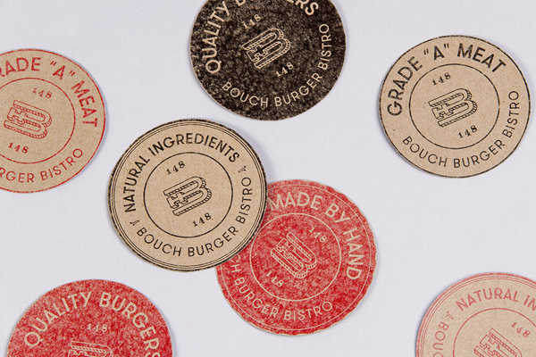
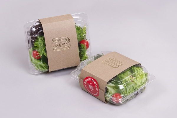
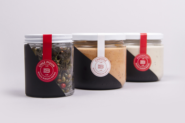
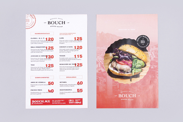
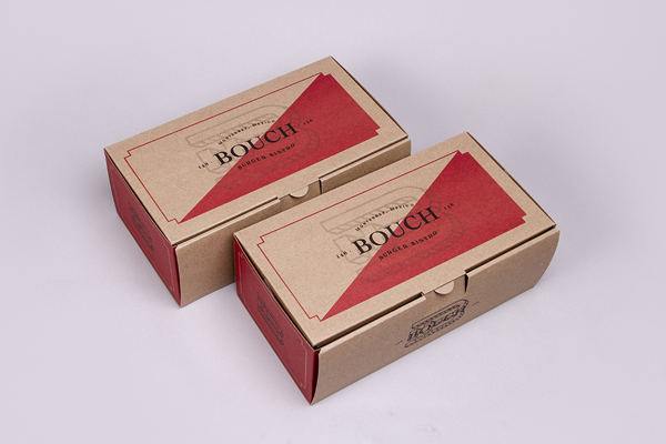
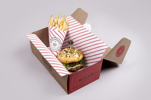
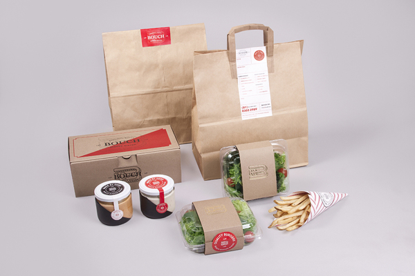
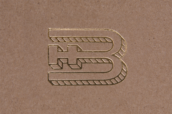
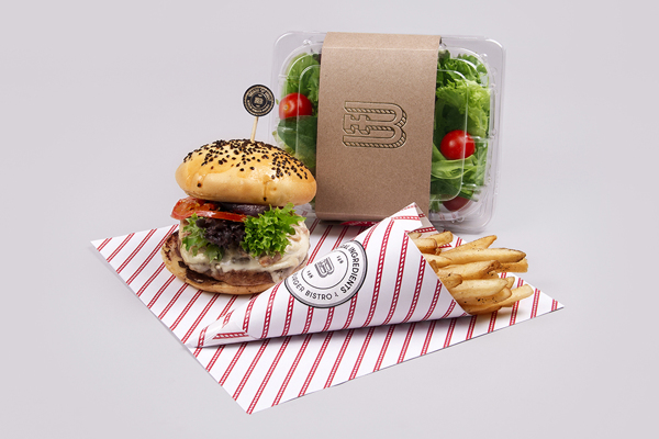
When we talk about “dynamic” brands we’re referring to how each touch point is well thought out. Instead of slapping the same logo on everything, the touch point’s usage is fully considered and a graphic language is applied accordingly. This makes for a vast “family” of elements that all bolster and build the restaurant’s brand. That’s exactly what Bouch Burger Bistro’s brand does successfully. Bouch’s brand identity is dynamic. It melds classic design treatments with modern styles to create a unique look that’s approachable but different. The identity isn’t restricted to a singular logo option either. There are many options from insignia style to seal, to simple logotype. Graphic elements are used throughout menus, takeout materials and more so each has it’s own vibe that supports the whole. Quite well done. Designed by Firmalt.
