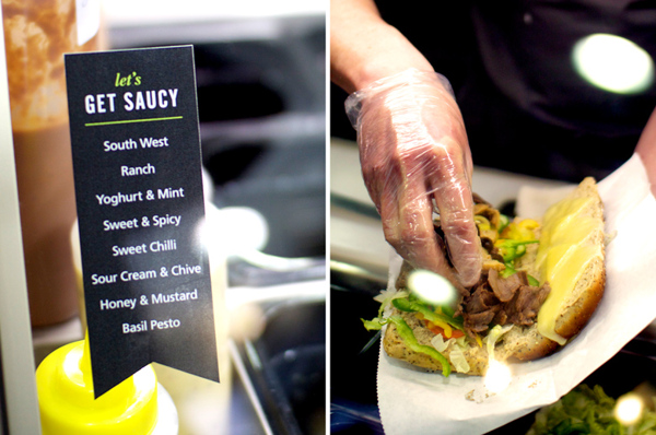
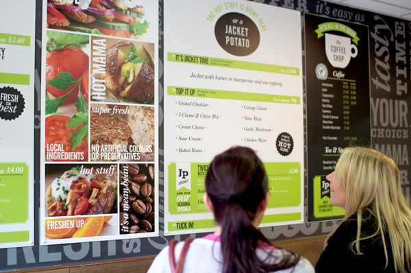
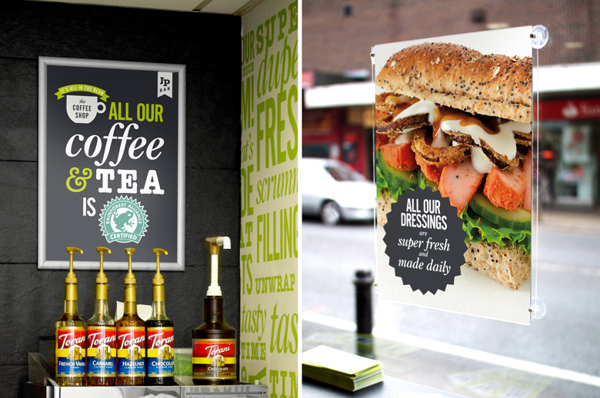
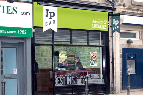
A dark black background gives a solid foundation upon which flourescent greens and bright whites can pop. With simple graphic elements mixed with simple typography, the designer’s at Robot Food have created a brand that’s fun and unique without being too over the top. The limited color palette gives hierarchy to the right places while letting subtlety be a driver for added features. For instance, subtle wall paper textures aren’t 100% in your face, but they’re there and they add the brand experience.

0b2055235294a5289c76c6e13a74944f

2cfee5831bc437ddf26d21816944dbac

70dc62acf4e855ae3f243dbdbe9c1d02

615e1737819e37169e1d427c82c8a6c1

0636a1aa19e2b34bb1b535c9e1fb3a7e

Discuss this Project

Leave a Reply

This site uses Akismet to reduce spam. Learn how your comment data is processed.

The Forktales Podcast™: Interviews with restaurant industry leaders and visionaries

Restaurant and advertising industry headlines and thinking

Reviews of restaurant experiences from around the globe 

Reviews of our favorite design, business, & restaurant books

Our favorite typography and fonts

Inspiration in your inbox

Get the latest inspiration in your inbox every Monday morning, for FREE!

"*" indicates required fields

This field is for validation purposes and should be left unchanged.

Delicious Bits in your Inbox!

Get the latest and greatest content delivered to your inbox for free!

"*" indicates required fields

This field is for validation purposes and should be left unchanged.