Avesso restaurant, bar and gallery branding

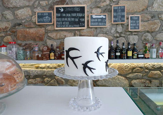
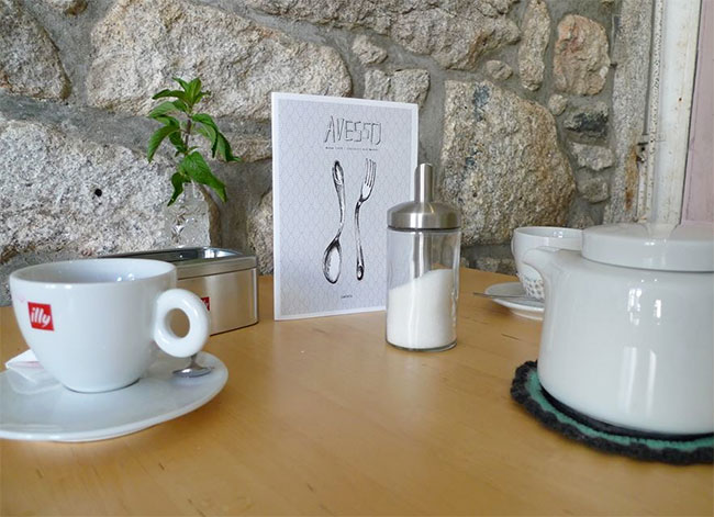
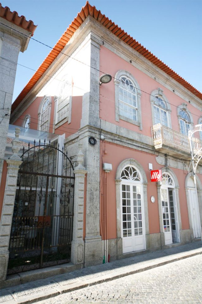
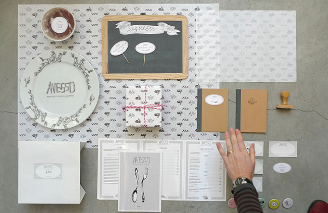
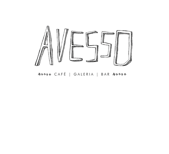
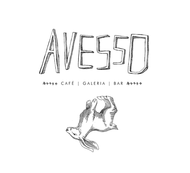
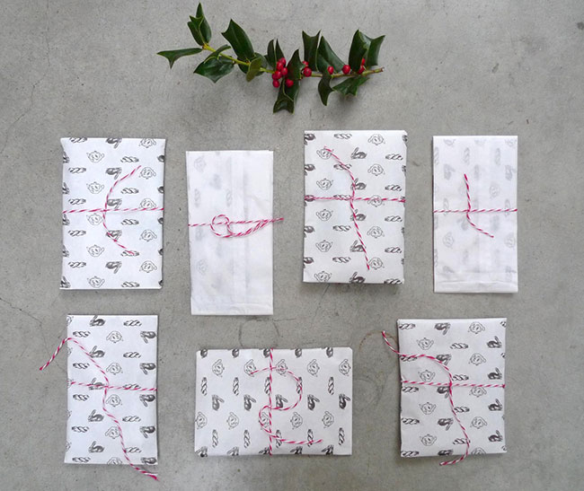
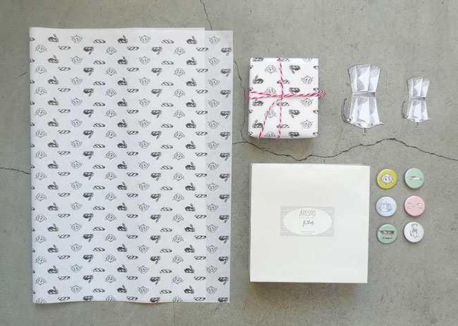
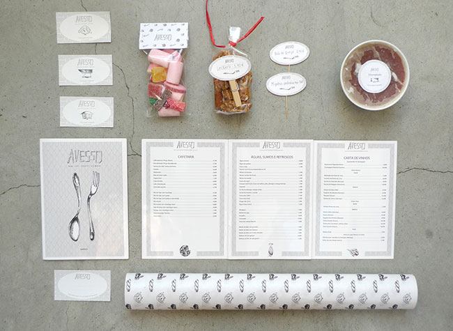
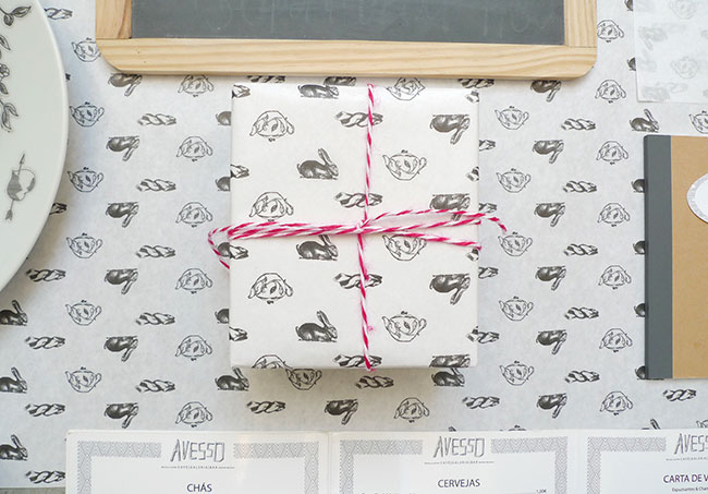
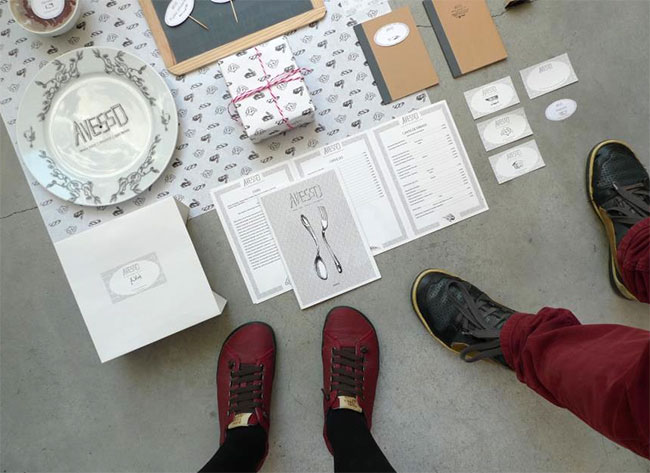
The identity for the restaurant, bar and bakery, Avesso in Esposende, Portgul, is clean, simple and marked by wonderful pen and ink illustrations. The white backgrounds create a clean, pure aura, while the illustrations in black ink help push the hand-crafted offering of the restaurant’s experience.

In Portuguese, Avesso means inside-out, opposite and different. The experience is everything and more. The intimate approach they take with customers is exuded via the identity design, but it doesn’t stray from staying nostalgic and classic.

More in depth coverage at Identity Designed. Designed by Anoik.

avesso-esposende-01

avesso-esposende-02

avesso-esposende-04

avesso-esposende-05

avesso-esposende-06

avesso-identity-01

avesso-identity-02

avesso-identity-03

avesso-identity-04

avesso-identity-05

avesso-identity-06

avesso-identity-07

avesso-identity-08

avesso-identity-09

Discuss this Project

Leave a Reply

This site uses Akismet to reduce spam. Learn how your comment data is processed.

The Forktales Podcast™: Interviews with restaurant industry leaders and visionaries

Restaurant and advertising industry headlines and thinking

Reviews of restaurant experiences from around the globe 

Reviews of our favorite design, business, & restaurant books

Our favorite typography and fonts

Inspiration in your inbox

Get the latest inspiration in your inbox every Monday morning, for FREE!

"*" indicates required fields

This field is for validation purposes and should be left unchanged.

Delicious Bits in your Inbox!

Get the latest and greatest content delivered to your inbox for free!

"*" indicates required fields

This field is for validation purposes and should be left unchanged.