Barbola Chocolate Branding

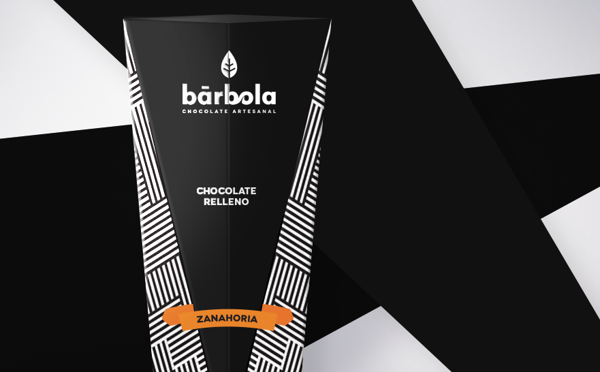
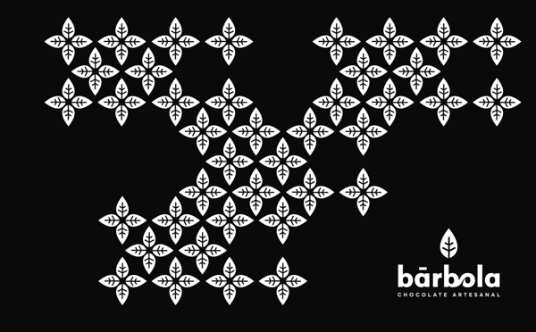
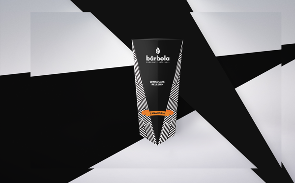
Although there isn’t a ton of imagery to show, the branding and package design for this Chocolatier is quite unique and brilliant. Highly contrasted black and white packaging helps the spot of color pop while creating a visual moving effect. The logo is simple and easy to visually interpret. The logo mark easily turns into an awesome pattern that can be applied elsewhere.

Excellent piece by Miguel Basurto.
6d9bf588043dded3f0a83434d866844a

8e0c5450f56dcbfbde9779e1fe6afbe8

adec044385e8448647469b537d56e4fc

fe4b9a87cbfb6ec14e0d4e5bce995c98

Discuss this Project

Leave a Reply

This site uses Akismet to reduce spam. Learn how your comment data is processed.

The Forktales Podcast™: Interviews with restaurant industry leaders and visionaries

Restaurant and advertising industry headlines and thinking

Reviews of restaurant experiences from around the globe 

Reviews of our favorite design, business, & restaurant books

Our favorite typography and fonts

Inspiration in your inbox

Get the latest inspiration in your inbox every Monday morning, for FREE!

"*" indicates required fields

This field is for validation purposes and should be left unchanged.

Delicious Bits in your Inbox!

Get the latest and greatest content delivered to your inbox for free!

"*" indicates required fields

This field is for validation purposes and should be left unchanged.