It’s so easy to get into the mindset of creating something that already exists. If I say “coffee shop” you probably already have an image of what the interiors look like: raw materials like brick and wood grains, softly muted color palette, dim lighting, artsy, etc. It’s what people expect and it’s easy to fall into that trap when designing a restaurant experience from scratch. At least you know it works, right? Well, that’s not good. Not good at all. A brand designer’s job is to create something fresh, new, unique, memorable; something that’ll stick in the customer’s mind, make them want to come back. That’s exactly the angle Cafe Despierto took under Gustavo Quintana and Estefania El Ros of MilkNCookies.
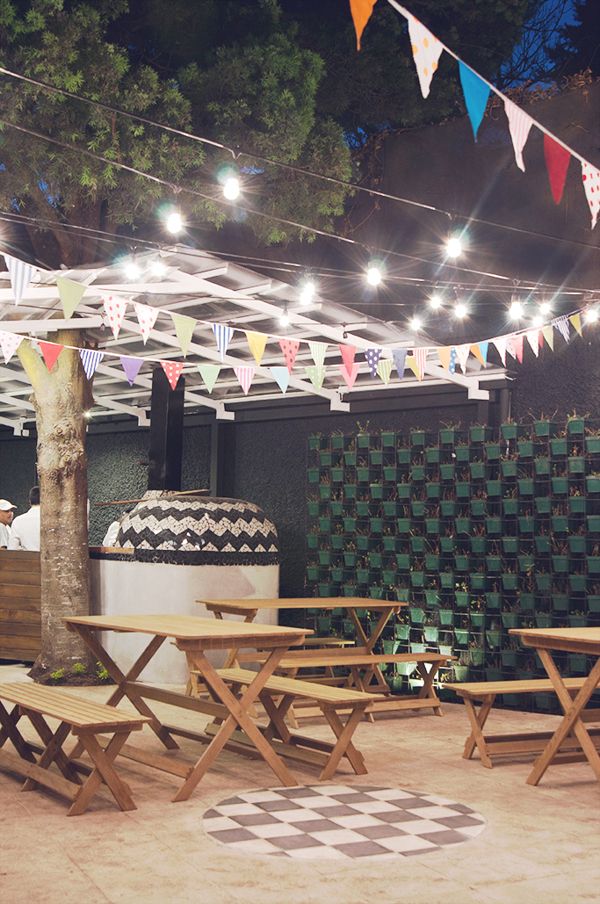
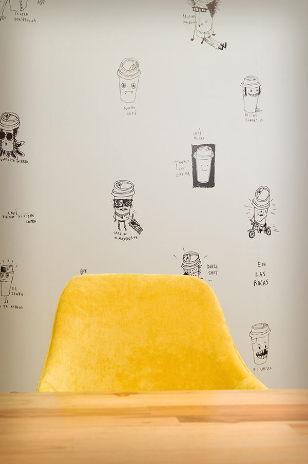
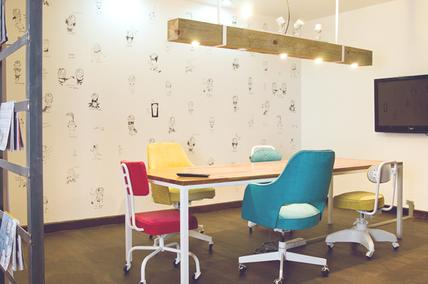
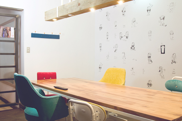
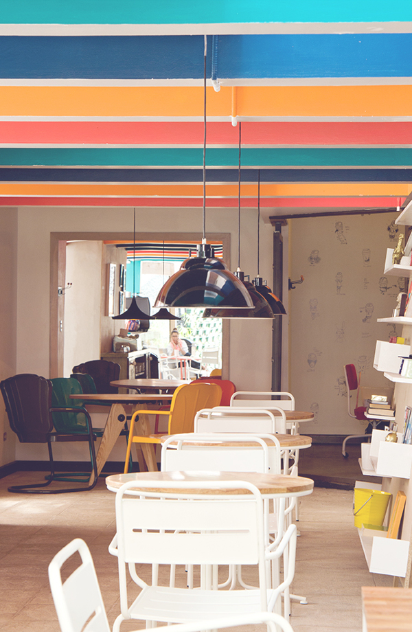
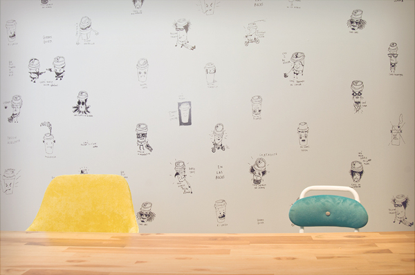
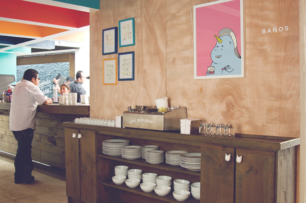
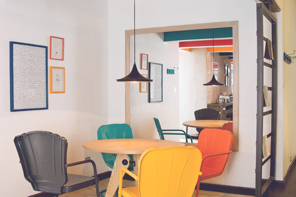
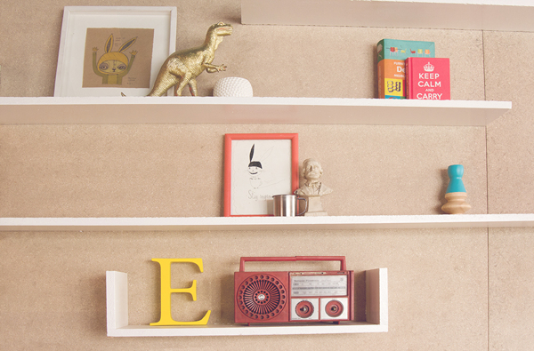
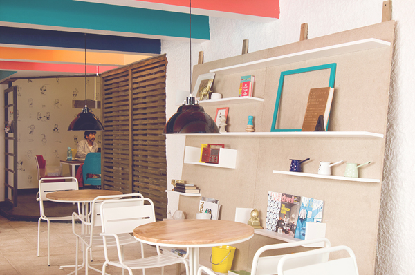
Their design is bright, colorful, and clean. It’s semi-ikea-esque, but doesn’t look cheap. Instead it’s inviting. It has an air of vibrance to it. With fun illustrations of cups on the one wall set against white, and pops of colors, the cafe has a great vibe that’s different from the Cari-Bucks Coffees out there.



2 Responses
Thank you for the kind words. Estefania & Gustavo
Keep up the excellent work you two!