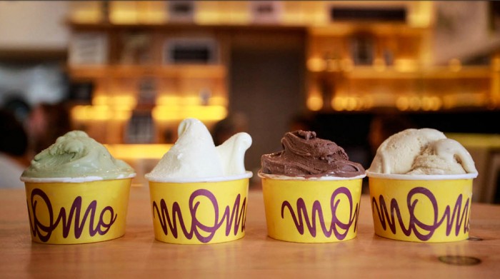
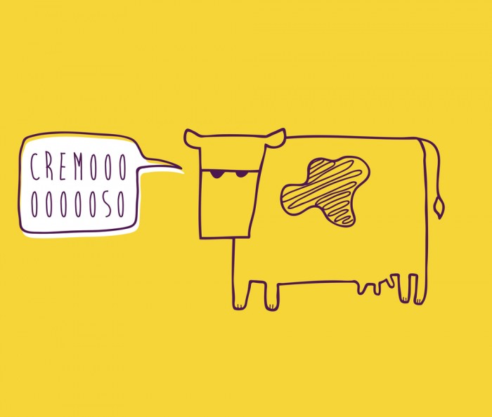
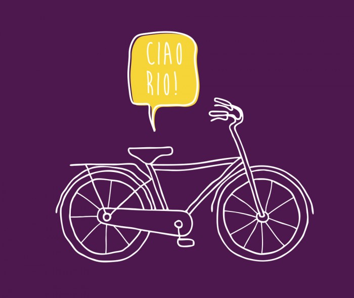
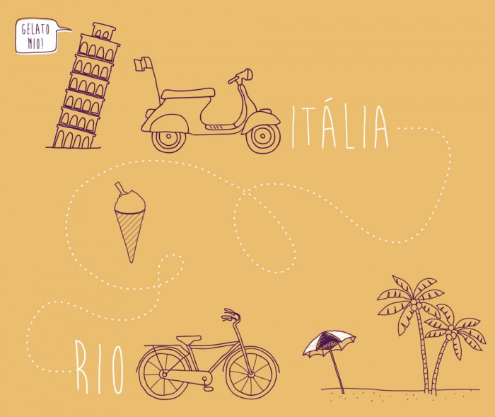
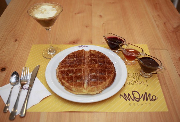
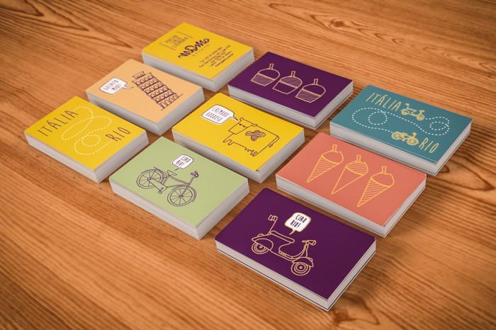
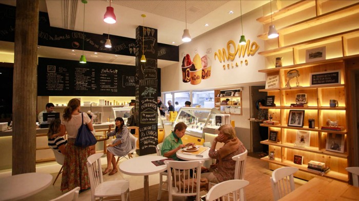
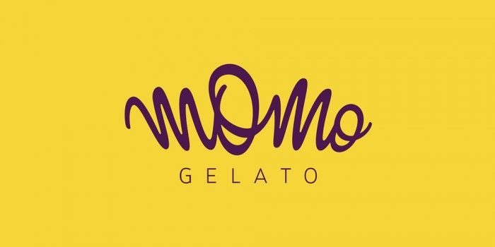
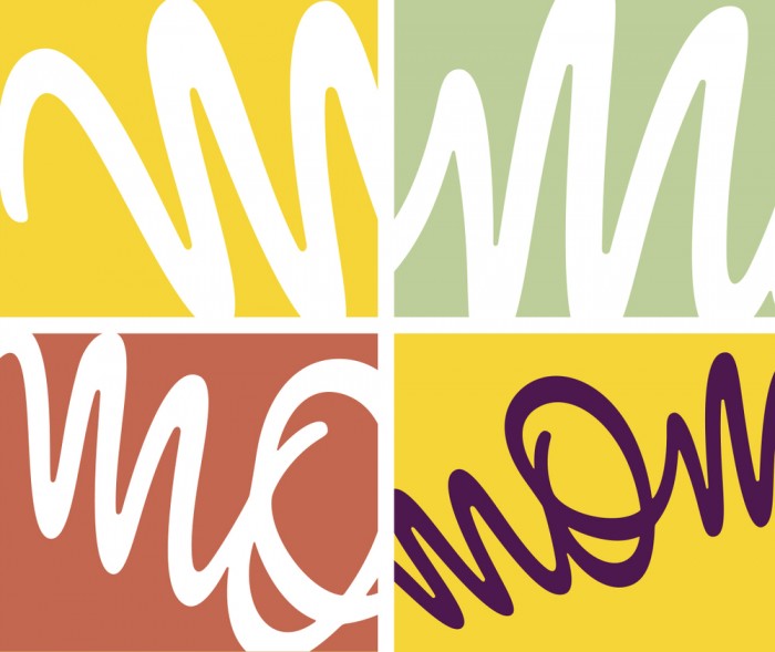
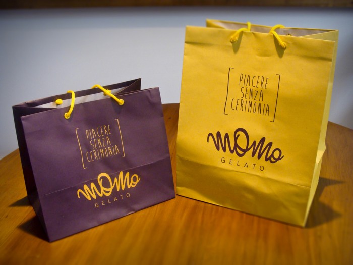
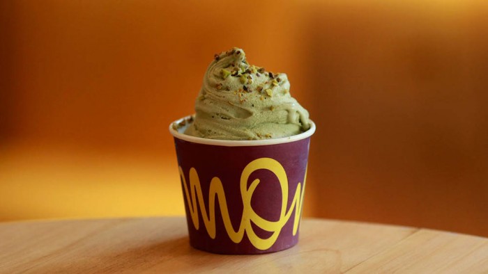
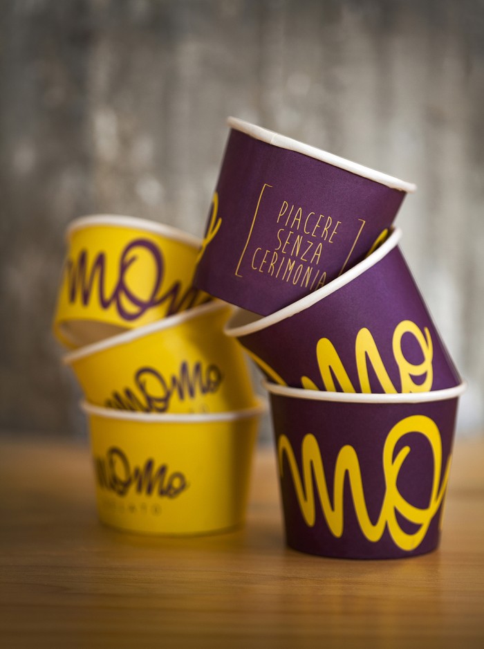
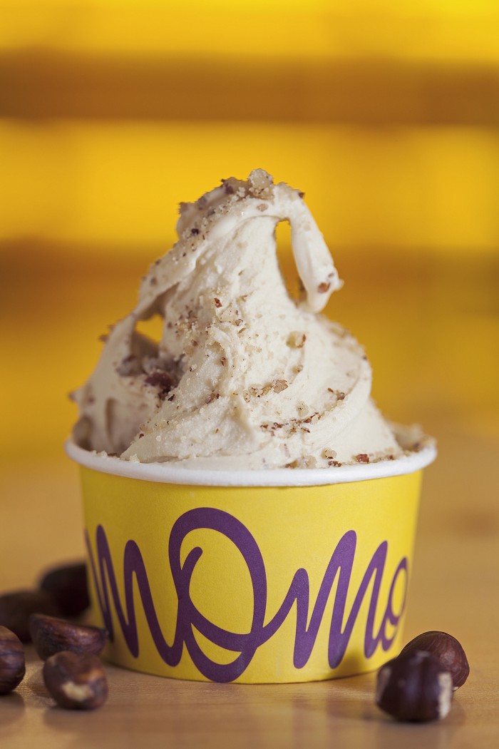
This sexy script typographical logo is the epicenter of the Momo Gelato brand. Bolstered buy a vibrant, fun color palette and excellent design on the packaging, Momo stands out and pops. Beyond the brand identity’s logo and color you’ll find fun illustrations and playful sayings in Italian to create a visual and aural voice that completes the Momo brand experience.

Designed by M Quatro
Designers: Natalia Azevedo, Lina Mizutani, Marcelo Fonseca da Rocha, Luana Luna
Copywritter: Daniel C. Ferreira
Illustrations: Natalia Azevedo, Luana Luna
Chalk Intervention on the Walls: Daniel Bo, Flo Monti
3_MG_1206

1_MG_1358

5_

12_ilustrac,o~es_5

13_ilustrac,o~es_6

15_ilustrac,o~es_2

16_ilustrac,o~es_3

6_1701_momo_wmeier_0800

7_card

9_Screenshot-2014-03-30-20.44.56

10_marca

18_ilustrac,o~es_4

download (1)

download (2)


Discuss this Project

Leave a Reply

This site uses Akismet to reduce spam. Learn how your comment data is processed.

The Forktales Podcast™: Interviews with restaurant industry leaders and visionaries

Restaurant and advertising industry headlines and thinking

Reviews of restaurant experiences from around the globe 

Reviews of our favorite design, business, & restaurant books

Our favorite typography and fonts

Inspiration in your inbox

Get the latest inspiration in your inbox every Monday morning, for FREE!

"*" indicates required fields

This field is for validation purposes and should be left unchanged.

Delicious Bits in your Inbox!

Get the latest and greatest content delivered to your inbox for free!

"*" indicates required fields

This field is for validation purposes and should be left unchanged.