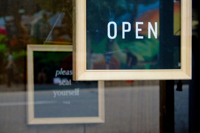
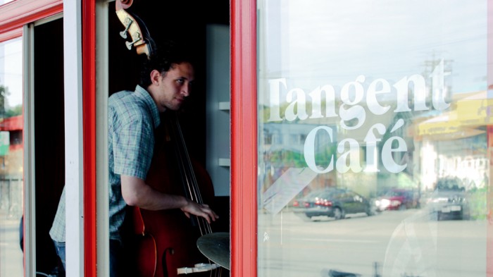
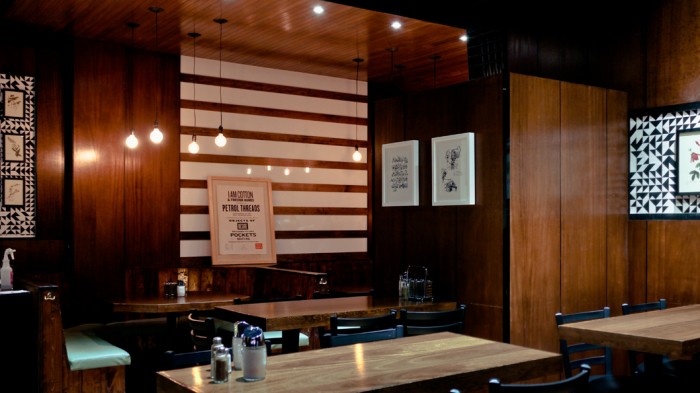
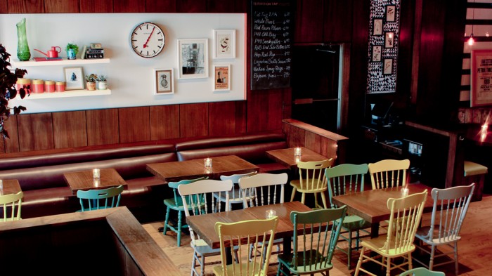
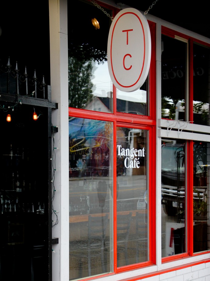
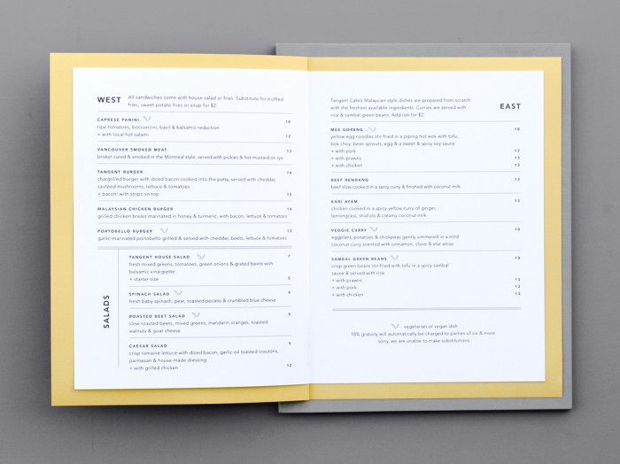
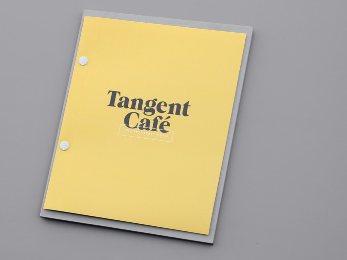
The creative minds at Five Thousand Fingers studio, had quite the challenge when embarking on the branding for Tangent Café. Not only is were they helping create a new brand from the ground up, they also had some existing issues to tackle involving the location.
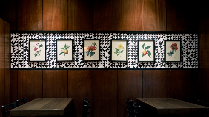
Established in a location with a high turnover of previous business and dubious interior design decisions made on the part of the prior establishment, the challenge of this project was to create a welcoming and trustworthy space which could overcome the location’s fickle reputation.
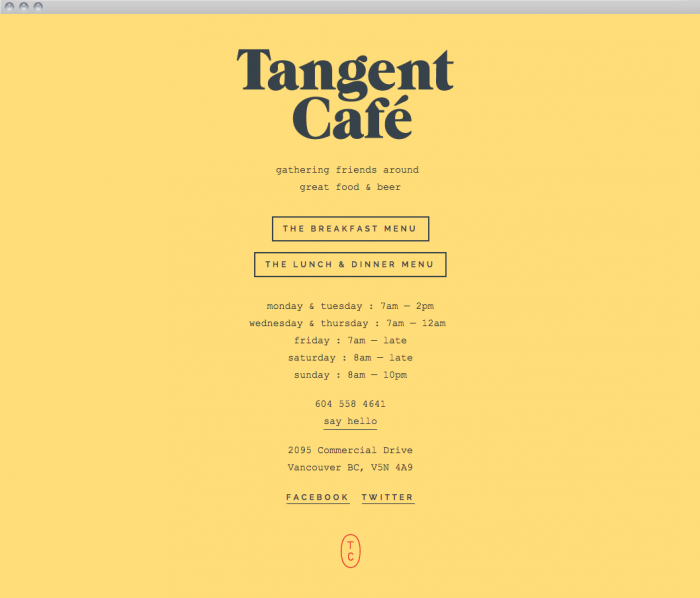
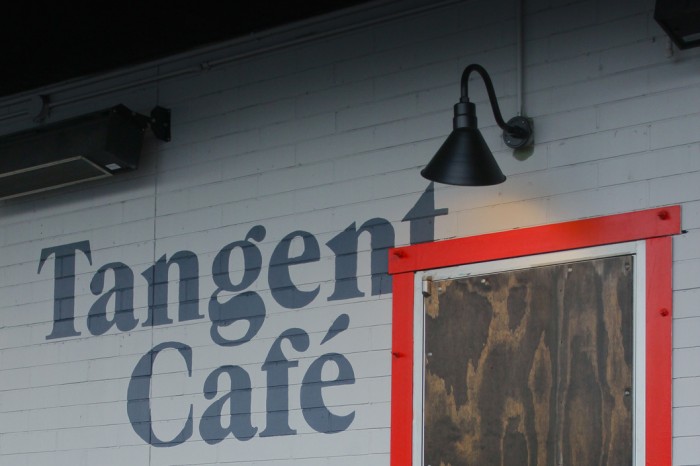
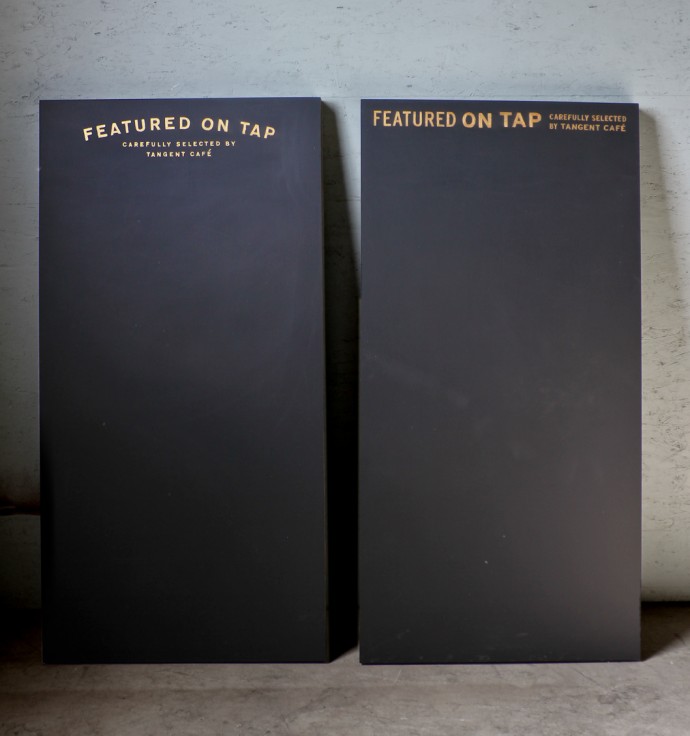
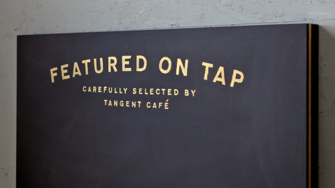
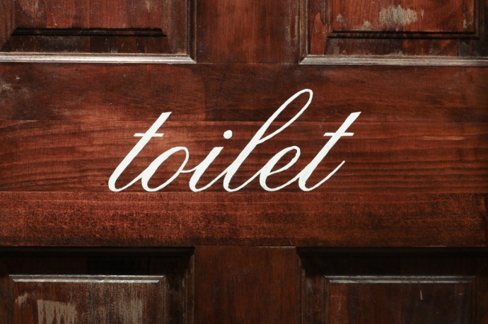
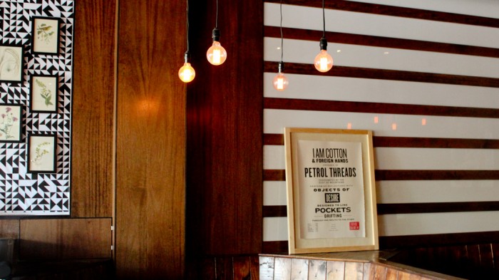
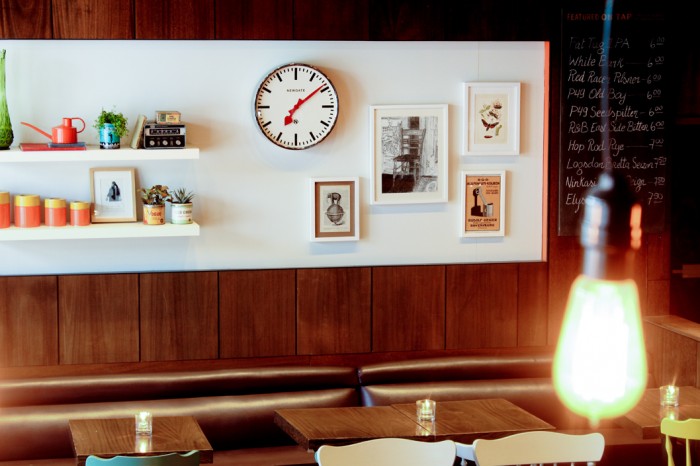
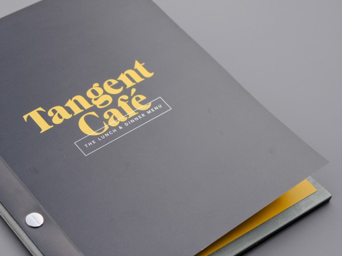
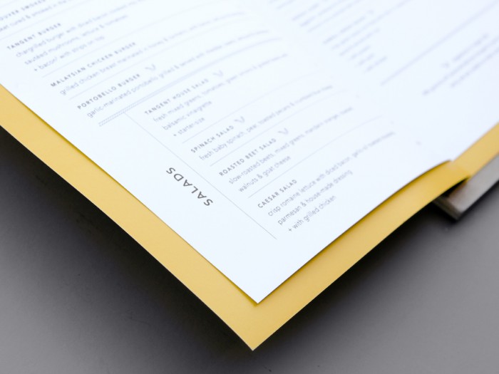
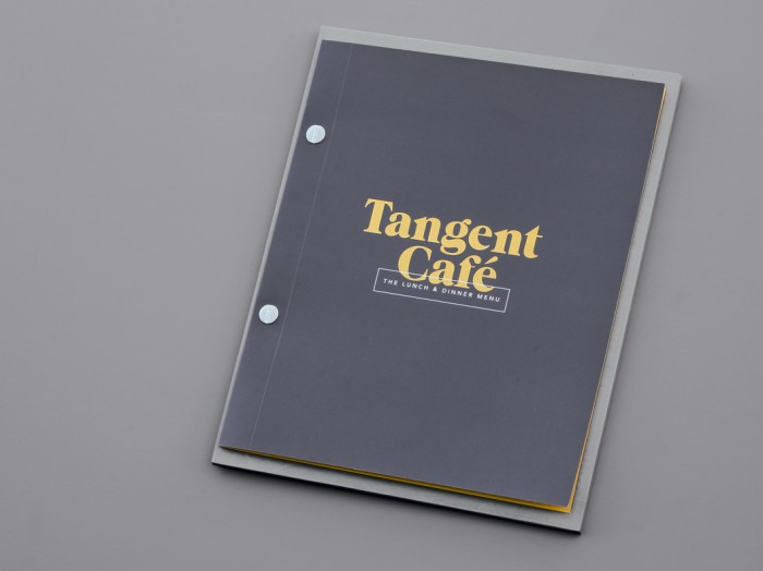
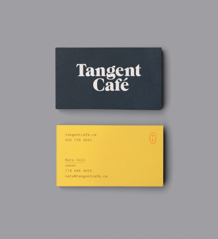
Location is everything, but with some insights into the market and the people in that market, Five Thousand Fingers was able to craft a simple, yet comforting brand for this new cafe. What makes this cafe brand identity stand out is its simplicity. Typography, colors and texture are allowed to breathe without being cramped by a ton of imagery and other accoutrements. It’s confident, no-nonsense, but still has unique elements to it that make the brand pop.
The mark that accompanies the typeface may seem incongruent with its simple, thin lines. However, once in action you can see how it adds another level to the brand’s identity. Almost as if it’s a tangent to the logo. Ha!
