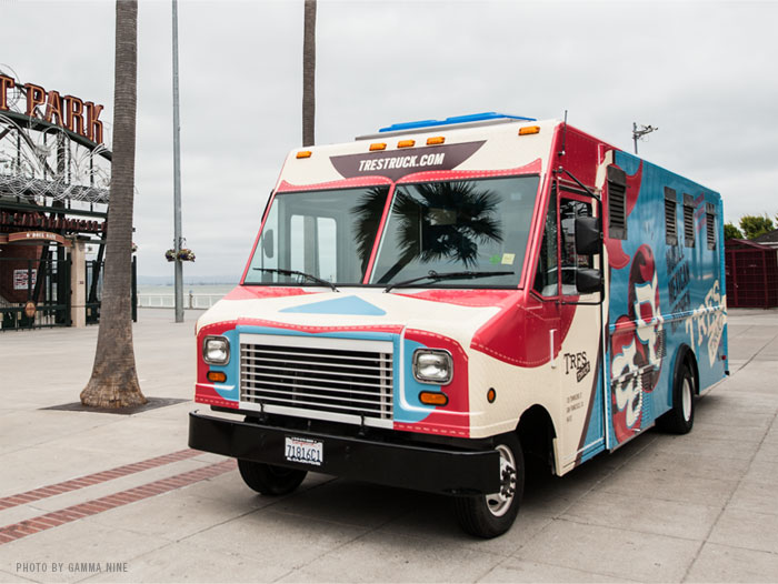
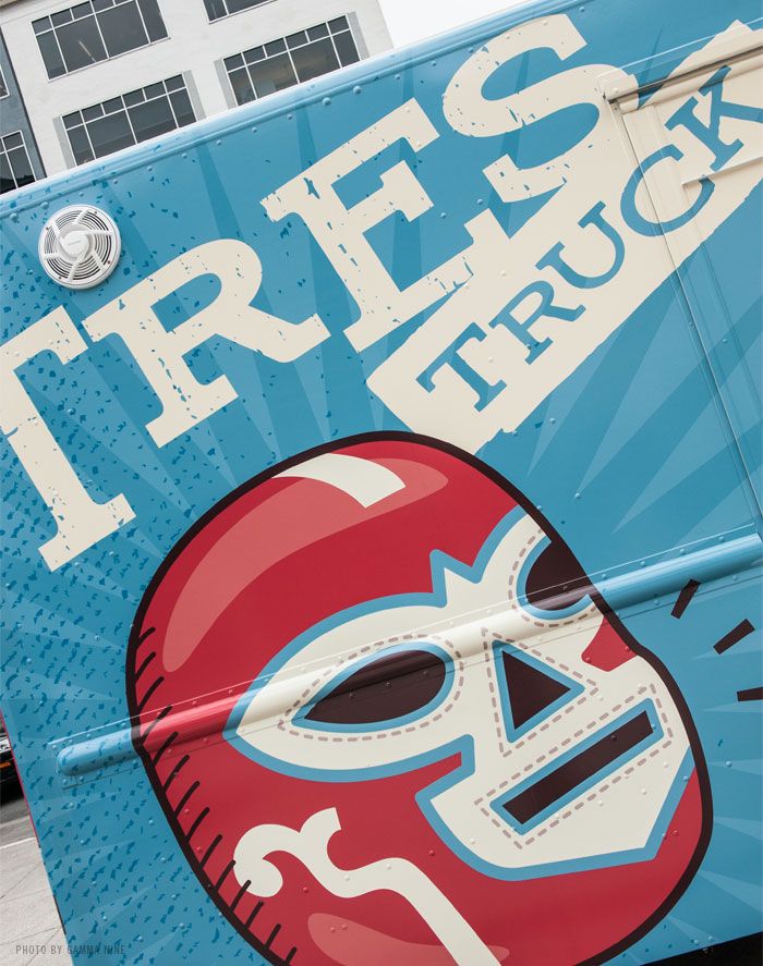
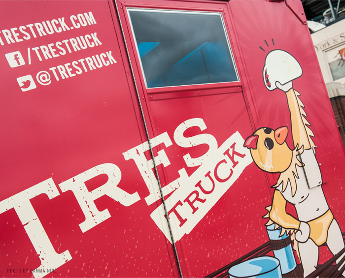
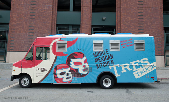
The creatives at Noise 13 pulled together this awesome foodtruck design and branding for Tres Truck, a mobile Mexican kitchen. The truck has been morphed into a luchador on the front with accompanying luchador graphics including a pretty rad chicken illustrated as a champion. Bright blues, yellows and cream colors help this pop out so you know where to get the good stuff. Here’s what Noise 13 says about the inspiration:
We started with a “Tres Truck” logo that utilized their existing “Tres” logotype, then used brighter colors and graphics bring a playful lucha libre theme to life and help the truck stand out in the ever-growing SF food truck scene. Custom illustrations adorn the sides, and a luchador mask on the front frames the windshield “eyes” and grill “mouth” of the vehicle. Perhaps our favorite design element is Li’l Chicken, characterized on the back of the truck (he makes an annual appearance at the restaurant for Cinco de Mayo). – See more at: http://noise13.com/work/portfolio-entry/tres-truck/#sthash.wh4KVUSQ.dpuf


