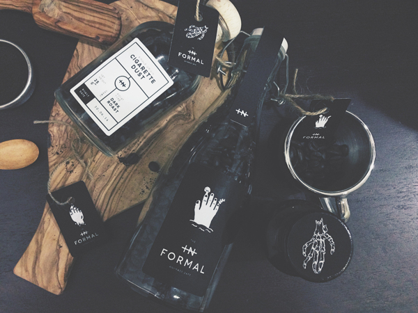
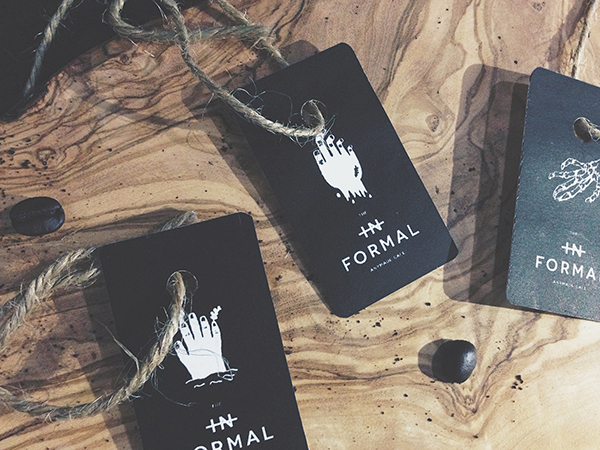
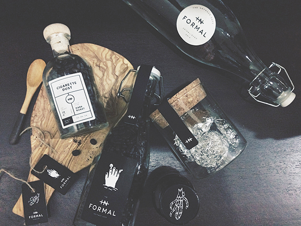
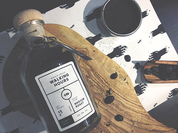
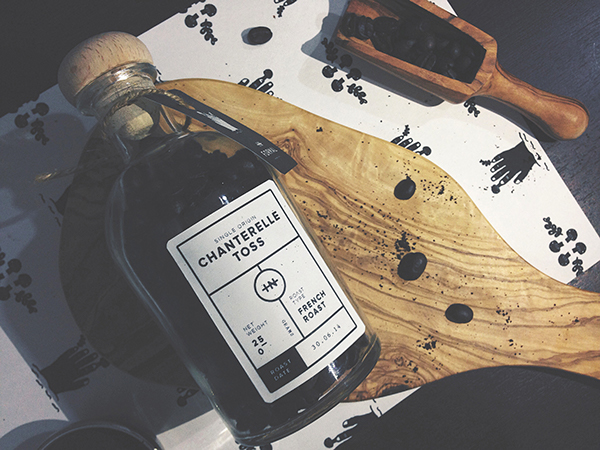
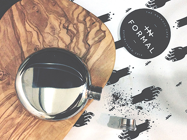
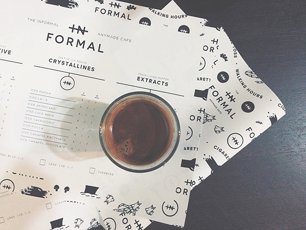
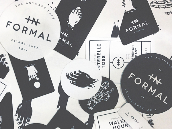
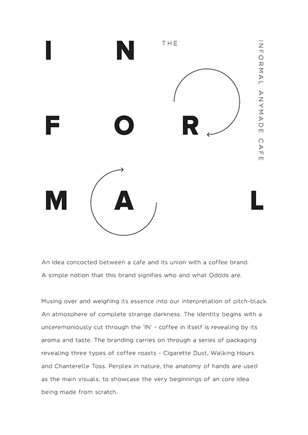
The simplicity of the brand identity for this cafe is what stands out the most. No need for colors, just black and white in a strong grid form. There is a note of confidence in this style of design. It’s not using any tricks or flashy elements to get attention. It doesn’t need to. It’s informal. Designed by Oddds.
The Forktales Podcast™: Interviews with restaurant industry leaders and visionaries
Restaurant and advertising industry headlines and thinking
Reviews of restaurant experiences from around the globe
Reviews of our favorite design, business, & restaurant books
Our favorite typography and fonts
Inspiration in your inbox
Get the latest inspiration in your inbox every Monday morning, for FREE!
"*" indicates required fields