Viva Pozole restaurant branding

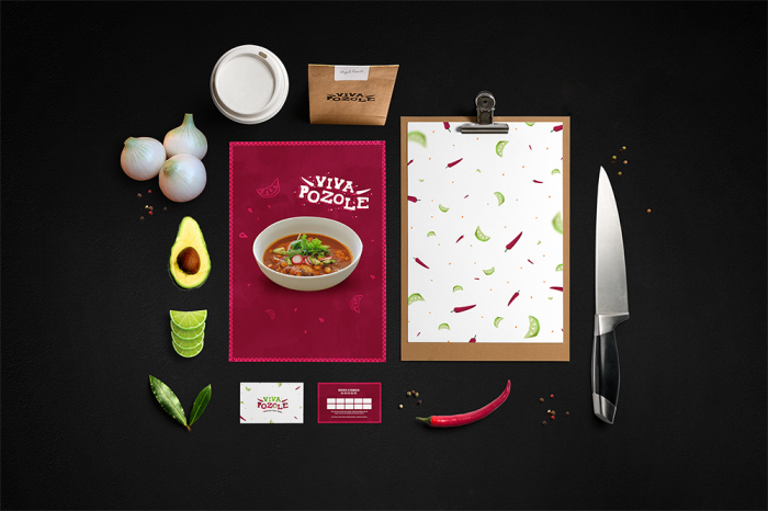
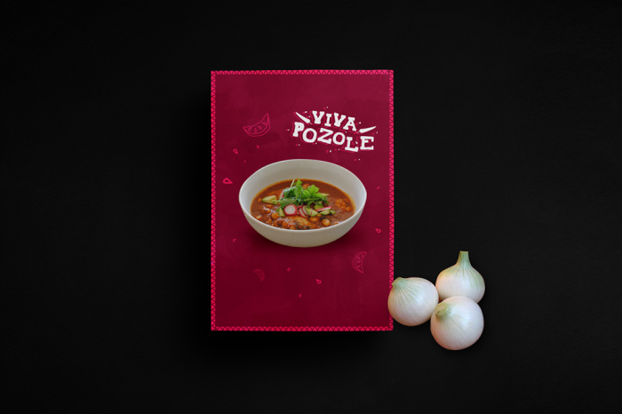
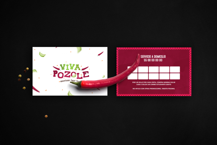
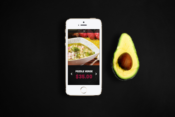
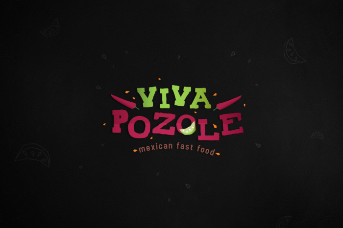
I love the unorthodox color choices for Viva Pozole, a mexican fast food restaurant. Along with a jumpy, campy, and playful typographical and illustrative graphic language, the restaurant’s brand identity has pep and a bunch of fiesta infused. Great work by Miguel Basurto 

001

002

004

005

006

Discuss this Project

Leave a Reply

This site uses Akismet to reduce spam. Learn how your comment data is processed.

The Forktales Podcast™: Interviews with restaurant industry leaders and visionaries

Restaurant and advertising industry headlines and thinking

Reviews of restaurant experiences from around the globe 

Reviews of our favorite design, business, & restaurant books

Our favorite typography and fonts

Inspiration in your inbox

Get the latest inspiration in your inbox every Monday morning, for FREE!

"*" indicates required fields

This field is for validation purposes and should be left unchanged.

Delicious Bits in your Inbox!

Get the latest and greatest content delivered to your inbox for free!

"*" indicates required fields

This field is for validation purposes and should be left unchanged.