Lawry’s Pasties restaurant branding

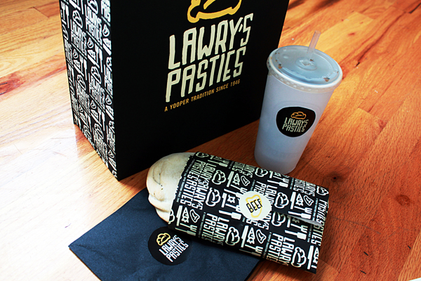
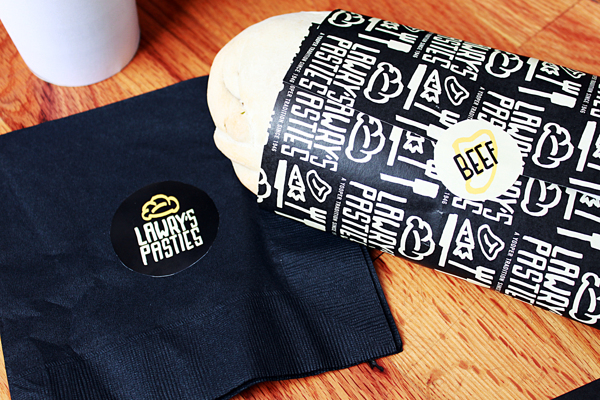
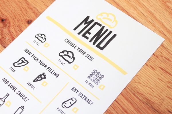
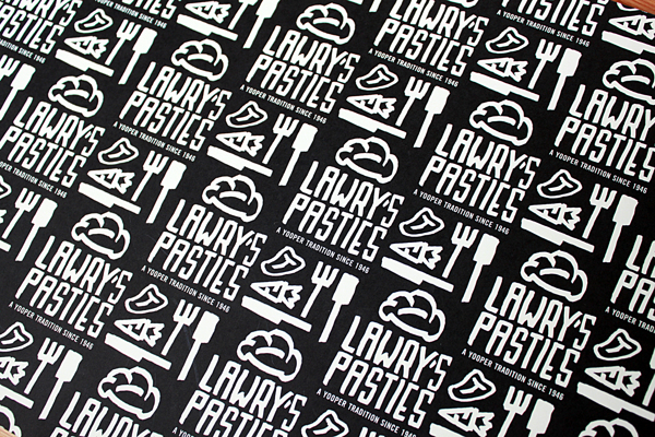
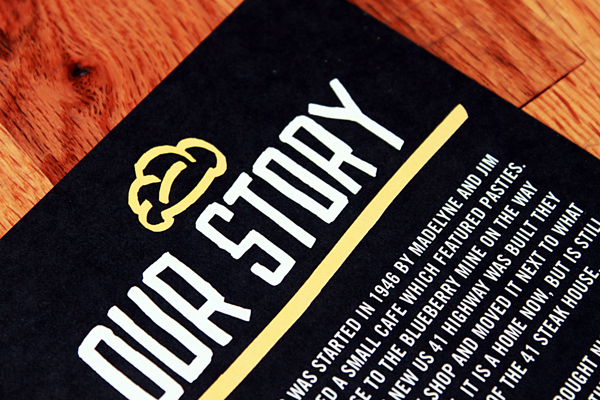
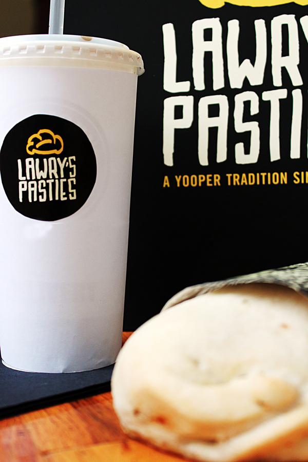
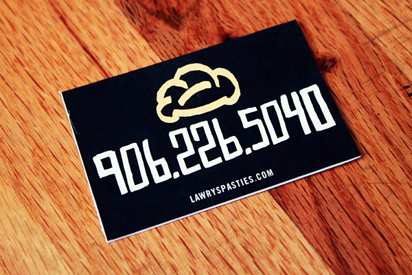
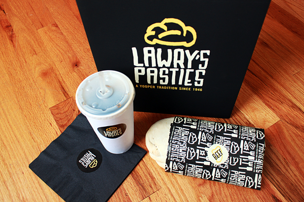
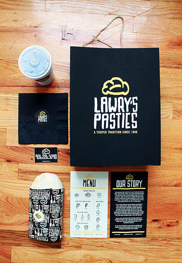
The main identity elements for Lawry’s Pasties come together on the brand’s takeout packaging design. The entire brand identity was drawn with a chiseled edge sharpie by Allison Supron. The general idea was to make Lawry’s Pasties look more legitimate if it were to grow into larger markets. This is a fun exercise designing in patterns with a limited color palette.

04ed862d77b2237043924530b8af09b2

f446666f7aec8de63643adf3dd08b6ec

76b283c9692e3ce64ea8687a8b848dde

6e2163fd1c311c4c63b6785067f855e0

f2f7a250c9891014317a3921e6f33a08

5391eda98a4a82d3e371f9209feb8dd9

c73b5ada3ddf8553593e0ac1db5ee8e4

bcec4a5a676301d94d06607cc973a1c8

c327a7b2b4b6b8598591f2abfd12c17f

Discuss this Project

Leave a Reply

This site uses Akismet to reduce spam. Learn how your comment data is processed.

The Forktales Podcast™: Interviews with restaurant industry leaders and visionaries

Restaurant and advertising industry headlines and thinking

Reviews of restaurant experiences from around the globe 

Reviews of our favorite design, business, & restaurant books

Our favorite typography and fonts

Inspiration in your inbox

Get the latest inspiration in your inbox every Monday morning, for FREE!

"*" indicates required fields

This field is for validation purposes and should be left unchanged.

Delicious Bits in your Inbox!

Get the latest and greatest content delivered to your inbox for free!

"*" indicates required fields

This field is for validation purposes and should be left unchanged.