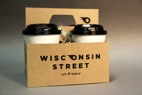
Wisconsin Street Cafe & Bakery branding

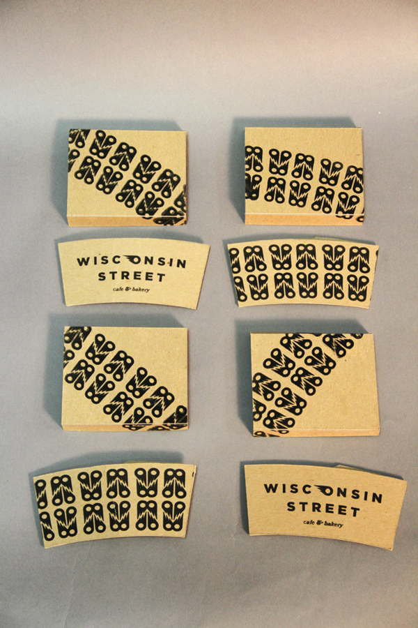
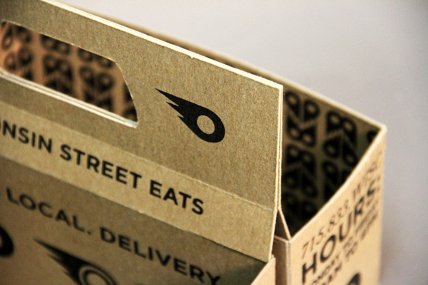
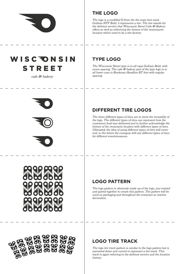
What really makes a brand have life isn’t just the simplicity and wit in its logo, but also how the identity plays out throughout the touch points. The brilliant thing about Wisconsin Street Cafe and Bakery is the logo is more fluid and isn’t constrained to the same format everywhere. It can take the shape of tires, become a pattern, or even become tire tracks making it dynamic.

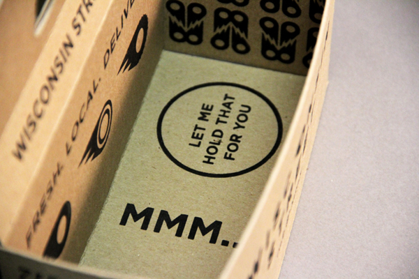
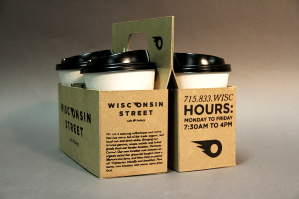
The brand’s voice and tone come out in the packaging through copy and unexpected areas of design, eg. the inside bottom of the coffee carrier.

Excellent work and thought shown here by RT Vrieze.
9406fe45656956651c5f56406f8a0d52

a991aa24bd866a91f3180c9e53006bbc

584e8b464fd4a27664e23f68c8bf56ac

48fd0bb8b356936d1a841b31a7965935

29d077db6d2cad7160adb4886108ca50

a93731240c48699274869e9b2cc20d13

f186cf91db1b144449605e90db5ba42f

Discuss this Project

Leave a Reply

This site uses Akismet to reduce spam. Learn how your comment data is processed.

The Forktales Podcast™: Interviews with restaurant industry leaders and visionaries

Restaurant and advertising industry headlines and thinking

Reviews of restaurant experiences from around the globe 

Reviews of our favorite design, business, & restaurant books

Our favorite typography and fonts

Inspiration in your inbox

Get the latest inspiration in your inbox every Monday morning, for FREE!

"*" indicates required fields

This field is for validation purposes and should be left unchanged.

Delicious Bits in your Inbox!

Get the latest and greatest content delivered to your inbox for free!

"*" indicates required fields

This field is for validation purposes and should be left unchanged.