It’s rare that I’m completely blown away by a restaurant brand design for multi-unit. Reason being, it’s extremely hard to get a restaurant to move forward once it’s hit a stride and finds itself in a multi-unit corporate-owned situation. This compounds when the brand franchises and starts to answer to other business owners. How do you begin to get buy-in on an initiative that’s sure to cost a lot of money. The big guys do it all the time, small guys do it was well, it’s that medium-size that seems to just not get it. If they do “get it” they still don’t spend the money. That’s not the case with ZPizza.
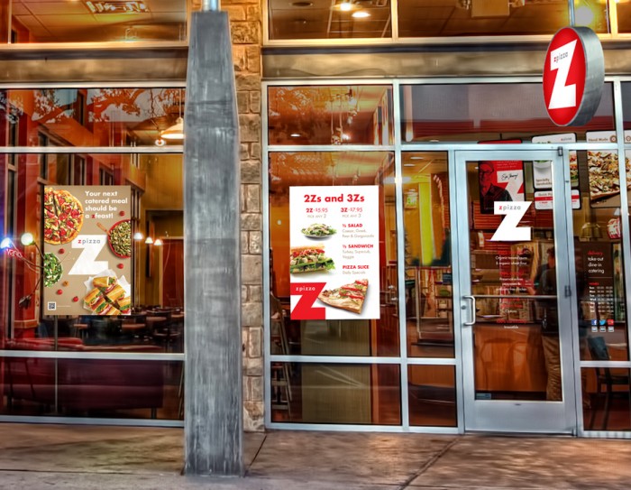
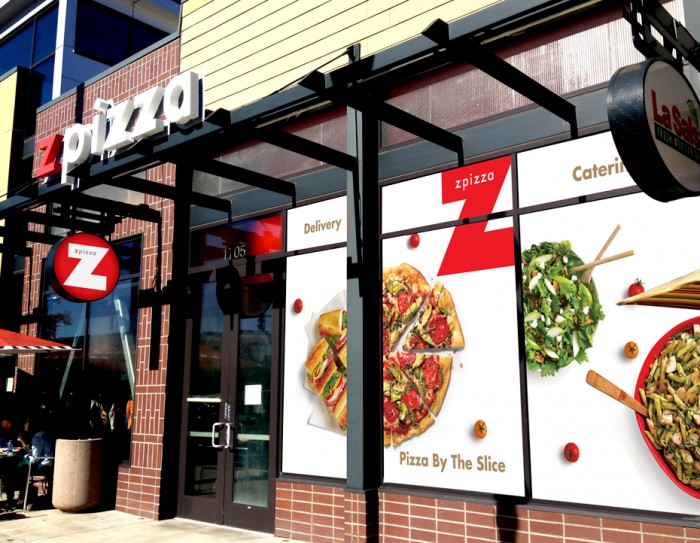
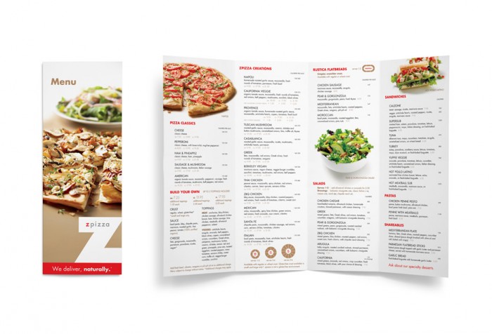
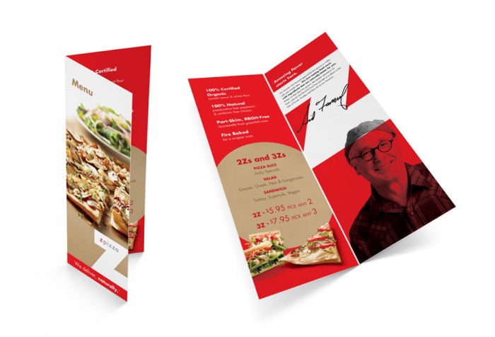
Z Pizza is a California-based chain that started with an excellent brand, but still found reason to rebrand as they grew. They found their core. They found their passionate purpose and sought to have their image reflect it. Everything is in concert with a focus on “pure.”
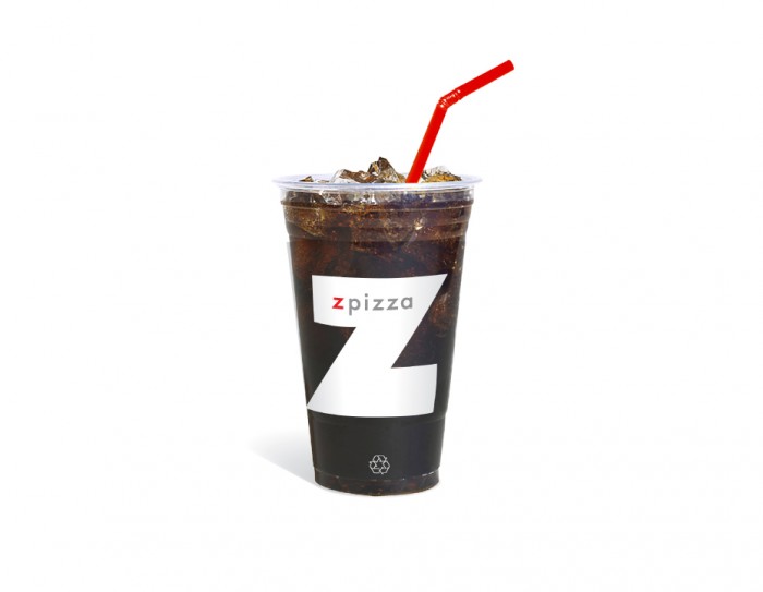
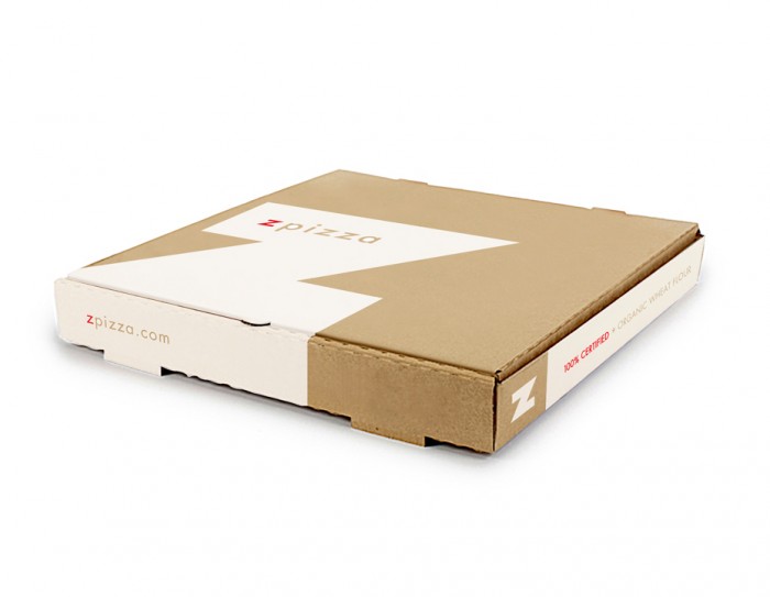
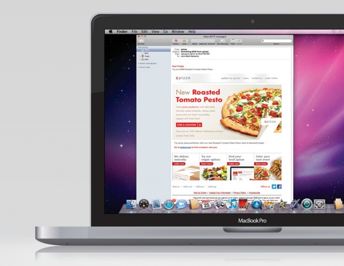
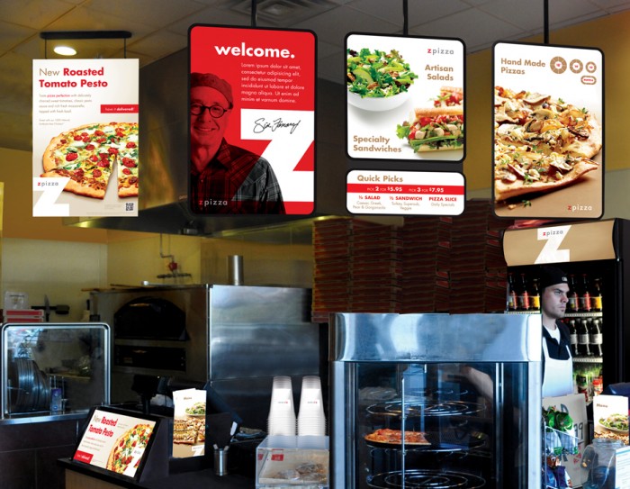
Pure is visually communicated by focusing on simple, clean design elements that work in tandem with stellar imagery of the product. This harmony is found throughout every touch point designed for Z Pizza. It’s especially prevalent throughout the new website (can’t find who produced it. Please comment with credit.)
Designed by Post-Agency.



One Response
The pizza box is lovely