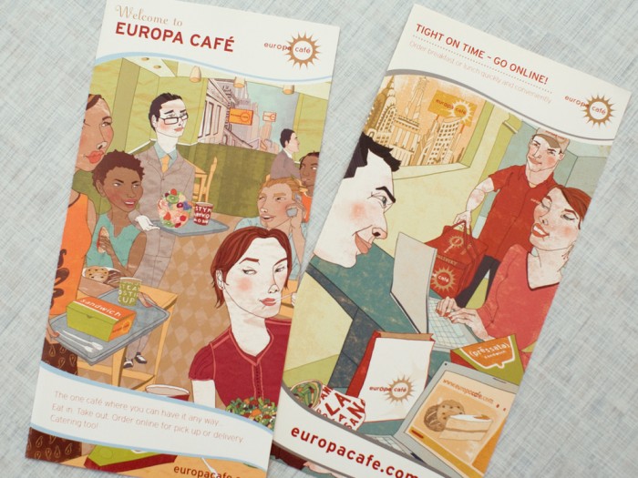
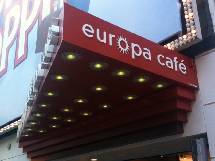
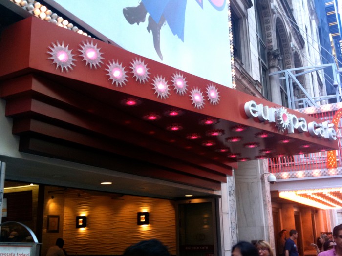
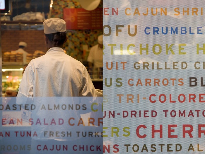
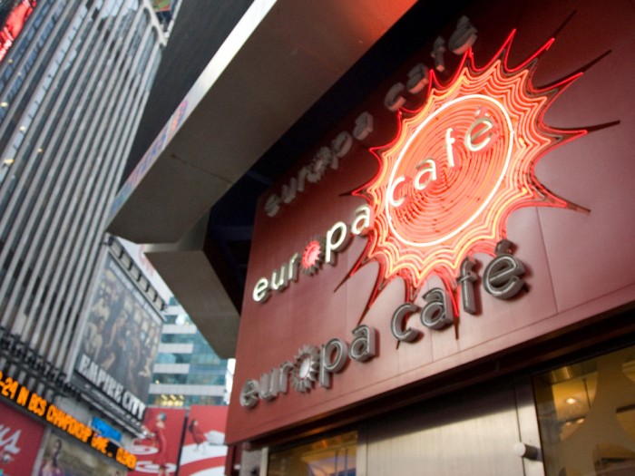
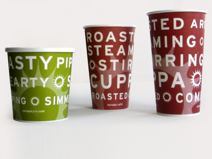
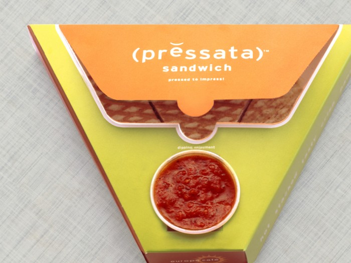
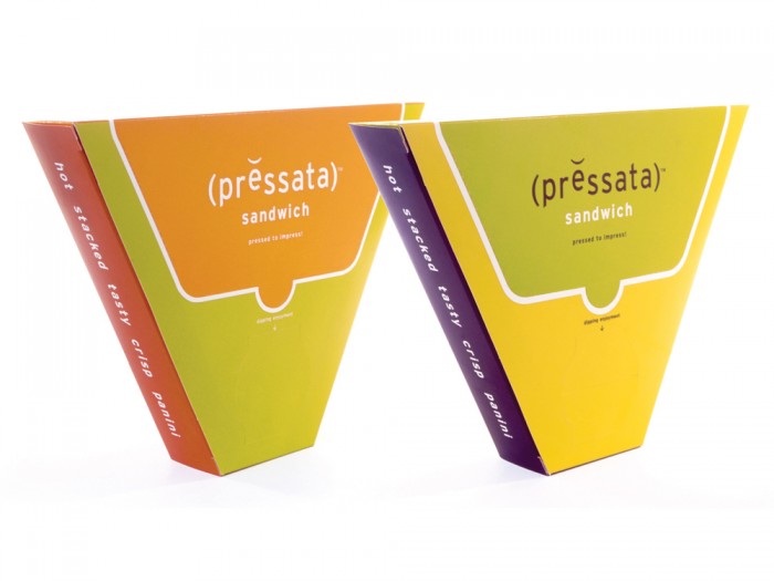
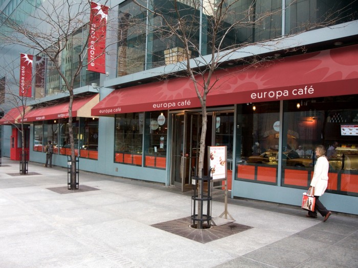
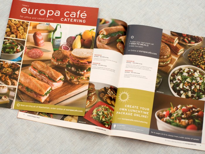
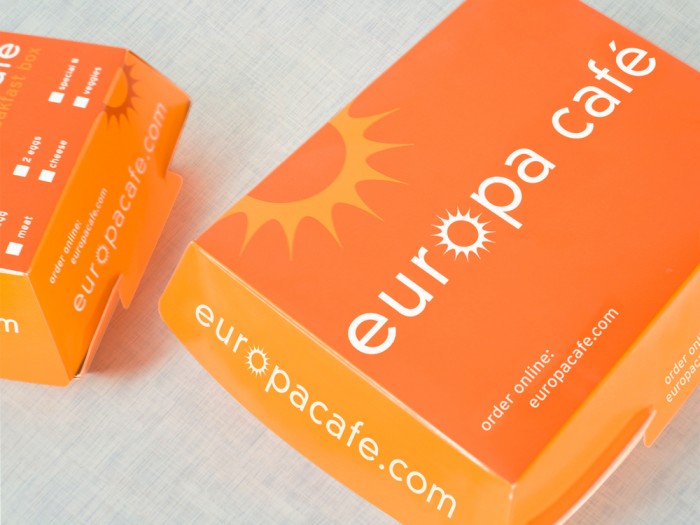
ADL‘s branding work for Europa Café is an exploration of vibrant colors, illustration and strong typography. Infusing illustration into design can be tricky at times. Usually it looks forced unless typography is hand draw. However, ADL does a great job of infusing the watercolor elements into the brand identity. It creates a fun, approachable vibe. The logo is simple with with a strong brand mark that resembles a sun. It’s easy to see and quite catchy in its confidence.

euro_5

euro_12

euro_11

euro_10

euro_9

euro_6

euro_8

euro_4

euro_7

euro_3

euro_2

euro_1

Discuss this Project

One Response

  1. Love the illustration! Reminds me of what we tried to do with countries like the putamayo world music. This requires an artist… not a graphic designer, hence a whole new level of engagement. I think this makes them more personal…otherwise look like panera.

Leave a Reply

This site uses Akismet to reduce spam. Learn how your comment data is processed.

The Forktales Podcast™: Interviews with restaurant industry leaders and visionaries

Restaurant and advertising industry headlines and thinking

Reviews of restaurant experiences from around the globe 

Reviews of our favorite design, business, & restaurant books

Our favorite typography and fonts

Inspiration in your inbox

Get the latest inspiration in your inbox every Monday morning, for FREE!

"*" indicates required fields

This field is for validation purposes and should be left unchanged.

Delicious Bits in your Inbox!

Get the latest and greatest content delivered to your inbox for free!

"*" indicates required fields

This field is for validation purposes and should be left unchanged.