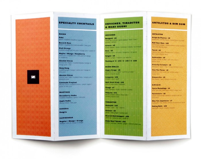
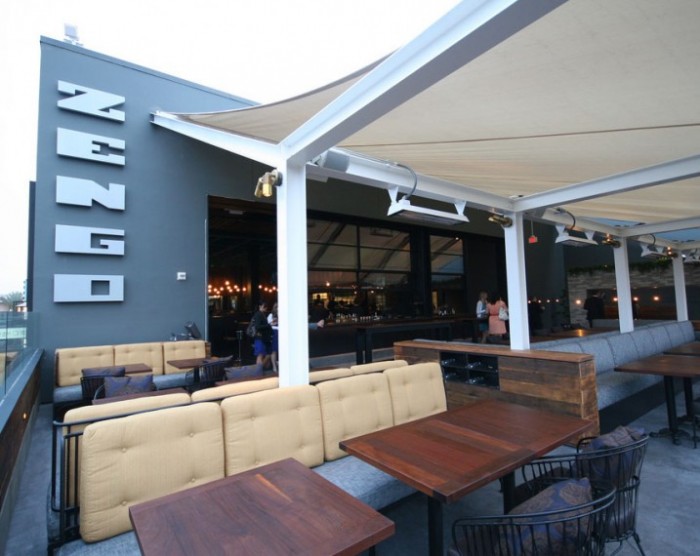
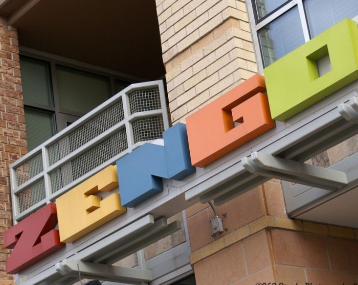
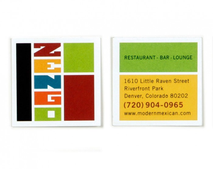
Although the amount of work to show is minimal, there is something quite catchy about the design for Zengo. Multiple colors, super geometric shapes and a fun attitude throughout, the design work is on point. I’d love to see how this plays out further through menus and other touch points. Designed by Memo.

ZENGO-CARDS

ZENGO-LOGO

ZENGO-MENU

zengoexterior-717x570

zengosign-717x570

Discuss this Project

Leave a Reply

This site uses Akismet to reduce spam. Learn how your comment data is processed.

The Forktales Podcast™: Interviews with restaurant industry leaders and visionaries

Restaurant and advertising industry headlines and thinking

Reviews of restaurant experiences from around the globe 

Reviews of our favorite design, business, & restaurant books

Our favorite typography and fonts

Inspiration in your inbox

Get the latest inspiration in your inbox every Monday morning, for FREE!

"*" indicates required fields

This field is for validation purposes and should be left unchanged.

Delicious Bits in your Inbox!

Get the latest and greatest content delivered to your inbox for free!

"*" indicates required fields

This field is for validation purposes and should be left unchanged.