Baldoria restaurant and bar branding

I’m finally back from vacation! Let’s jump into some tasty restaurant branding!

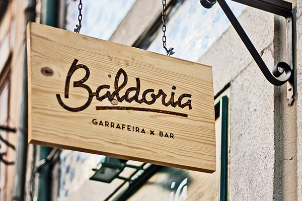
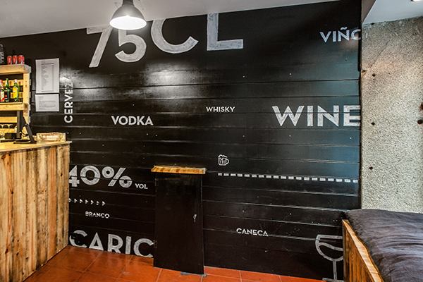
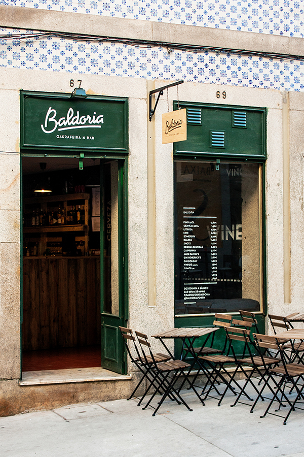
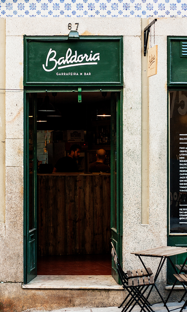
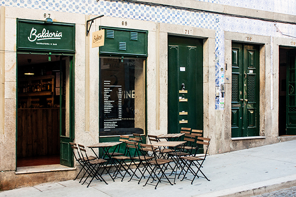
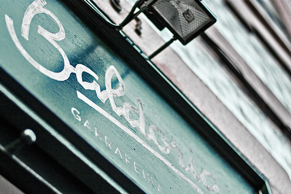
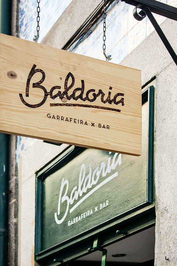
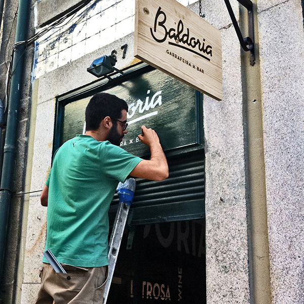
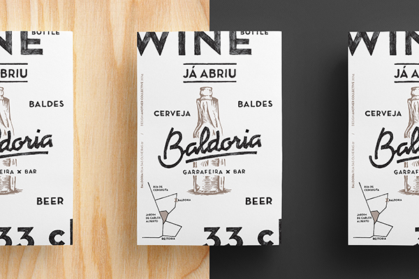
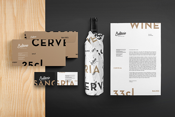
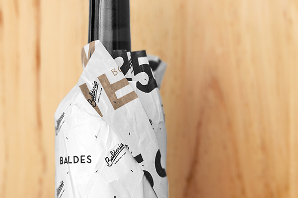
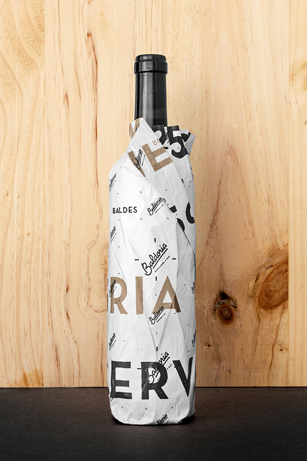
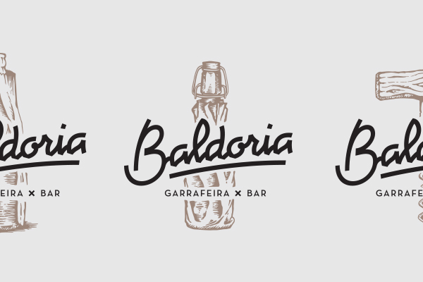
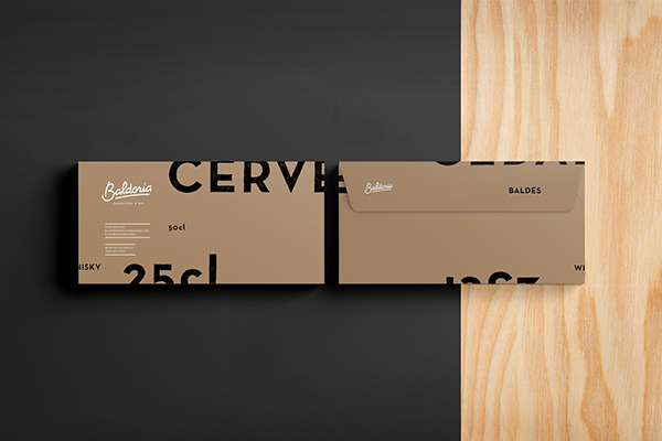
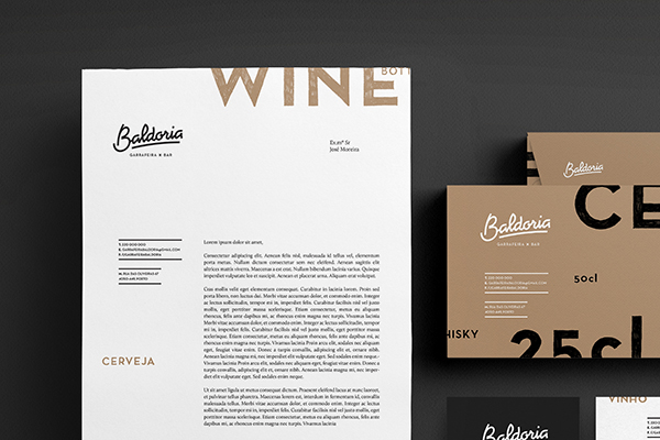
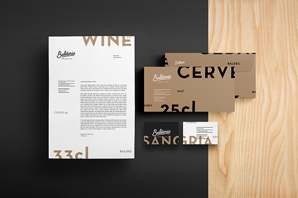
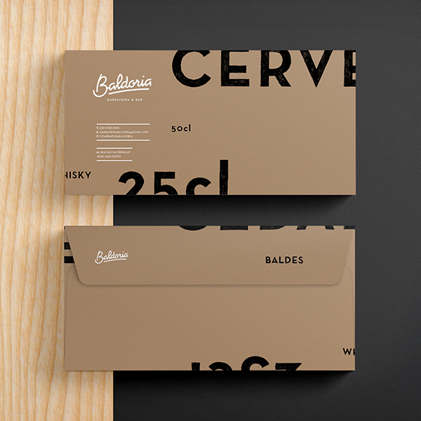
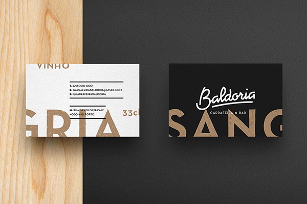
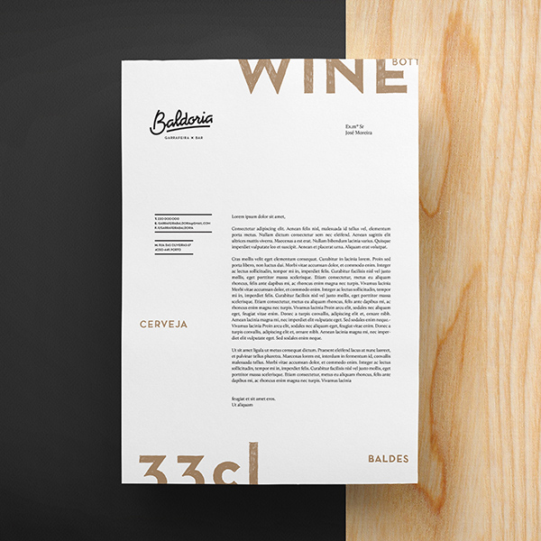
The design for Baldoria’s brand can be summed up with two words: Shifted Type. The logo uses a hand rendered, semi-angular treatment with a simple sans-serif descriptor line. Beyond that, the rest of the brand uses shifted typography to create an excellent, unique effect across menus, interiors and more. Excellent work by Another Collective

2dc1cdffca72bfd4124078460e1413e0

1d7877550ffc0b3e1bc8c331ee354d97 b5dda05bc84b4a4eca678c4026f8b61f

40b5dbf01332475e9ba5f9f39b4d878d

ff38e1a11ba4d2eeecbee0f112cb1ffb

88721a3515f74d38a6c9d6c2e0cf5593

34fa756745669a6cd6ed78d3c05a414c

d1643cdf75710a1751e832ae3af084a0

6d3a276533df0ae397f11dfac3f1beb6

f11eed08e7a6d00997dc00b4dc84acf8

4cf28963bb97823717b0d3d69a5763c3

90e0da4702aaa45735f3809508a917d5

1e3a8fe06cbcc0f0138cd5bf7d8e3a54

126e4a610bf10ea31d68bb761dbd495b

f37a69fc7b7d99cc51413e12b37e768d

f003e3a6f6f4bcf748ef4152734306e0

bdce6798de9a924904cf9628c53c3e40

849d6fcdb103174b5e64db6a136a05f0

e000723b1e5f6935597fbf1984605c9e b0575c875f82ff3250ac0809f997778b

Discuss this Project

Leave a Reply

This site uses Akismet to reduce spam. Learn how your comment data is processed.

The Forktales Podcast™: Interviews with restaurant industry leaders and visionaries

Restaurant and advertising industry headlines and thinking

Reviews of restaurant experiences from around the globe 

Reviews of our favorite design, business, & restaurant books

Our favorite typography and fonts

Inspiration in your inbox

Get the latest inspiration in your inbox every Monday morning, for FREE!

"*" indicates required fields

This field is for validation purposes and should be left unchanged.

Delicious Bits in your Inbox!

Get the latest and greatest content delivered to your inbox for free!

"*" indicates required fields

This field is for validation purposes and should be left unchanged.