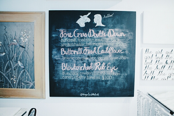
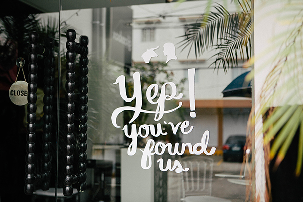
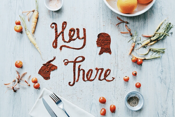
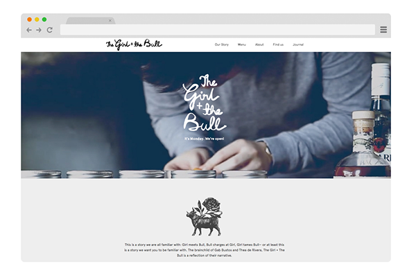
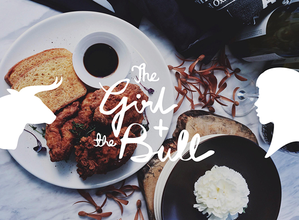
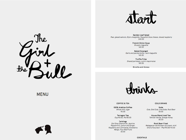
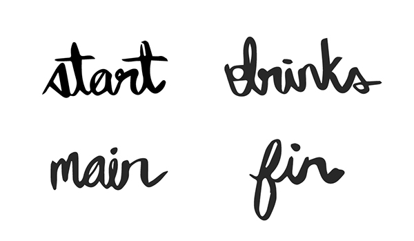
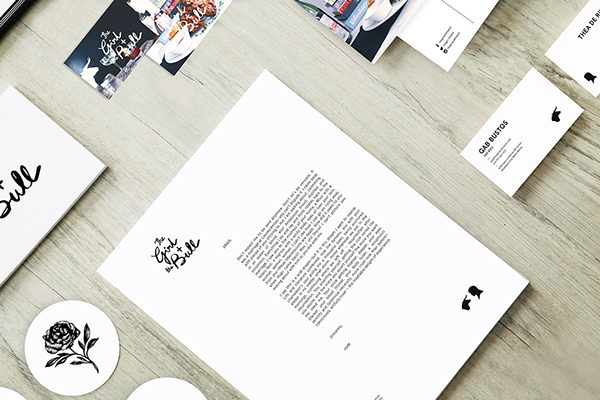
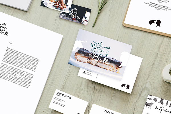
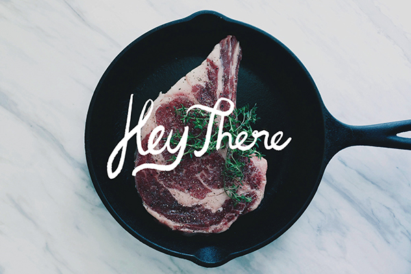
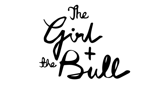
I have a bit of a fascination with the free flowing, hand rendered scripts. Their imperfect, but personal. There’s something sexy about them. Serious Studio uses this style of typography quite well in their brand identity design for The Girl & The Bull. Side note: Please stop naming restaurants Blank & Blank. It’s played out and tired. Here’s why.
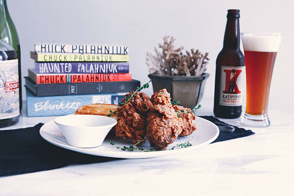
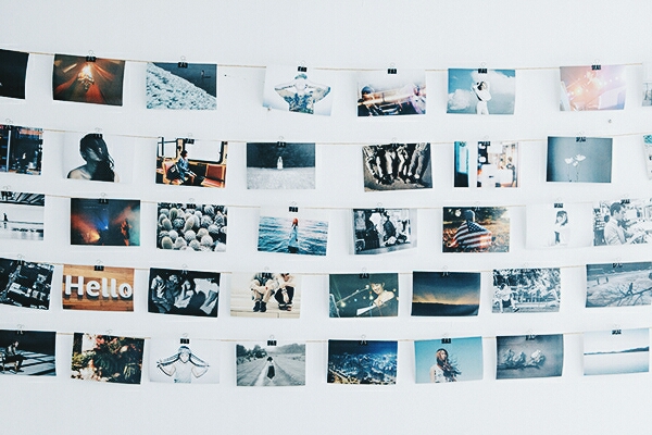
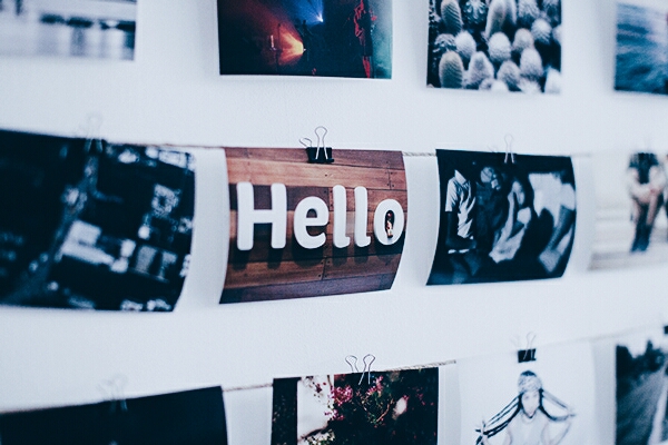
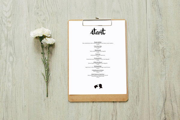
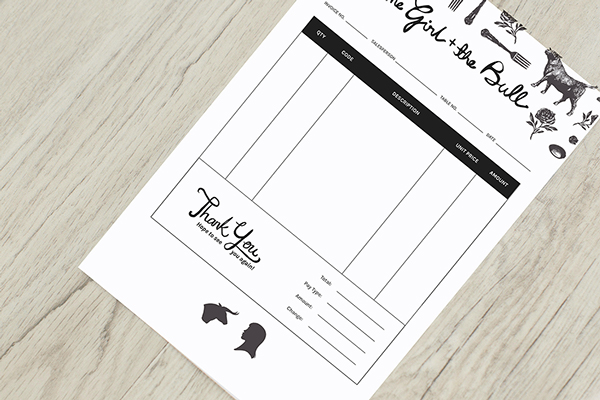
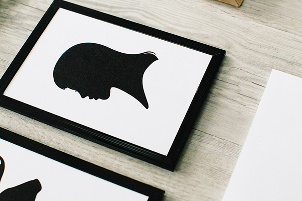
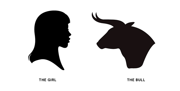
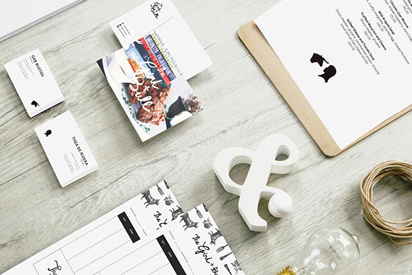
The beautiful script is supported by simple typography and layout technique. The use of cameo style graphic treatments push the name visually, while etched illustrations send it home. Great work, and who couldn’t love a brand that uses Chuck Palahniuk books for photo styling?
Designed by Serious Studio
