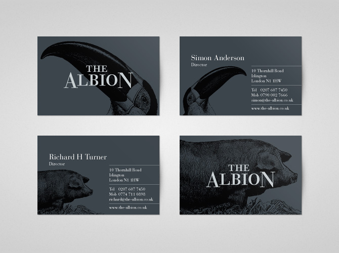
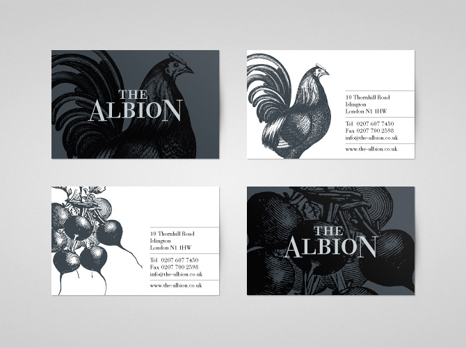
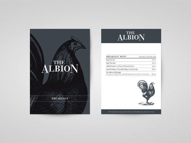
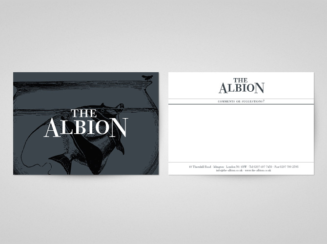
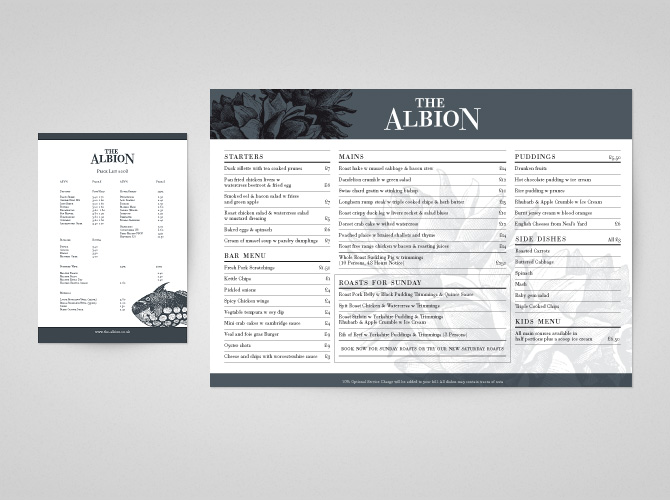
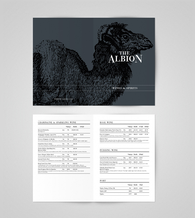
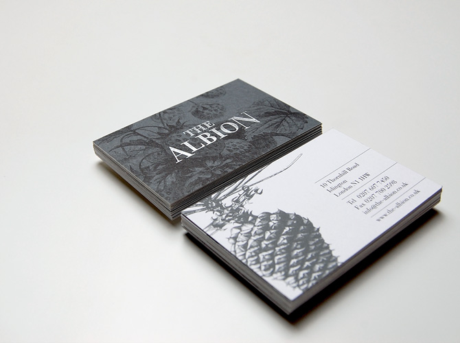
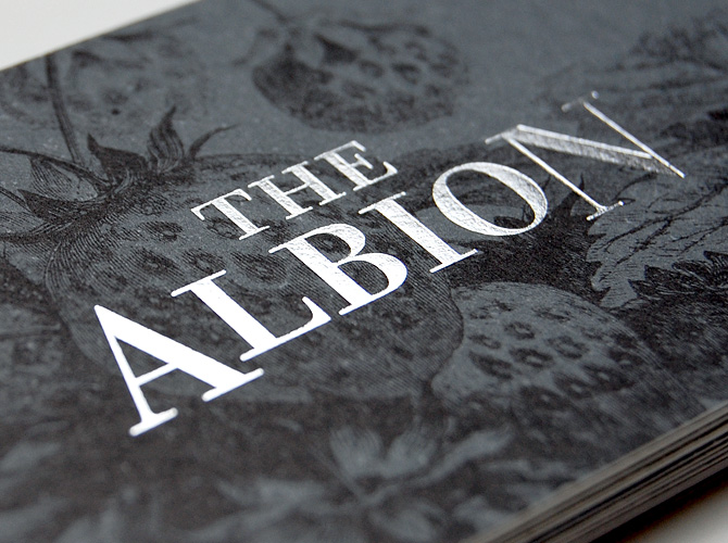
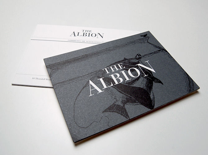
Although vibrant colors can do wonders for a restaurant brand, sometimes subtle color choices can set a tone much better. In the case of The Albion, designed by Popcorn Box, the color is a cool slate gray. It’s subtlety speaks to refinement and confidence. The typographical treatment for the logo follows suit with a beautiful use of a modern serif typeface, set perfectly for this restaurant’s identity. The remaining touch points continue the refined approach with injections of classic pen and ink illustrations depicting produce, food, and animals. Very well done.
