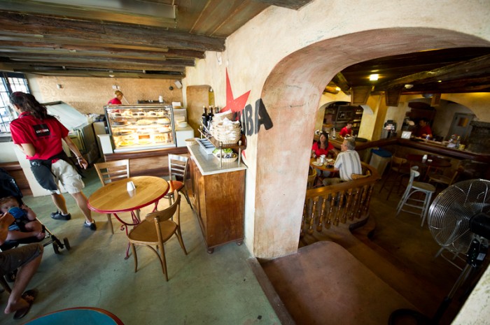
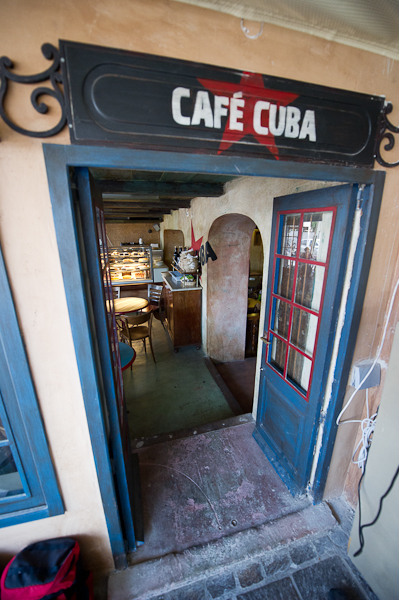
Cafe Cuba takes the visitor back to a small town in classic Cuba with that mom and pop feel of service. The identity is simple and humble which matches the interior design perfectly. I like a rustic textures of the woods and walls used throughout the space. Here is what Steves & Co say about the design:
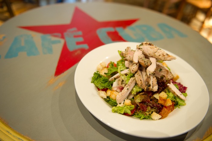
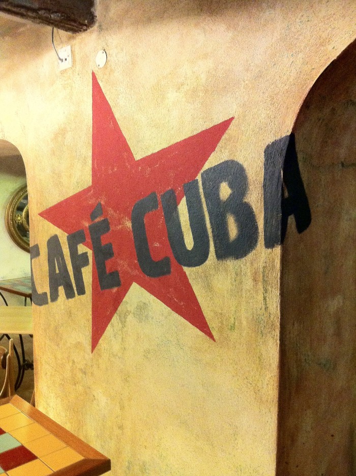
Café Cuba’s branding is a melting pot of everything traditionally associated with the South American country. The fiery red star is a springboard for the bold white guerrilla font ‘Cuba’ that jumps right at you. The textured logo wouldn’t be out of place on the wall of a rundown Latin American street, working closely with the food to provide an all-round Cuban-style culinary experience.
My only concern with the angle is that it nods towards communism. Recently Yum Brands has been getting knocked because of their similar use of communist design elements for their Bahn Shop bahn mi concept. This looks very similar, and could be subject to the same outcries.