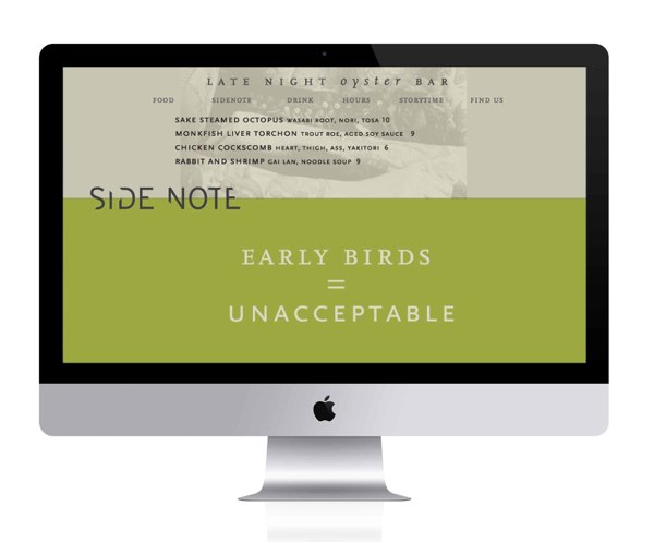
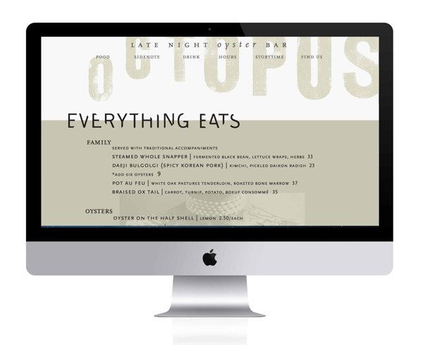
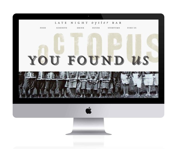
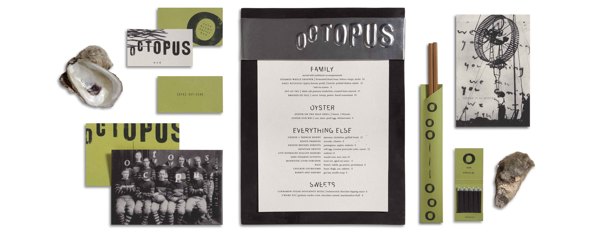
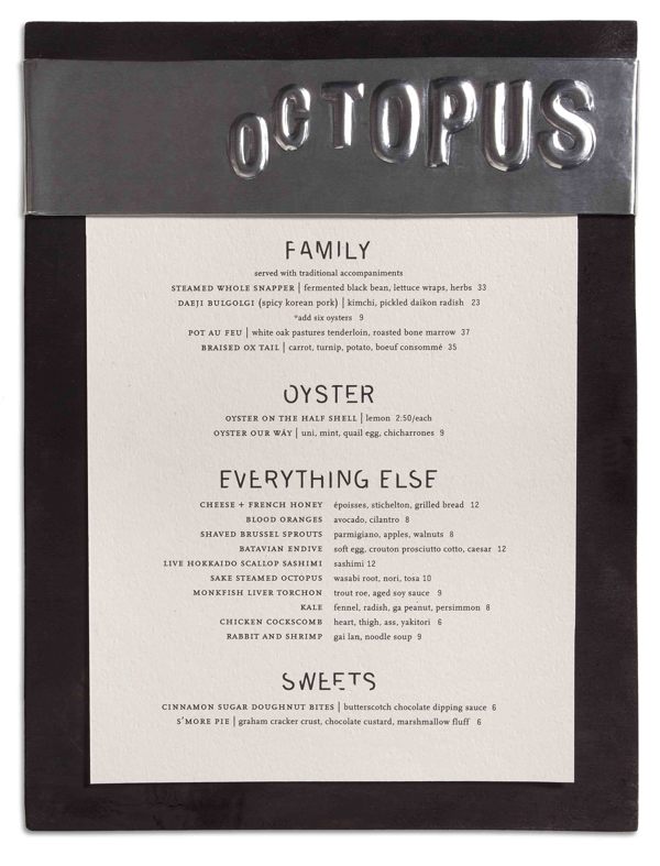
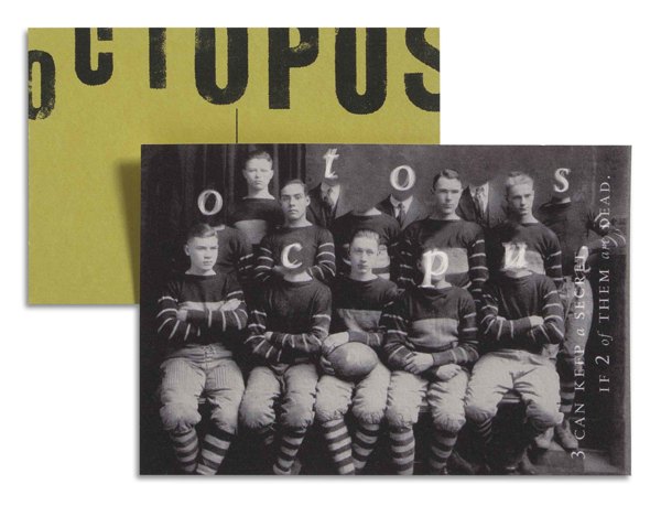
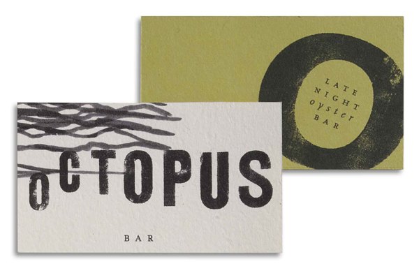
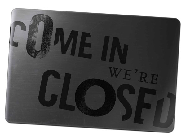
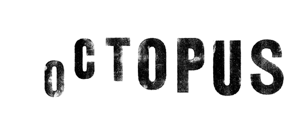
Maybe I’m going through beach-deprivation, but I’m digging this brand identity design for Octopus bar by Jille Natalino. It’s fresh, new and memorable. Using the old-school circus photography to pull in that speakeasy feel. The messaging through the copy nails the speakeasy feel as well. Here’s what she says about the project:
Many of the more circus like 1920’s photos come from this idea of the speakeasy and the spectacle. They are given a dark twist with some of the heads of the rugby players cut off as well as the eyeballs and marks that spell out SOS in morse code on the chopstick wrapper. Octopus bar is similar to that because in order to find it or even know it exists, someone has to tell you about it. There are no signs, no advertising, no comprehensive websites for it.
The menu here changes daily, according to whats in season and what the chef want to cook, so the menu was constructed in a way that would be very easy to change out easily.
