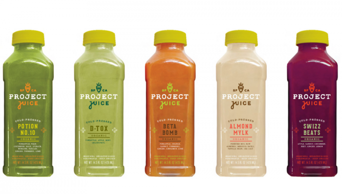
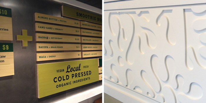
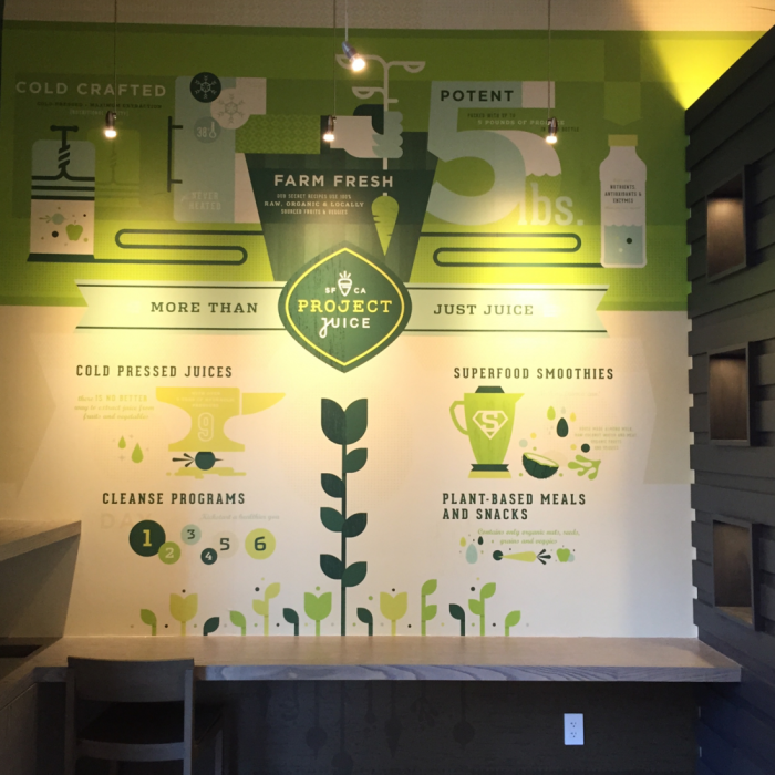
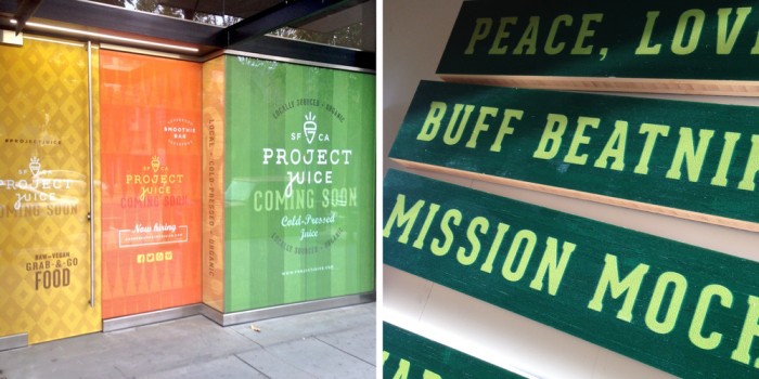
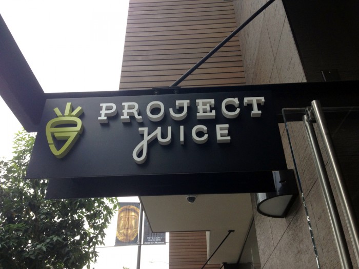
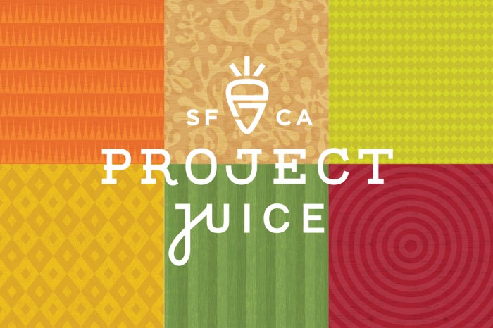
I was pretty excited to see this work for Project Juice by Chen Design Associates. I’m always a fan of CDA’s melding of patterns and multiple type treatments to create a unique look that’s inherently “Chen.” The interiors leverage textures and light to create dramatic elements that communicate Project Juice’s brand vibe appropriately and effectively. The color palette pulls in the natural vibrance of veggies and fruits while maintaining that natural feel. Excellent work as always.
