Hello Tomato restaurant branding

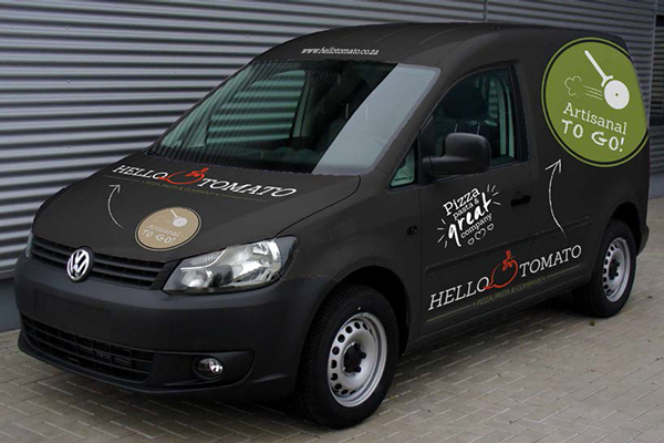
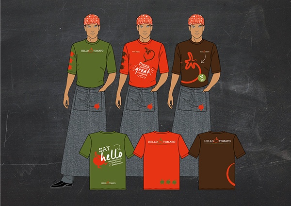
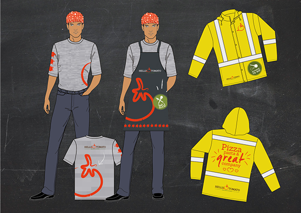
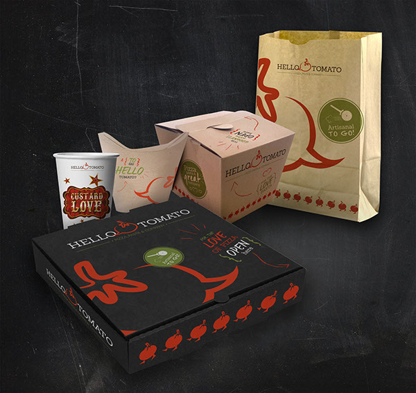
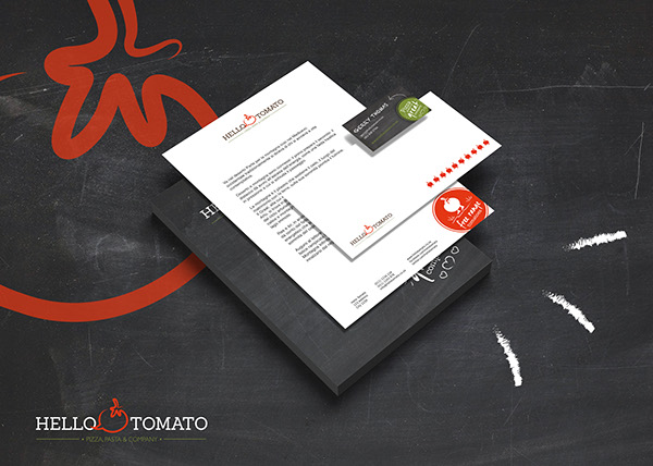
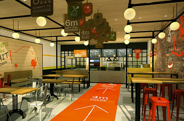
First, Happy New Year everyone! Second, let’s look at some awesome restaurant brand identity designs. The identity for Hello Tomato was designed by Tandem Create. What’s making this work is the use of black/charcoal as a foundation for the typographic and graphic treatments. It makes everything pop a little more while maintaining a more upscale look and feel. The effect is especially true in the vehicle livery and the packaging design. The rest of the brand identity marries nicely with the other elements to create a hand-crafted vibe without relying on the expected reclaimed wood design accouterments.

ed4df91074d826882131a08e6ff42c66

48fbdddf844cb32ae2c5e03e6b61ddac

ea38f29404c03622fdc48a3c6b38a8bb

c025f905a97d3d2e29ffecbeade700c5

1cc4ae8805cb30c3bfcd3c5313bb36f7

4b7fcf37a566e4d13f3d4c5eaaec83e0

Discuss this Project

Leave a Reply

This site uses Akismet to reduce spam. Learn how your comment data is processed.

The Forktales Podcast™: Interviews with restaurant industry leaders and visionaries

Restaurant and advertising industry headlines and thinking

Reviews of restaurant experiences from around the globe 

Reviews of our favorite design, business, & restaurant books

Our favorite typography and fonts

Inspiration in your inbox

Get the latest inspiration in your inbox every Monday morning, for FREE!

"*" indicates required fields

This field is for validation purposes and should be left unchanged.

Delicious Bits in your Inbox!

Get the latest and greatest content delivered to your inbox for free!

"*" indicates required fields

This field is for validation purposes and should be left unchanged.