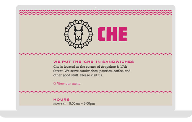
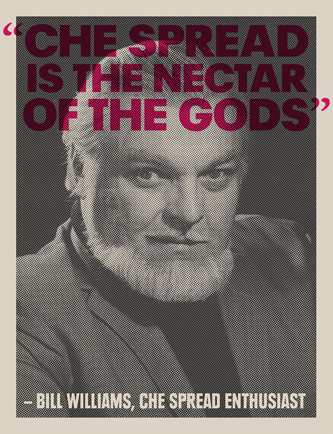
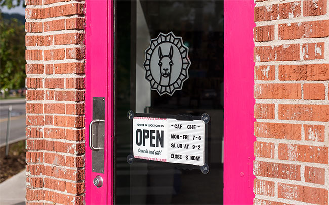
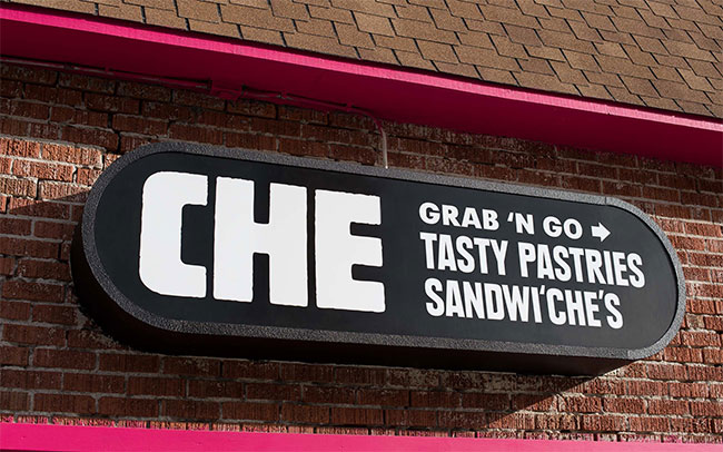
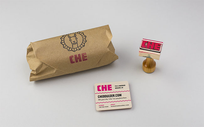
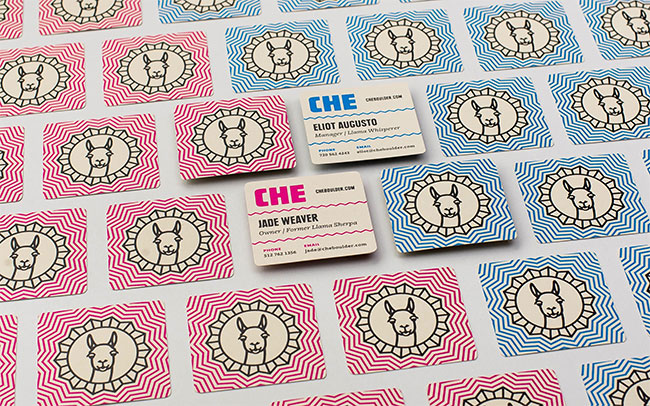
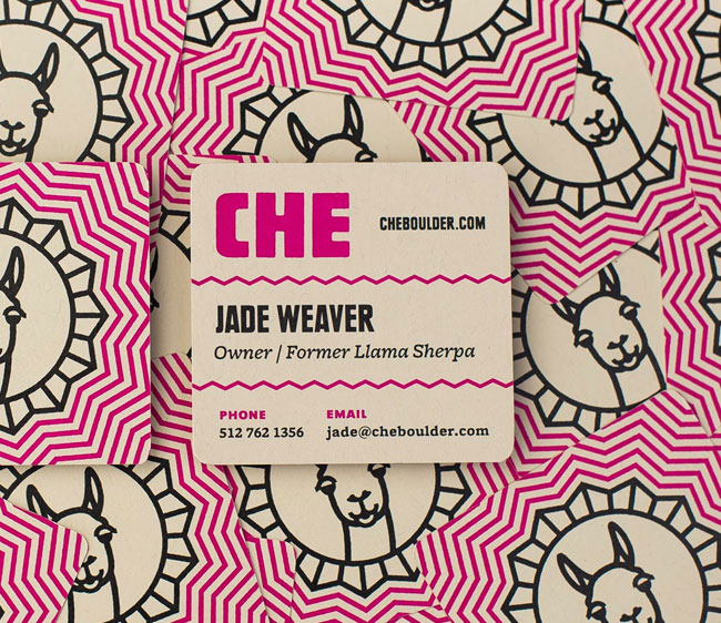
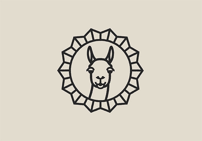
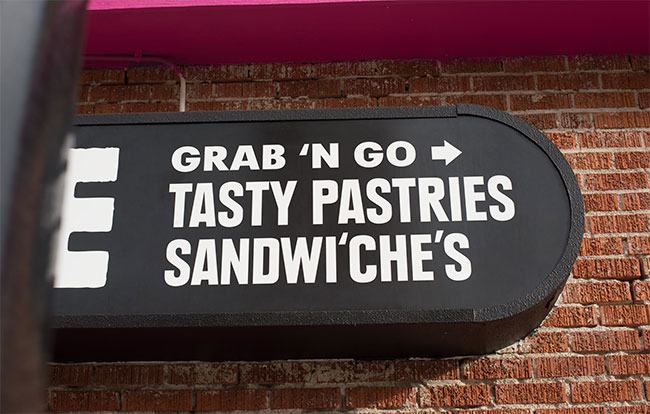
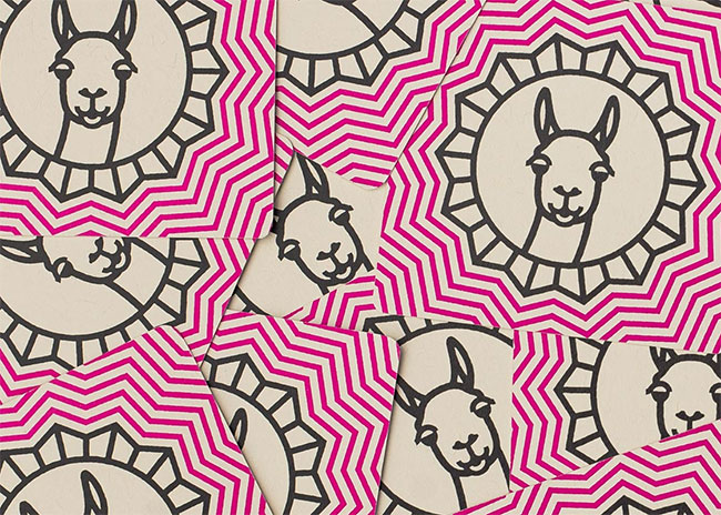
I just found the guys from Cast Iron Design today and are super impressed with their work and how they present it. One such project in their portfolio caught my eye: the branding for Che Cafe. The identity for this restaurant uses a color I happen to dig, but it’s not just my personal interests that prompt me to share. Che’s brand identity uses a remarkably memorable llama device in conjunction with simple graphic treatments to round out a look that’s fresh and new for a restaurant. The design team seems to have fun with the mark as they explore patterns and quippy bits of copy. Great stuff.

cafe-che-identity-17

cafe-che-identity-13

cafe-che-identity-09

cafe-che-identity-08


cafe-che-identity-07

cafe-che-identity-06


cafe-che-identity-05

cafe-che-identity-04

cafe-che-identity-03

cafe-che-identity-02

cafe-che-identity-01


Discuss this Project

Leave a Reply

This site uses Akismet to reduce spam. Learn how your comment data is processed.

The Forktales Podcast™: Interviews with restaurant industry leaders and visionaries

Restaurant and advertising industry headlines and thinking

Reviews of restaurant experiences from around the globe 

Reviews of our favorite design, business, & restaurant books

Our favorite typography and fonts

Inspiration in your inbox

Get the latest inspiration in your inbox every Monday morning, for FREE!

"*" indicates required fields

This field is for validation purposes and should be left unchanged.

Delicious Bits in your Inbox!

Get the latest and greatest content delivered to your inbox for free!

"*" indicates required fields

This field is for validation purposes and should be left unchanged.