No. Six Depot roastery and cafe branding

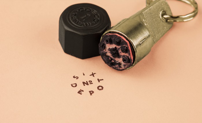
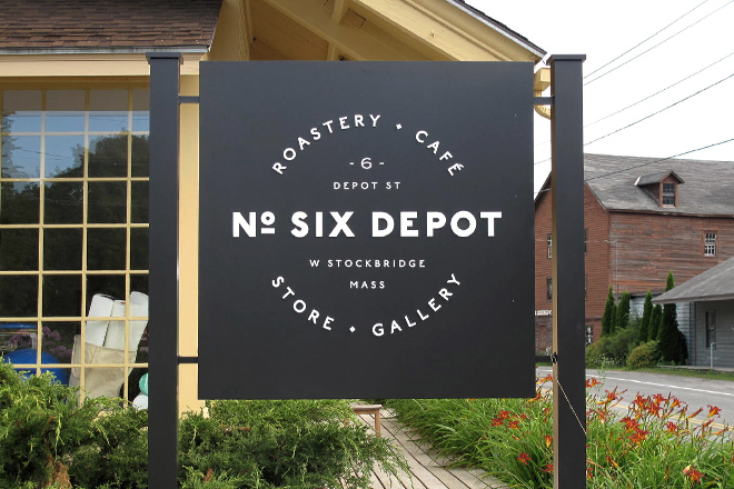
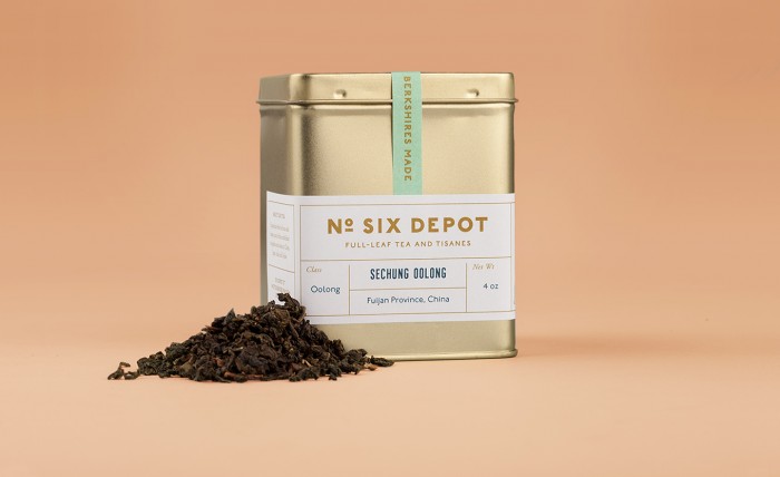
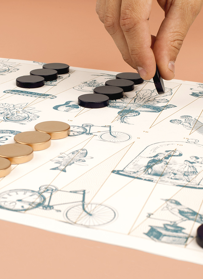
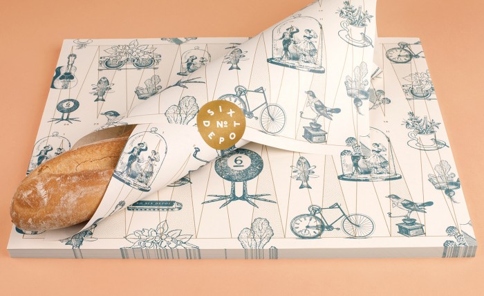
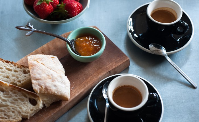
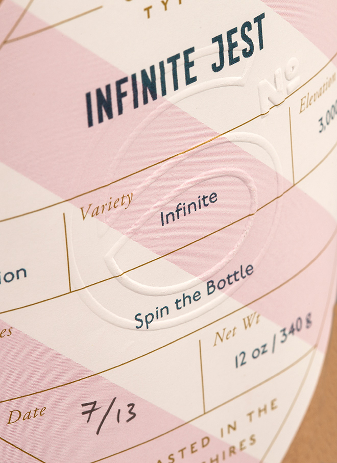
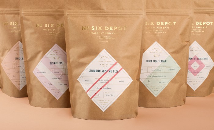
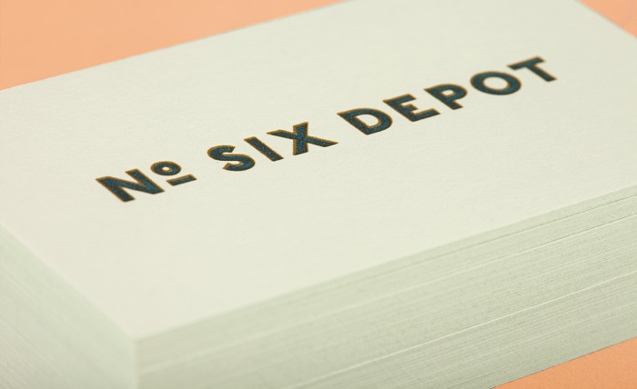
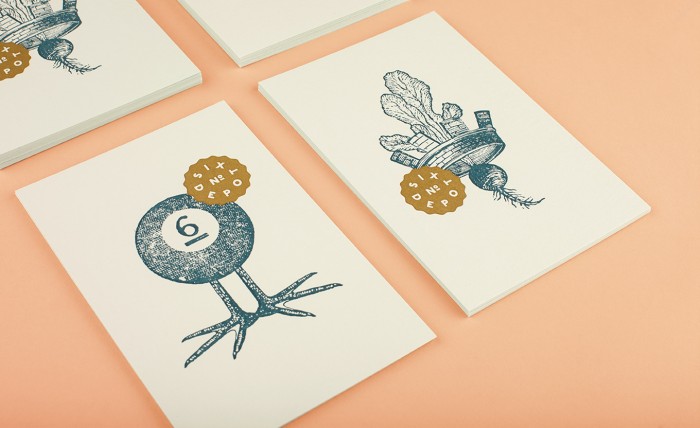
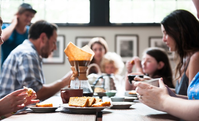
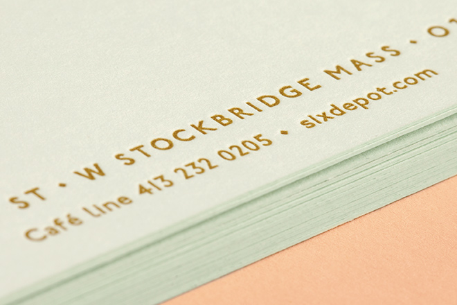
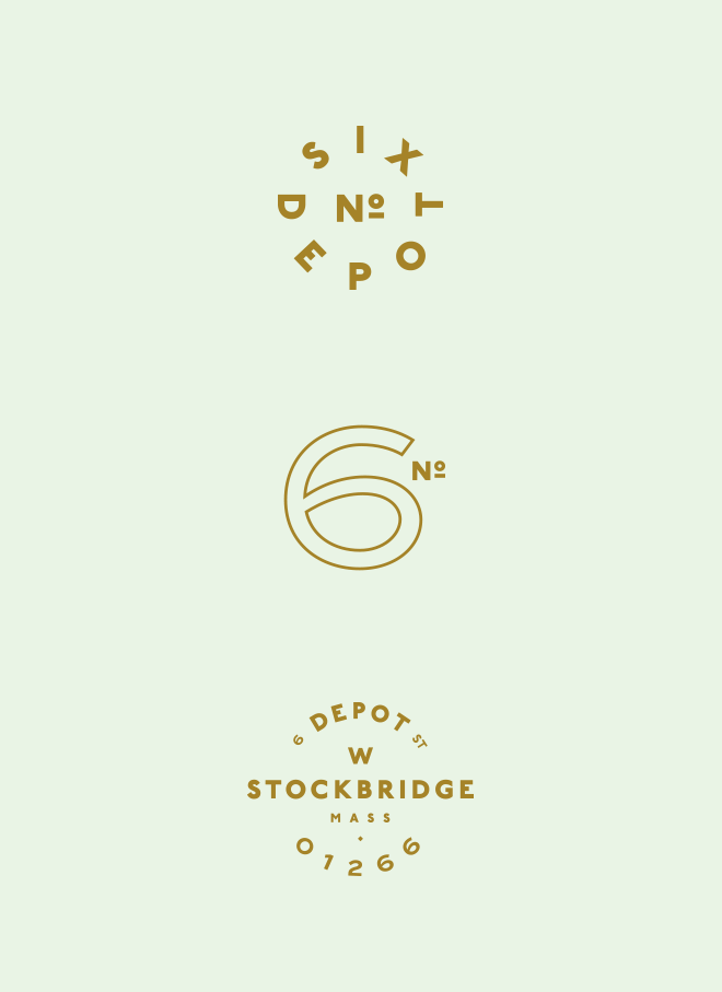
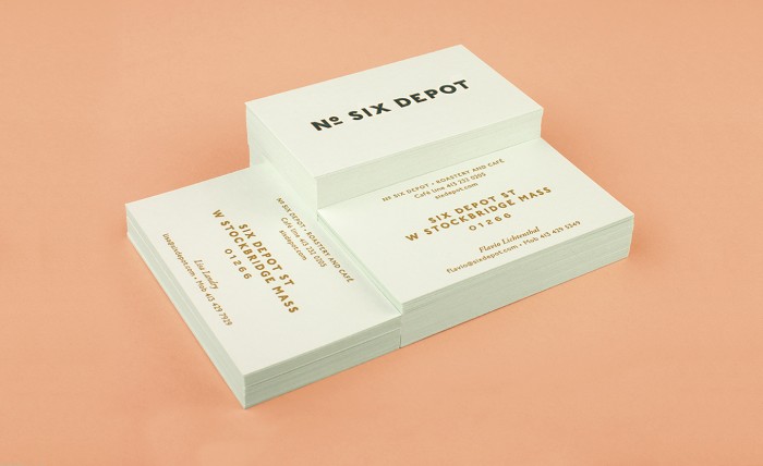
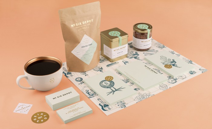
I’ve had my eye on the Perky Bros portfolio for quite a bit. They have a lot of lovely work under their belts including this excellent identity for No. Six Depot roastery and cafe. The logo family is an excellent exercise in solid typography that allows other touch points to each have their own look and feel. With smart use of tip-on techniques the team is able to create a low-cost solution to the packaging which opens up the opportunity for other finishing techniques like embossing. Who doesn’t love a  multipurpose placemat/sandwich wrap that also acts like a backgammon board? Finally, that pastel color palette really sings.

SixDepot_18

SixDepot_21

SixDepot_15

SixDepot_10

SixDepot_9

SixDepot_17

SixDepot_7

SixDepot_5

SixDepot_2

SixDepot_19

SixDepot_13

SixDepot_6

SixDepot_Marks

SixDepot_4

SixDepot_1

Six_Depot_Logo21


Discuss this Project

Leave a Reply

This site uses Akismet to reduce spam. Learn how your comment data is processed.

The Forktales Podcast™: Interviews with restaurant industry leaders and visionaries

Restaurant and advertising industry headlines and thinking

Reviews of restaurant experiences from around the globe 

Reviews of our favorite design, business, & restaurant books

Our favorite typography and fonts

Inspiration in your inbox

Get the latest inspiration in your inbox every Monday morning, for FREE!

"*" indicates required fields

This field is for validation purposes and should be left unchanged.

Delicious Bits in your Inbox!

Get the latest and greatest content delivered to your inbox for free!

"*" indicates required fields

This field is for validation purposes and should be left unchanged.