Jack & June restaurant and bar design

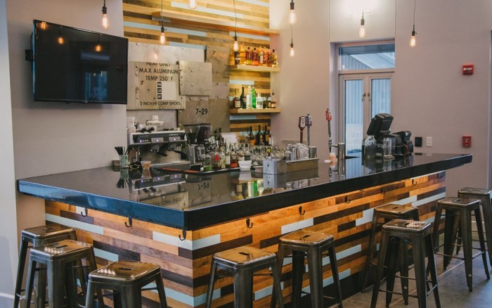
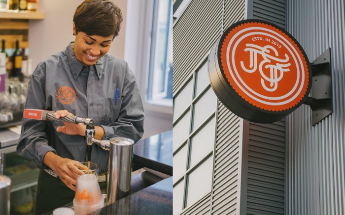
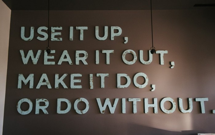
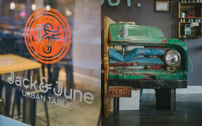
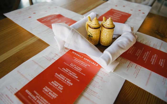
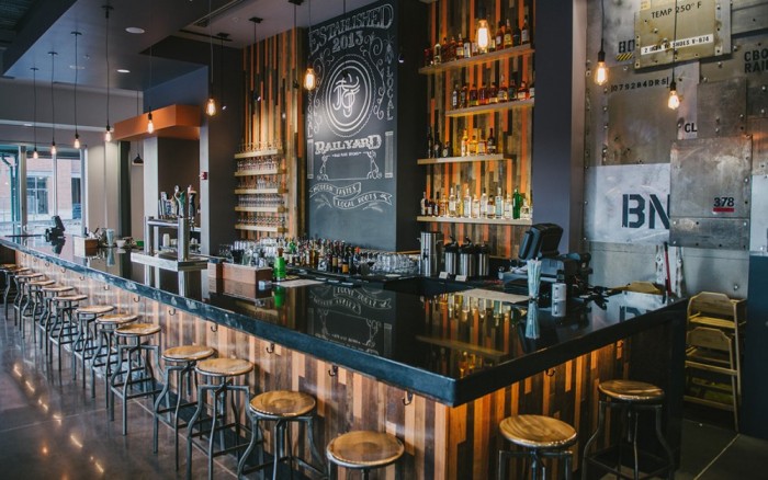
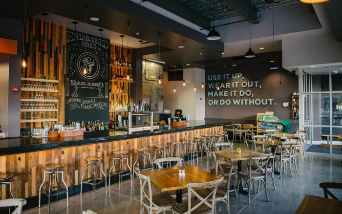
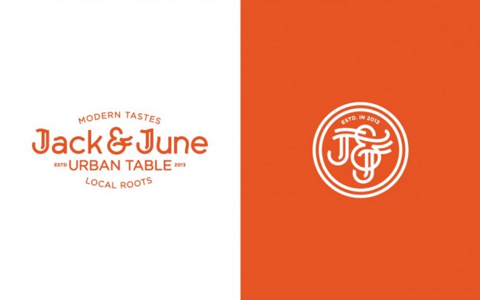
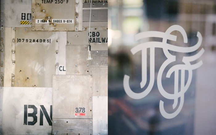
I absolutely love the typography design for this restaurant’s brand identity. The monogram version is even better than the full logo version. Swooping ascenders and descender create an interesting geometric feel. The interiors are unique without being too out there. Website is fresh and not a cookie cutter experience. Overall this is an excellent identity design by Archrival.
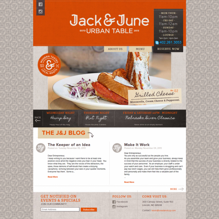
asset_93_j_j_website_01

asset_93_jack_june_02

asset_93_jack_june_14

asset_93_jack_june_13

asset_93_jack_june_03

asset_93_jack_june_11

asset_93_jack_june_06

asset_93_jack_june_12

asset_93_jack_june_08

asset_93_jack_june_logos-01

Discuss this Project

Leave a Reply

This site uses Akismet to reduce spam. Learn how your comment data is processed.

The Forktales Podcast™: Interviews with restaurant industry leaders and visionaries

Restaurant and advertising industry headlines and thinking

Reviews of restaurant experiences from around the globe 

Reviews of our favorite design, business, & restaurant books

Our favorite typography and fonts

Inspiration in your inbox

Get the latest inspiration in your inbox every Monday morning, for FREE!

"*" indicates required fields

This field is for validation purposes and should be left unchanged.

Delicious Bits in your Inbox!

Get the latest and greatest content delivered to your inbox for free!

"*" indicates required fields

This field is for validation purposes and should be left unchanged.