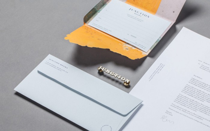
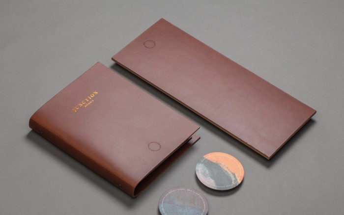
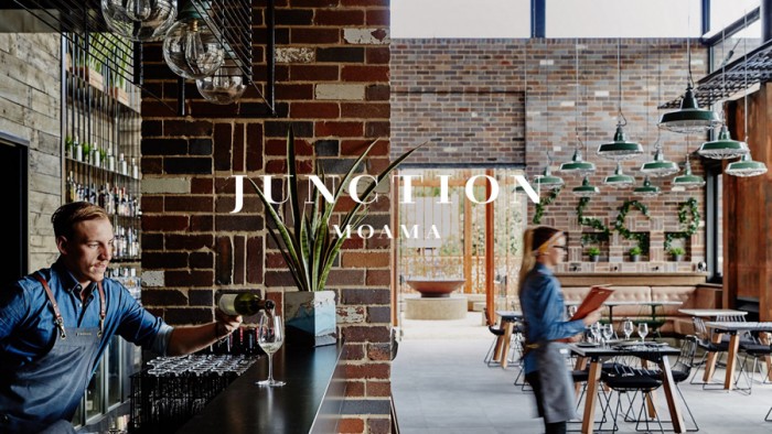
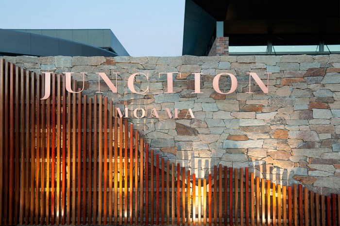
Fine art meshes with superb use of touch points in this brand identity for Junction Moama by Seesaw. The brand identity takes influence from the inspirational beauty found in the twin towns of Moama and Echuca. The beauty drew many folks to the area including artists which helped inspire the restaurant’s brand identity design. They explain it excellently in their case study:
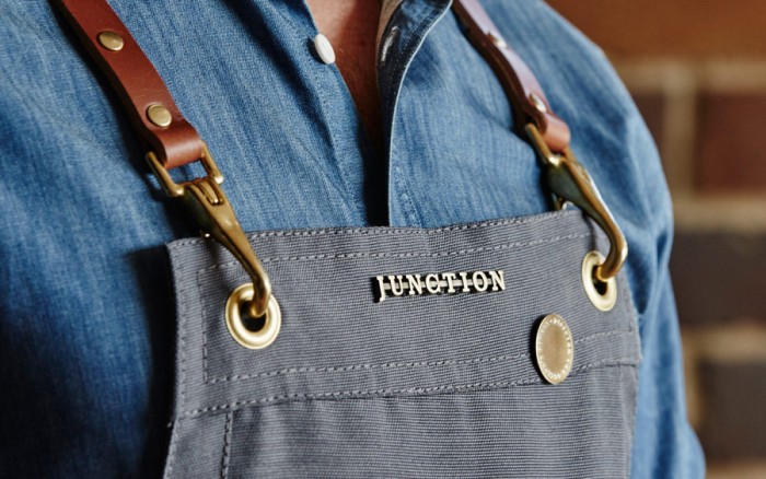
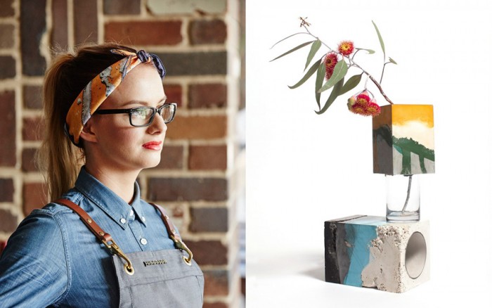
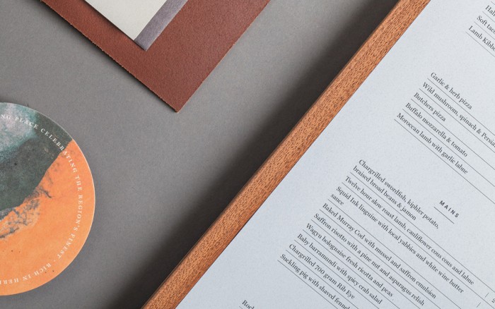
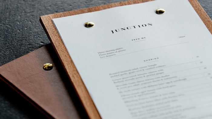
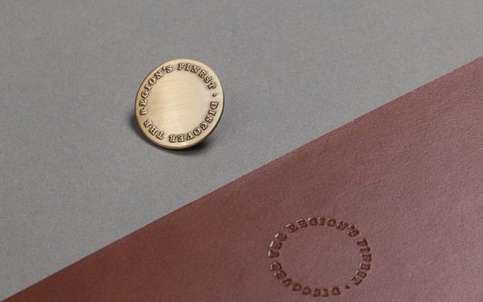
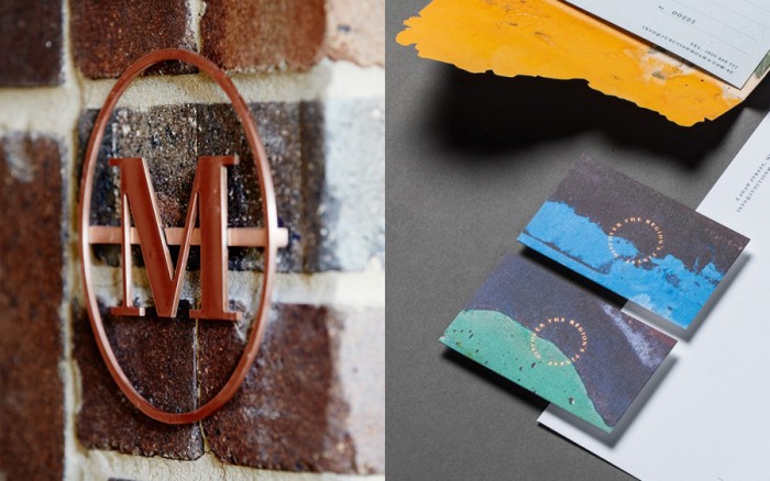
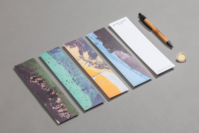
Graphic elements reflect the curving line of the river, the hunting and gathering of the local Yorta Yorta people and the traditional crafts of the area. Menu design fused branded leather and the unique patina of the local spotted gum. Aprons were crafted out of canvas, leather and brass, referencing horse bridals. Signage was built out of hand-beaten copper. And tactile copper stamping is featured graphically on all printed collateral.
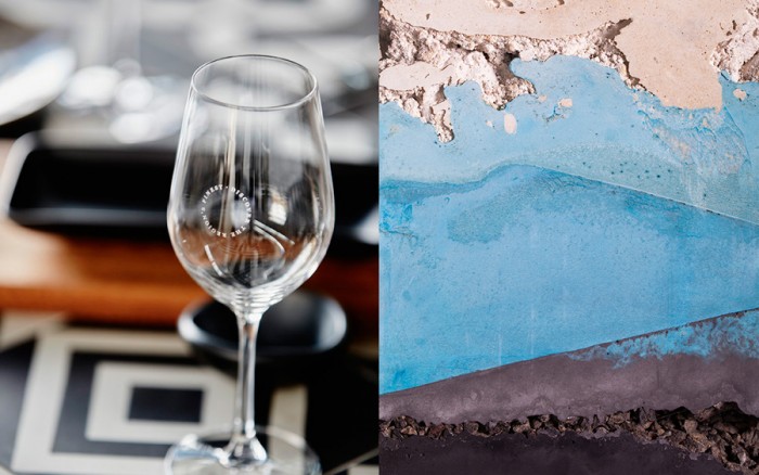
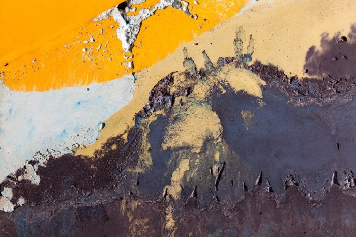
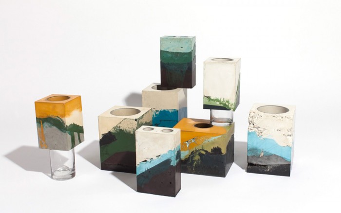
An artist was commissioned to create a series of exquisitely textured cement vessels that reflect the layered sediment and water levels of the river. These artworks formed the basis of many of the touch points – from signage and stationery though to environmental graphics and uniforms.
Special thanks to Richard Baird at BP&O for posting this on this blog. He has an awesome assessment you all should checkout.
