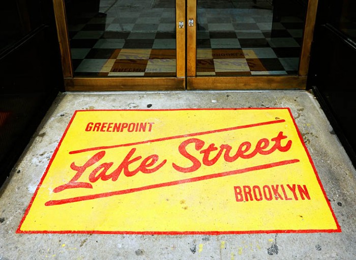
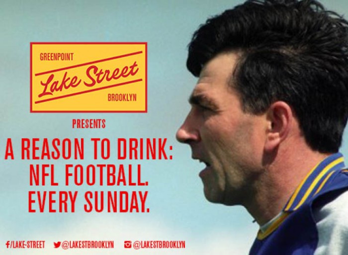
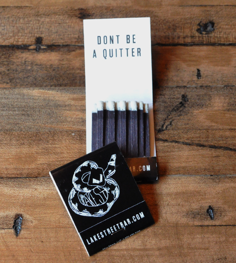
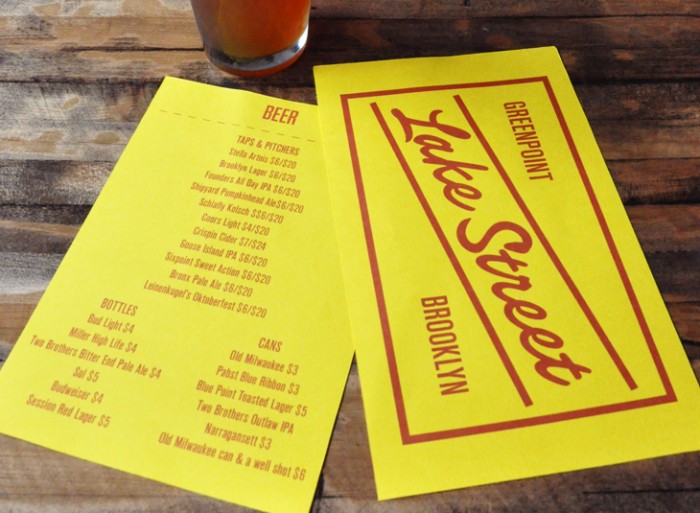
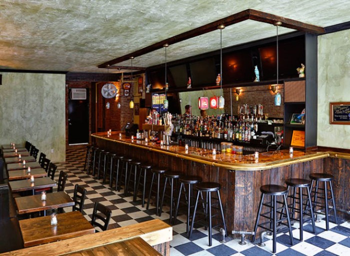
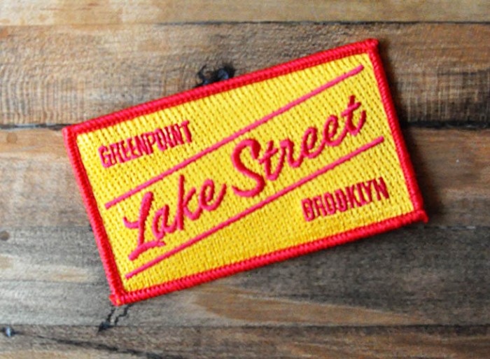
Another bright right and yellow brand, I promise this isn’t a theme for the week. The LMNOPeeps (get it?) pumped out this excellent brand identity design for Lake Street in Greenpoint, NY. I love the simplicity of the shape and how it bolsters the hand rendered typographic element of the restaurant’s logo design. The color palette is aggressive in a great way. It pops. The matchbook touch point seems a bit off brand and doesn’t quite match, but the copy is awesome. Enjoy