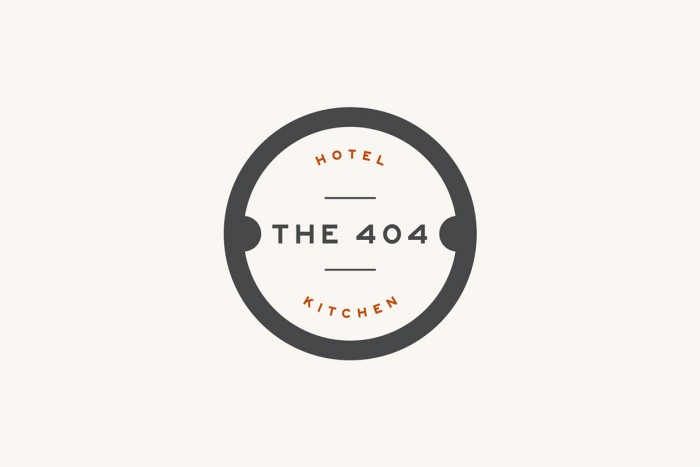
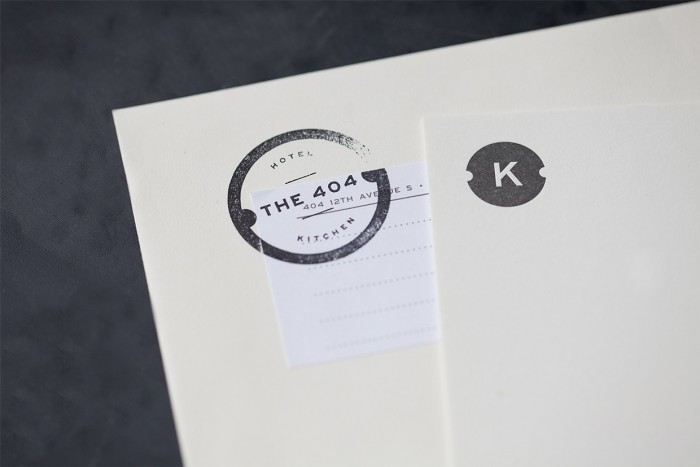
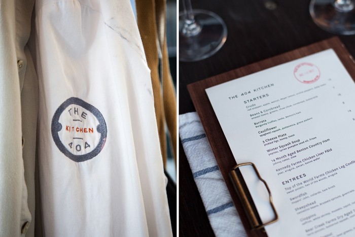
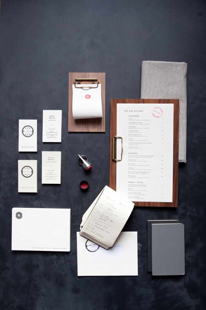
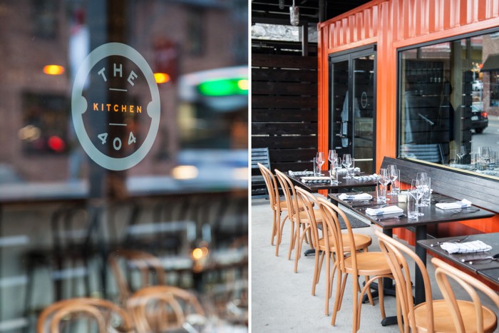
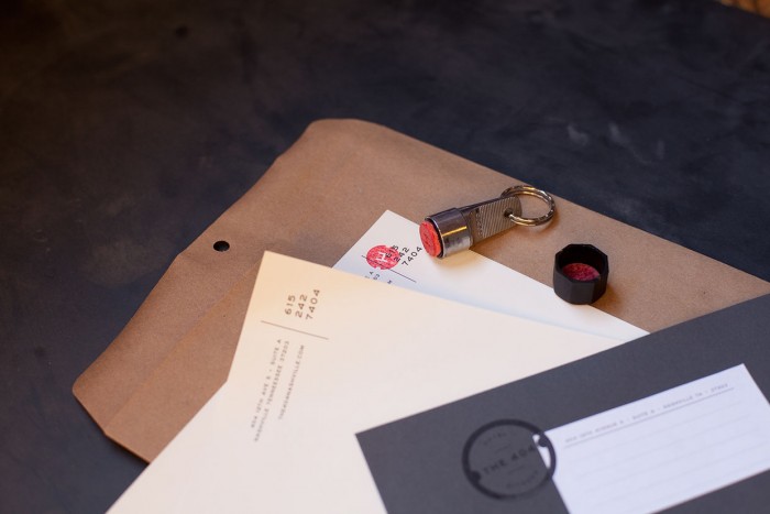
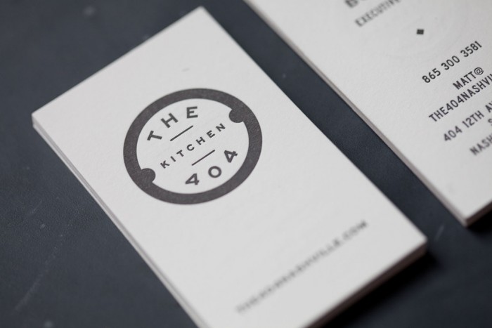
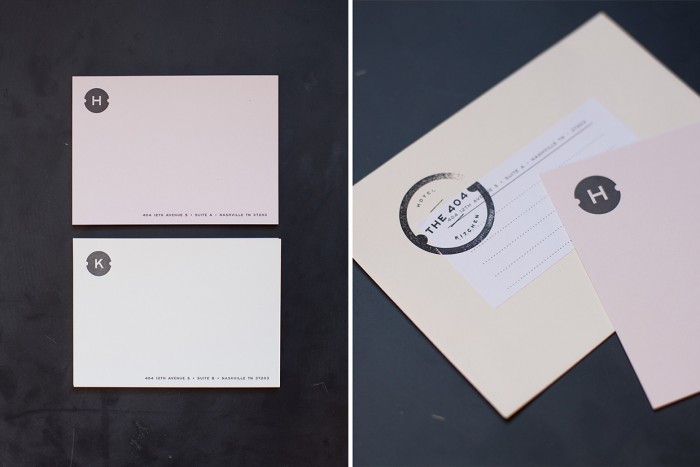
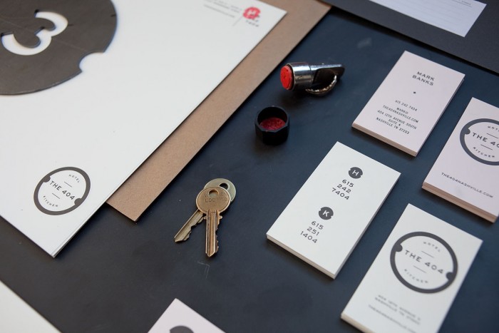
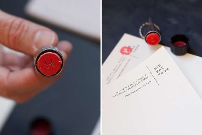
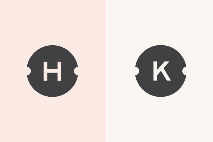
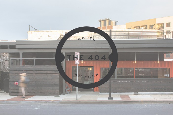
The simplicity and smart use of typography and white space is what really jumps out at me with this restaurant brand identity design by Benji Peck. The logo is clean, but naturally becomes distressed when applied with additional techniques like stamping. The overall identity adheres to design principles, but breaks the mold in all the right places. I’ll let the design speak for itself here. Well done.

3b2a2bc043d014e84f35c59fae164d53

af5eb55afa811fd6a3faac9b5b85fee4

3d7bdfc887b19f9137390950e6cdb940

e5e1cfb856739f30367f35ded5d0d137

6c12d5e0494b99498ddb385e78f61029

53678c2dd47427a129312a6aa40a03d4

8b44a21356394e2a161e2e47c81037d6

b6bbbcea1887fdba6cf2d879f015ff92

305a6dcacfbb8d7063f8e300eb36cdcd

f7eddee9175333752e5390969e05f720

eccdbe2cb0b8e3ea7b43bc7c34380c52

3bb183be669855f1514aa4bc0e8f6cea

649ae5a6f3bfcf735482ac92a3b3cd29

2973dae3eeb1ed1b28ff1fe92d15b15b

Discuss this Project

Leave a Reply

This site uses Akismet to reduce spam. Learn how your comment data is processed.

The Forktales Podcast™: Interviews with restaurant industry leaders and visionaries

Restaurant and advertising industry headlines and thinking

Reviews of restaurant experiences from around the globe 

Reviews of our favorite design, business, & restaurant books

Our favorite typography and fonts

Inspiration in your inbox

Get the latest inspiration in your inbox every Monday morning, for FREE!

"*" indicates required fields

This field is for validation purposes and should be left unchanged.

Delicious Bits in your Inbox!

Get the latest and greatest content delivered to your inbox for free!

"*" indicates required fields

This field is for validation purposes and should be left unchanged.