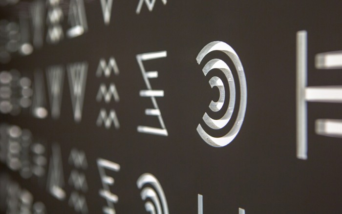
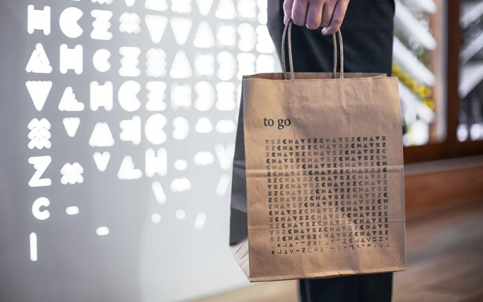
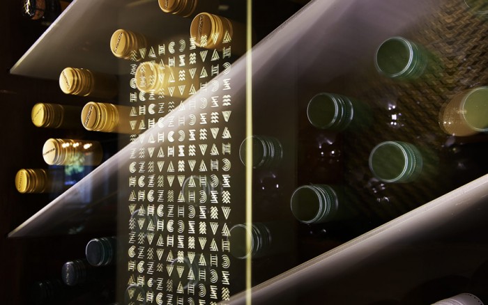
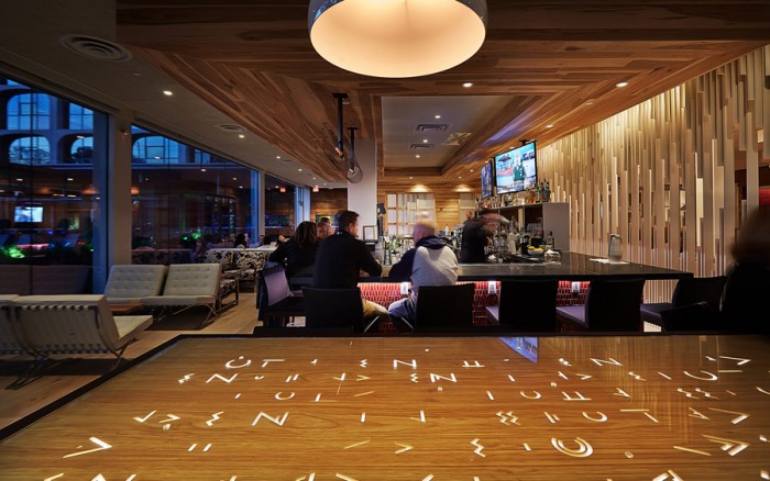
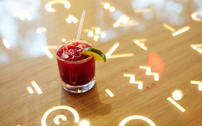
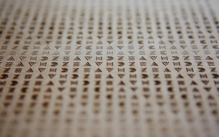
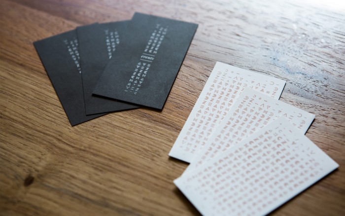
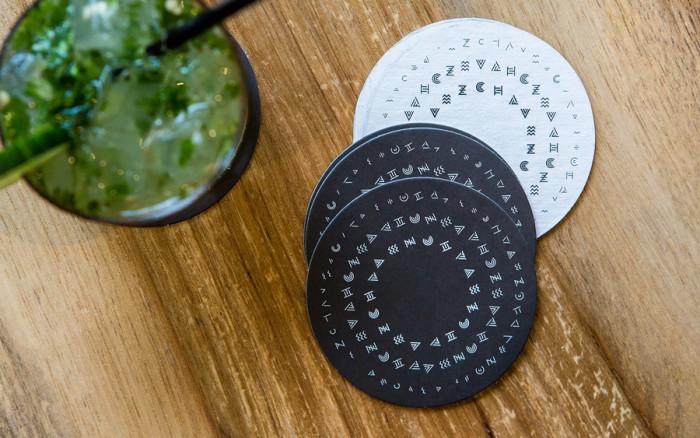
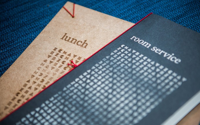
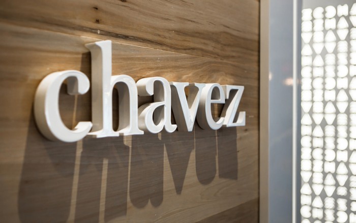
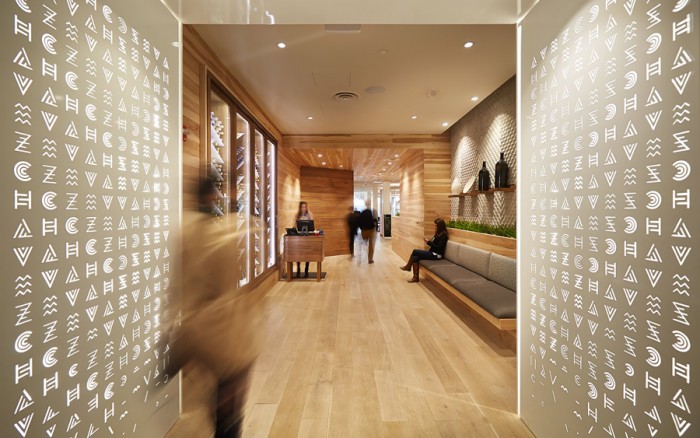
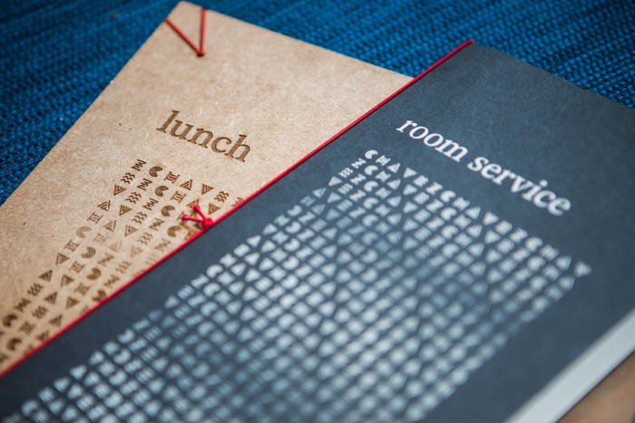
Chavez isn’t like other restaurant brand identities. The team at Foda Studio didn’t create just a graphic language, they designed a whole new “alphabet” of glyphs. These glyphs create a statement about the brand and experience. The glyphs represent one of the each of the letters in Chavez. The studio describes the thinking, “Developed in 6 weights, the glyphs create patterns that evoke movement and structure similar to that found in Mesoamerican textiles and pottery. These formal gestures can also be seen in contemporary Mexican folk art.” Checkout the work below and see more images on the Foda Studio site.

CH∆VEZ

CH∆VEZ

CH∆VEZ

CH∆VEZ

CH∆VEZ

CH∆VEZ

CH∆VEZ

CH∆VEZ

CH∆VEZ

CH∆VEZ

CH∆VEZ

CH∆VEZ

CH∆VEZ

CH∆VEZ

CH∆VEZ

01-Chavez-Menus-by-Foda-on-BPO


CH∆VEZ

Discuss this Project

Leave a Reply

This site uses Akismet to reduce spam. Learn how your comment data is processed.

The Forktales Podcast™: Interviews with restaurant industry leaders and visionaries

Restaurant and advertising industry headlines and thinking

Reviews of restaurant experiences from around the globe 

Reviews of our favorite design, business, & restaurant books

Our favorite typography and fonts

Inspiration in your inbox

Get the latest inspiration in your inbox every Monday morning, for FREE!

"*" indicates required fields

This field is for validation purposes and should be left unchanged.

Delicious Bits in your Inbox!

Get the latest and greatest content delivered to your inbox for free!

"*" indicates required fields

This field is for validation purposes and should be left unchanged.